
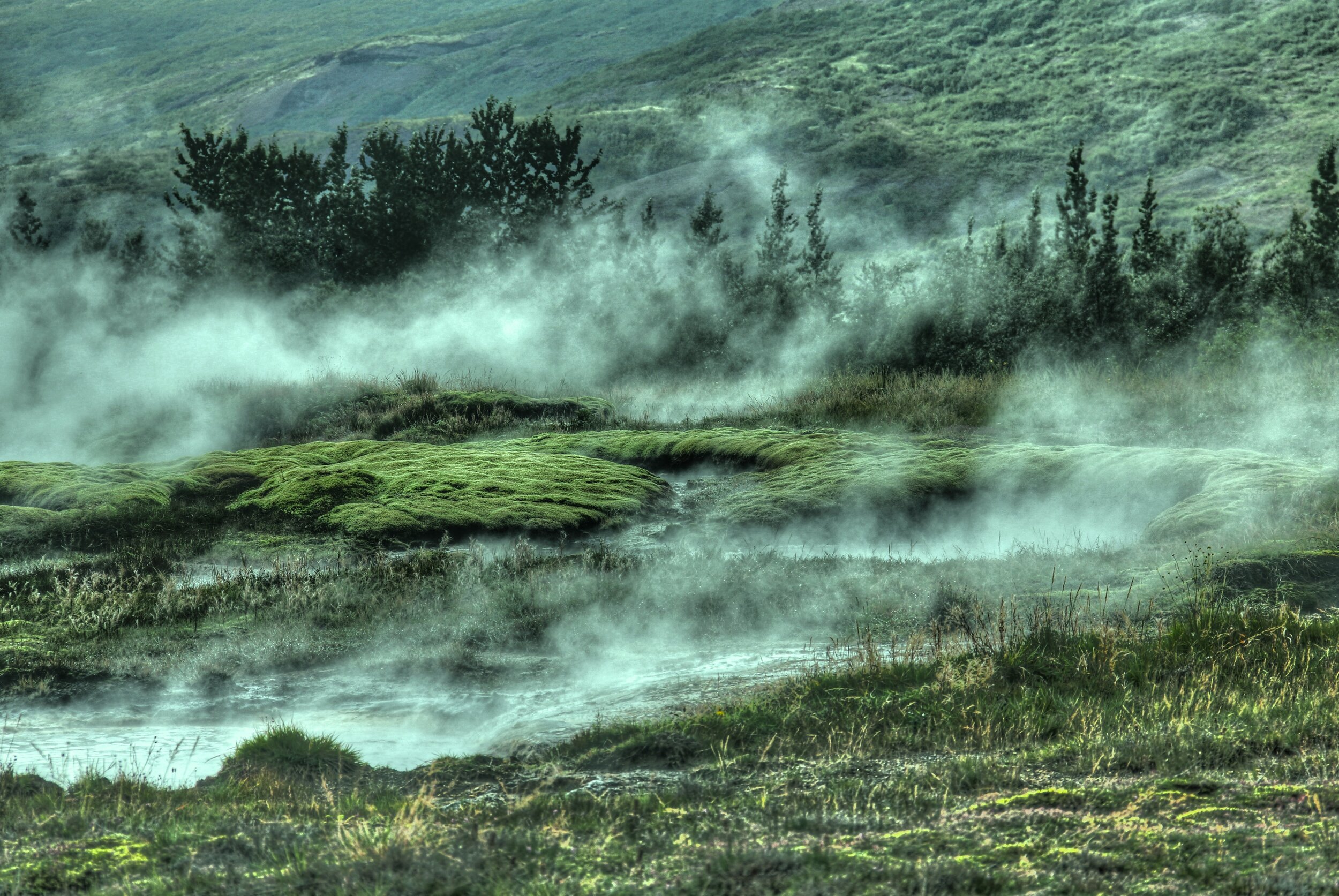
Photo-Inspired Palettes

@Tiago Murano
Inspiration can come from anything - ideas, stories, objects, even an interesting phrase. As designers working in a visual medium, we’re often inspired by things that are visual and a source of almost constant inspiration for us are images.
Today, we’re taking a look at several amazing photographs and the palettes they inspired - take a look below to see how these beautiful images can be the catalyst for wonderful design concepts!
@Gian Reto Tarnutz


@Muhammed Kara


@Lermakovas

What photos are inspiring you?
Patriotic Palettes | 3 Ways
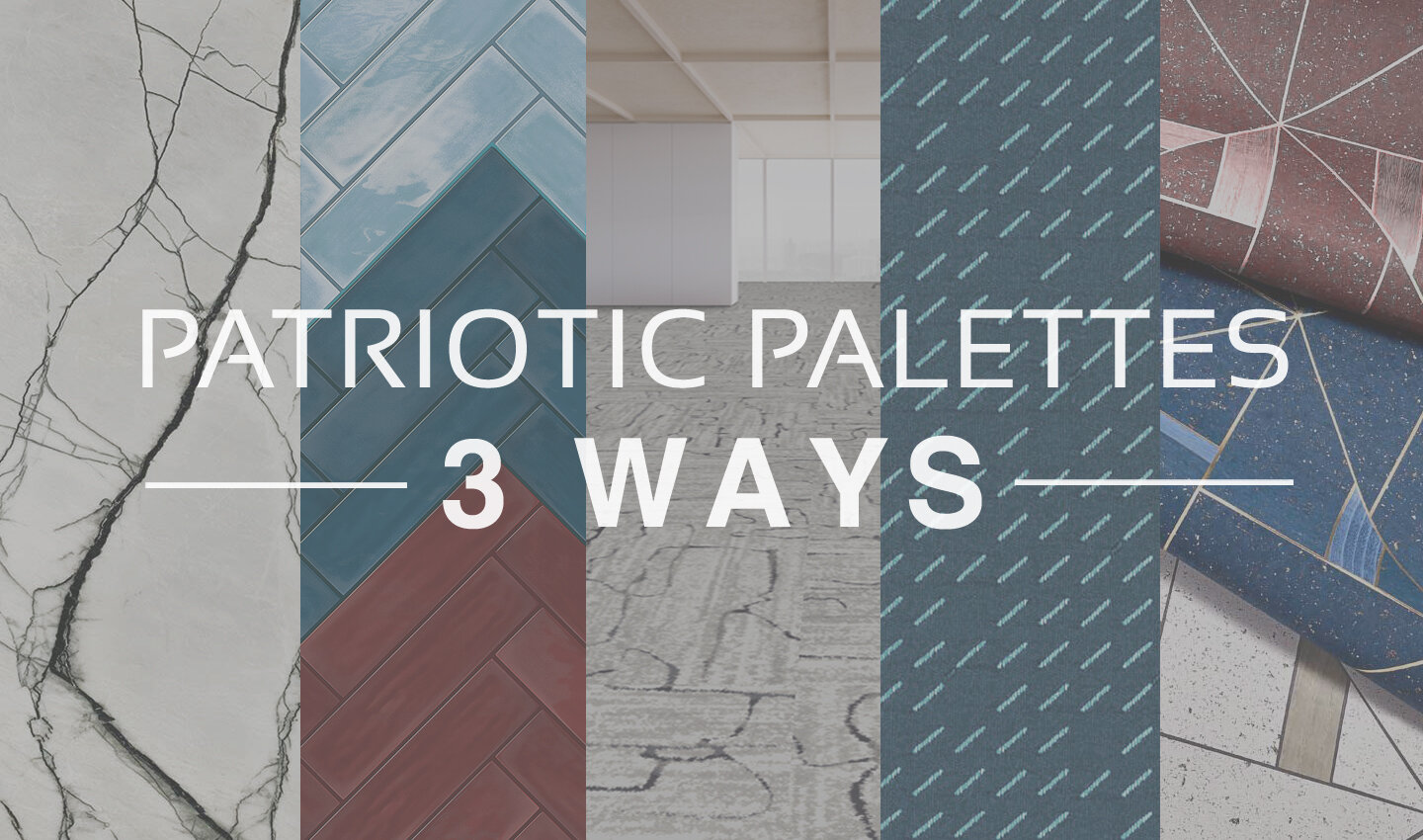
Everyone knows the colors of the American flag are red, white and blue. And at this time of year when Independence Day draws close, these colors seem to be everywhere from decorations, to clothing, to retail displays. And while this trend always fades as the summer holidays pass, there’s no denying that these classic colors aren’t limited to holiday merchandise.
Red, white, and blue is a classic combination. It has both warm and cool tones for interest, with a bright neutral to balance them out. Moreover, this color combination can be interpreted in countless different ways, either by playing with the colors themselves or by adding new textures, materials, and patterns into the mix.
Today, we’re taking inspiration from the upcoming holiday and sharing a few ideas for Independence Day material palettes - take a look below at some of our favorite patriotic-inspired combinations!
PALETTE 1
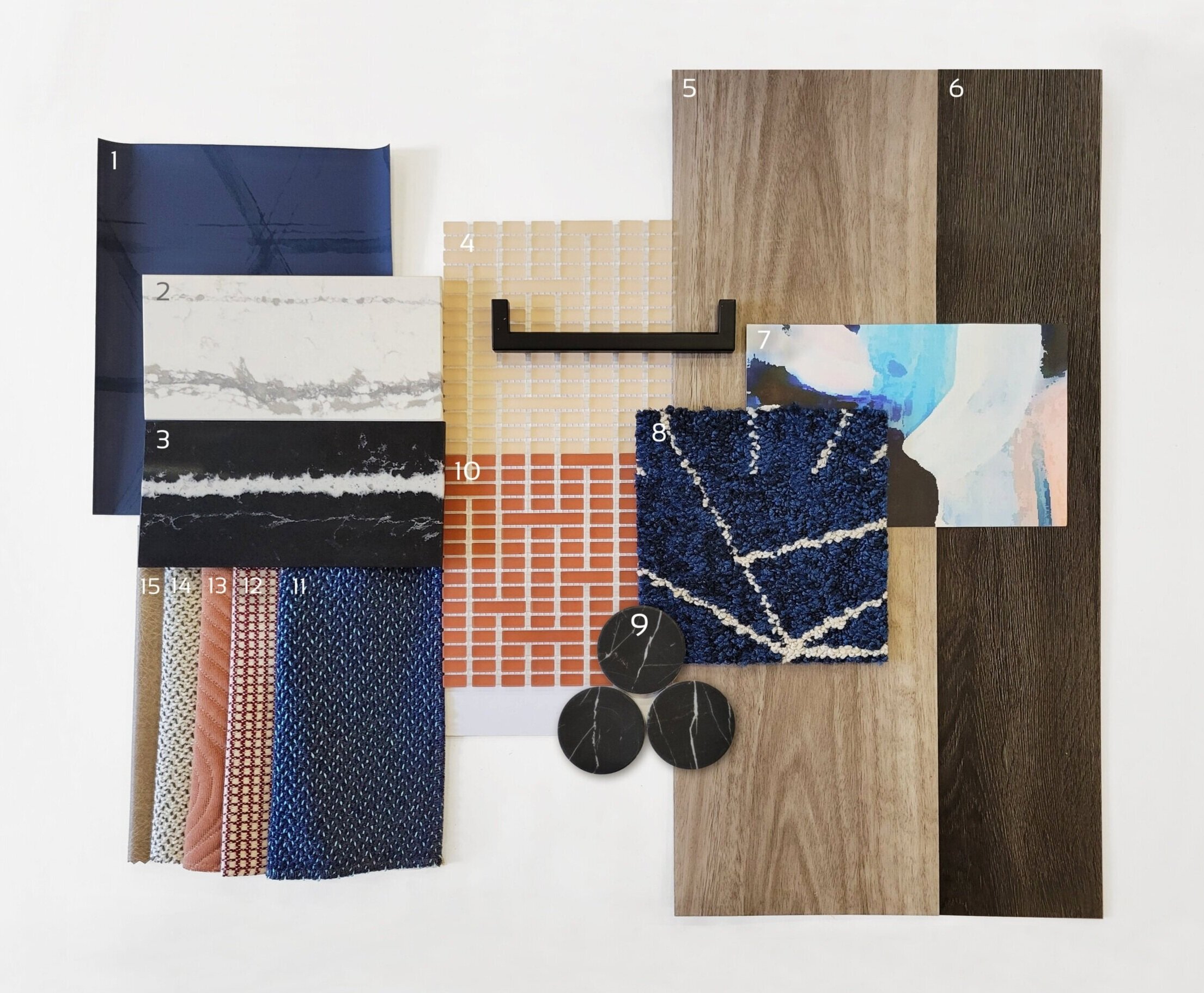
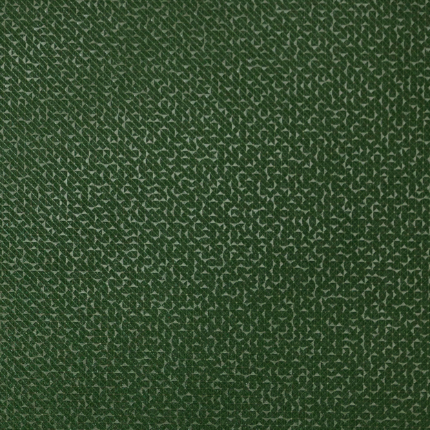
1) Triad, Midnight Blue | @Arc-Com 2) Et Bella | @Silestone 3) Eternal Marquina | @Silestone 4) Mist, Peach | @Mosaico+ 5) Eucalyptus Saligna | @Milliken 6) Woodlands, Ebony | @EF Contract 7) Tilda, Blush Lapel | @Mitchell Black 8) Skyfall, Cobalt | @Flor 9) Nero Marquina Dots | @Roca Tile 10) Mist, Paprika | @Mosaico+ 11) Quill, Swan | @HBF 12) Theo, Dark Red | @Brentano 13) Ms. Quilty, Fickle | @HBF 14) Quill, Goose | @HBF 15) Cow House, Pavement | @Valley Forge
For a sophisticated spin on the traditional 4th of July palette, red can be swapped for elegant peach tones to add whimsey. Including very saturated blues (both light and dark) helps to ground this palette while adding variety. The wood tones bring warmth and texture, balanced by timeless stone materials. When put together, this palette is a playful and sophisticated combination of styles, textures, and color tones.
PALETTE 2

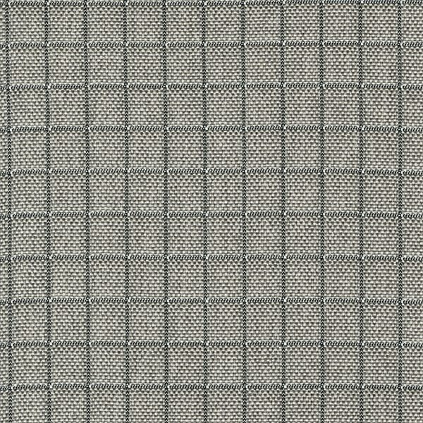
1) Sommalier | @Sherwin Williams 2) Yohen Border, White | @Inax Tile 3) Bars | @Audrey Lane 4) Olaria, Blue Steel | @Roca Tile 5) Walnut | @Bacon Veneer Company 6) Skara Brae | @Cambria 7) Duet, Blueprint | @Brentano 8) Merit, Cabernet | @Maharam 9) Sideways, Blanc | @HBF 10) Theo, Dark Red | @Brentano 11) Mist, Avio | Mosaico+ 12) Walnut Tambour | @Surfacing Solution 13) To the Point, All Nighter | @D.L. Couch 14) To the Point, Gold | @D.L. Couch 15) To the Point, Graphite | @D.L. Couch 16) To the Point, Inky | @D.L. Couch
Classic red, white, and blue never goes out of style! This ensemble is an modern take on a timeless palette, with beautiful colors and sophisticated accents that elevate it to a new level. Warm, textured woods juxtapose, sleek, gold metallics to create balance. Stone with a large-scale veining pattern add elegance, while fun geometric wallcoverings add an element of playfulness.
PALETTE 3

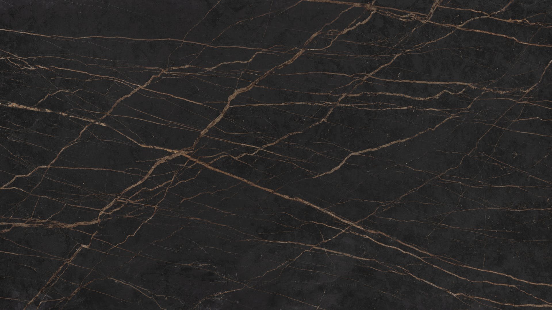
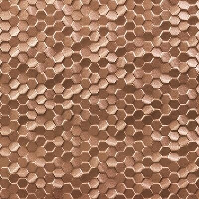
1) Maple Tambour | @Surfacing Solution 2) Sunbeam, Matador | @Sina Pearson 3) Prime, Iceberg | @Maharam 4) Gem, Lapis | @Brentano 5) Bright Angle, Cyan | @Maharam 6) Lines, Black & White | @Olivia + Poppy 7) Deconstructed Stripe, Ivory on Black | @Schumacher 8) Maddox Deco, Black | @Stacy Garcia 9) Penny Rounds, Aqua Blue | @Artistic Tile 10) Penny Rounds, Steel Blue | @Artistic Tile 11) Penny Rounds, Coral Red | @Artistic Tile 12) White Oak Planked Groove | @Treefrog 13) Tre Super Jag, Black | @Somer Tiler 14) Marble Breach | @Florim 15) Gem I, Midnight Ocean | @Ann Sacks
Using bold corals and aqua blues, our final concept is a bright and modern interpretation of a 4th of July palette! In addition to the unique colors, mixing in graphic black and white patterns and materials adds a playful element. Geometric tiles, wallcovering, and textiles are balanced by the natural patterns of woodgrains and marble-look stone. Finally, the light wood tones tie the palette together with warmth and texture.
How are you inspired by the colors of Independence Day?
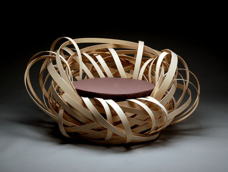
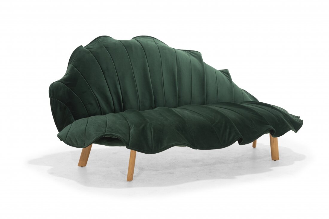
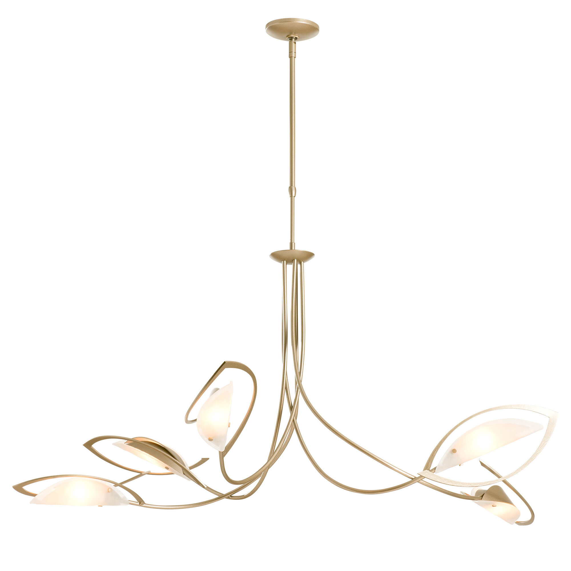
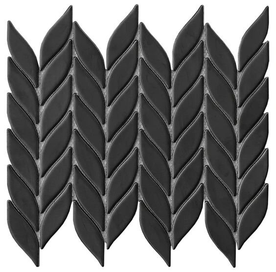
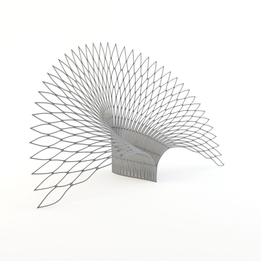
Trend Watch: Botanical & Organic Design

Vista Cafe | @Karv One Design
On average, people tend to spend 90% of their time indoors. And as the world becomes ever more urbanized and the built environment more expansive, natural areas and green spaces have grown more scarce. But despite these changes to our world, humans still have a deep connection to nature, and are inherently attracted to it.
Today we’re looking at a design trend inspired by these facts. Botanical and organic-inspired design are not new concepts, but their popularity has grown dramatically as the natural environment shrinks and every green space becomes more precious. Moreover, this trend has a beautiful and sophisticated aesthetic that helps to create timeless spaces - take a look below at some of our favorite projects and products inspired by botanical and organic design!
PROJECTS

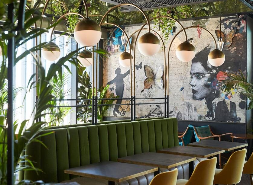
Le Klay Restaurant | @Julien Colombier

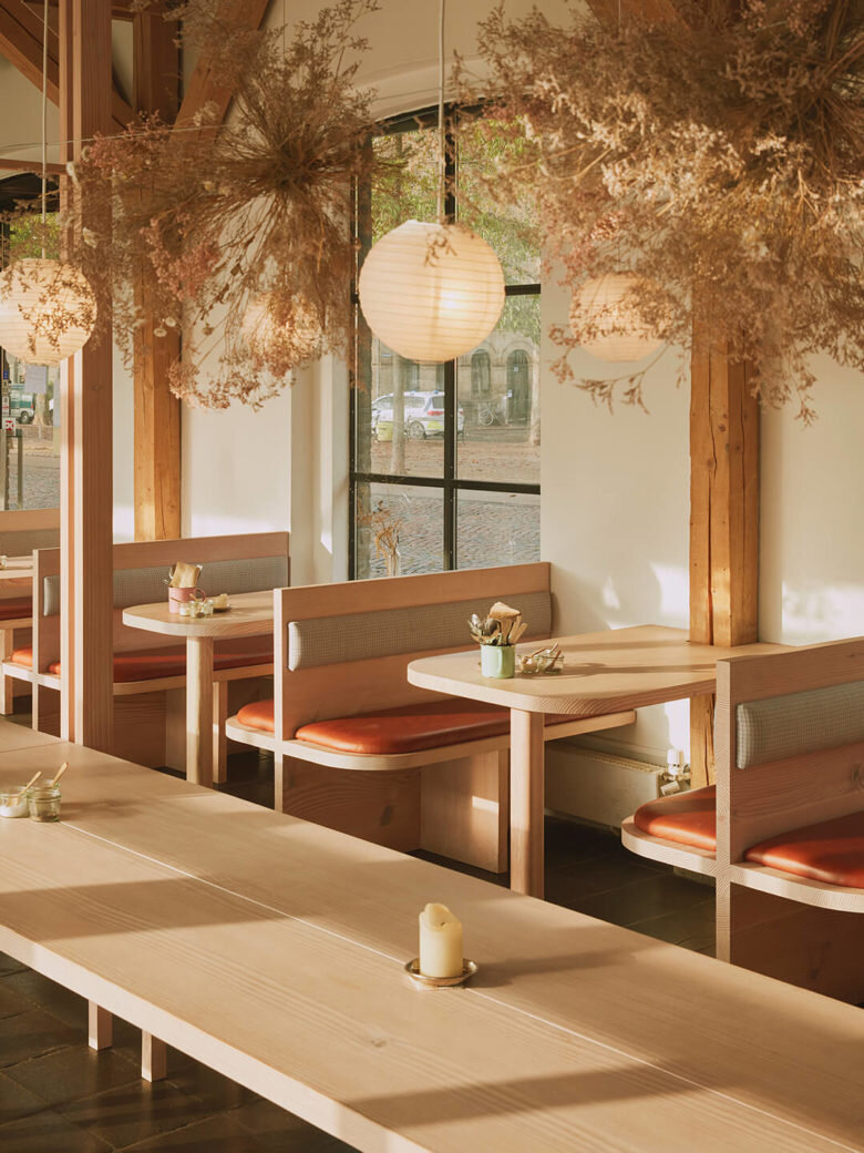
Hverdagen Restaurant | @Vermland
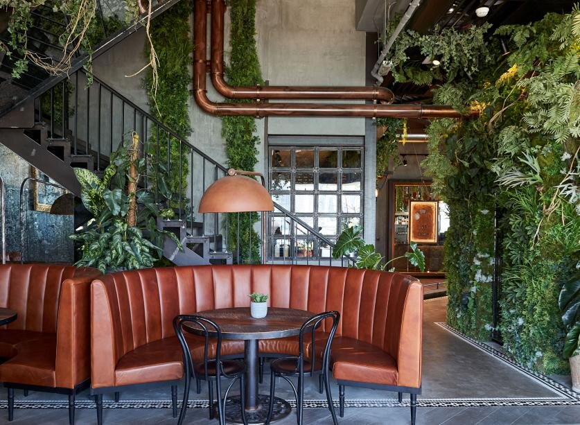
The London Project | @Yam Jam Interior Design

Bayerischer Hof Hotel | @Jouin Manku

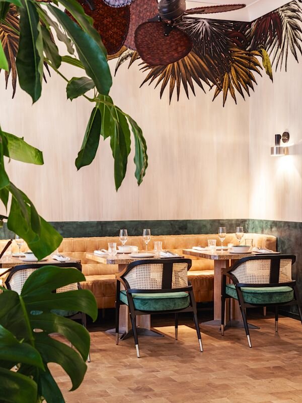
Vista Cafe | @Karv One Design
PRODUCTS
How are botanical and organic designs inspiring you?
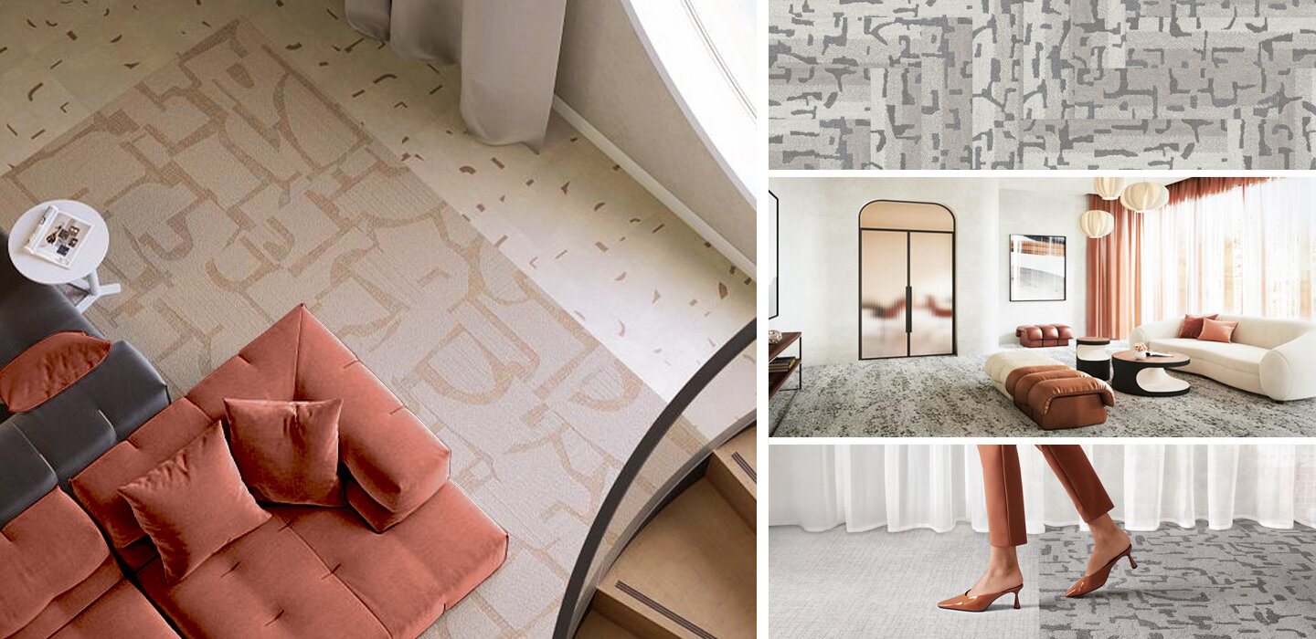
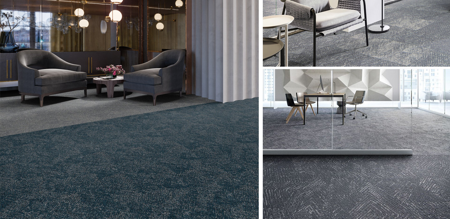
Sustainability | Carpet

As a major contributor to commercial production and waste cycles, the design and construction industry is focusing ever more on sustainability in new projects. It’s an incredibly important factor, and as designers, we love companies that make it easier for us to specify environmentally-conscious products and take part in sustainability programs.
Carpet is a big industry, and it’s installed into millions of new spaces each year. With that in mind, carpet companies can make a major environmental impact based on what materials they use, how they produce their products, and what sustainability efforts they choose to make. We love companies that take eco-consciousness seriously, so today we’re looking at sustainability in the carpet industry - take a look below to see some amazing companies and their products!

We love companies and products that are committed to reducing or eliminating post-consumer waste, and Shaw is doing just that! The company introduced the first Cradle to Cradle (C2C) flooring product more than 20 years ago, and continues to offer C2C products today. Moreover, their Re[TURN] Reclamation Program has allowed Shaw to reclaim and recycle almost 1 billion pounds of carpet since 2006, much of which has been reused in the production of new flooring products!

Mannington not only creates beautiful carpets, but the company produces them using less energy and resources! They are committed to reducing their environmental footprint, and were one of the original 50 Save Energy Now Leaders (now know as the Better Plants initiative). Mannington has 3.3 acres of solar arrays and has reduced energy intensity by 17% since 2007 - all while doubling their manufacturing sites!


Some of our favorite flooring is from EF Contract, and we love their commitment to reclamation! Their R4 Program was started in 2007, and focuses on the ideas of Return, Reuse, Recycle, & Reduce. Each year more than 60,000 pounds of waste are diverted from landfills through this program!
What sustainable carpets are you loving right now?
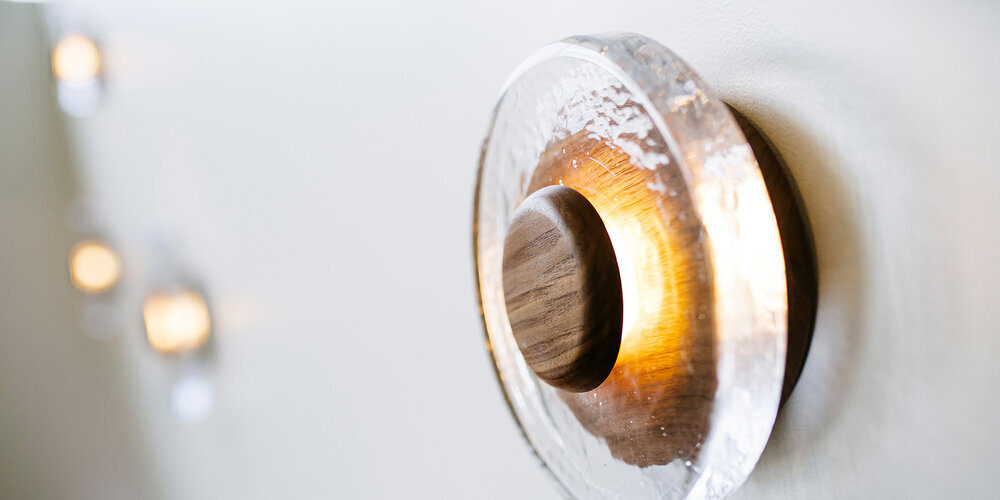
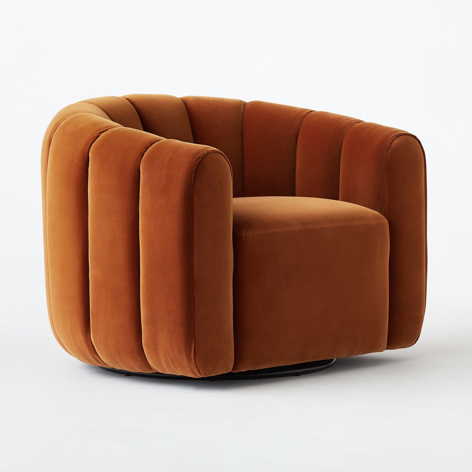
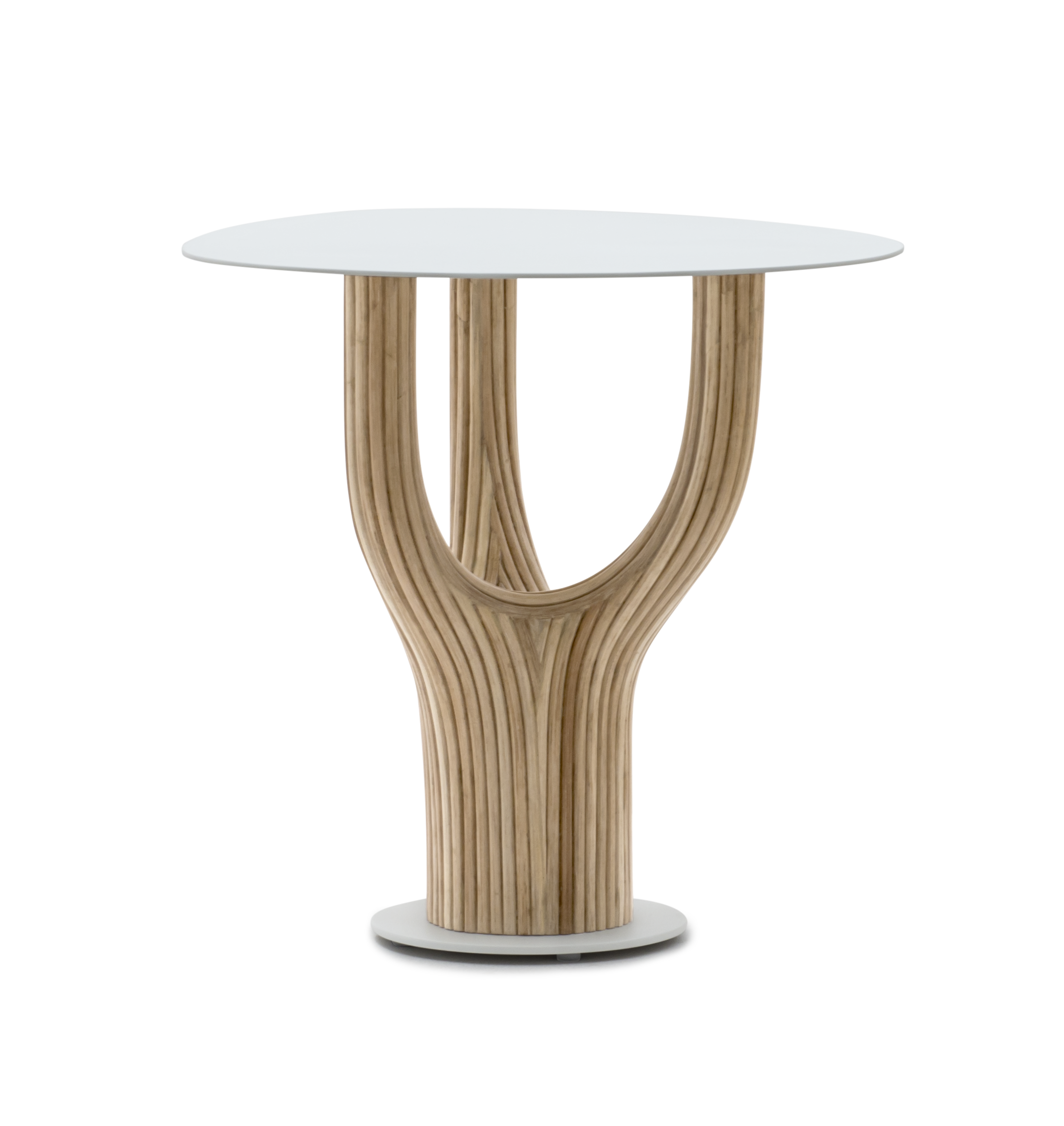
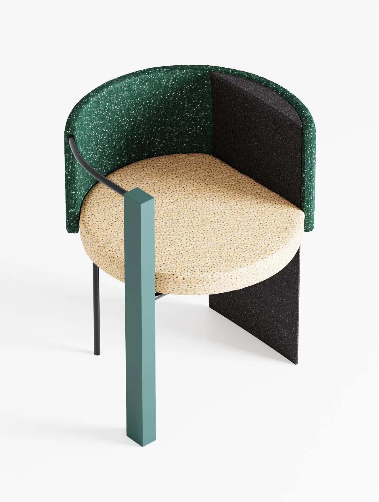
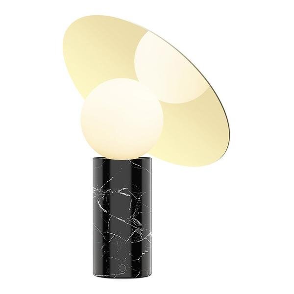
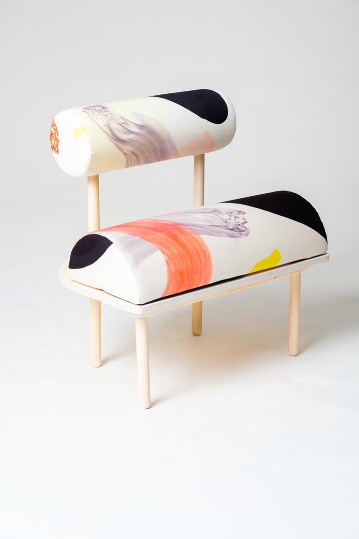
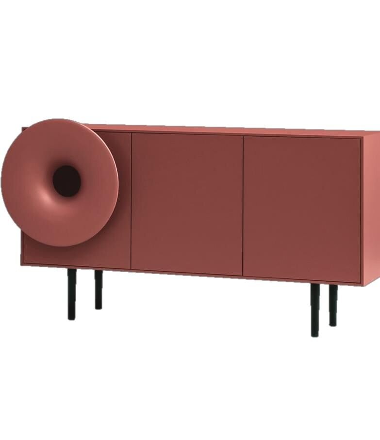
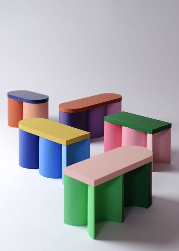
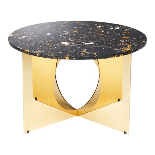
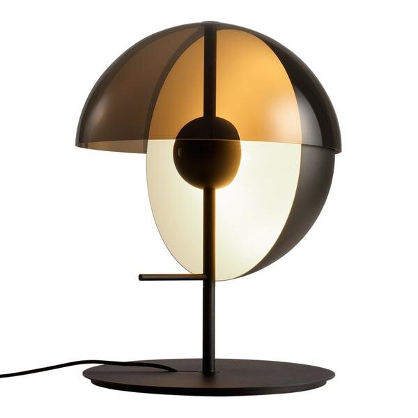
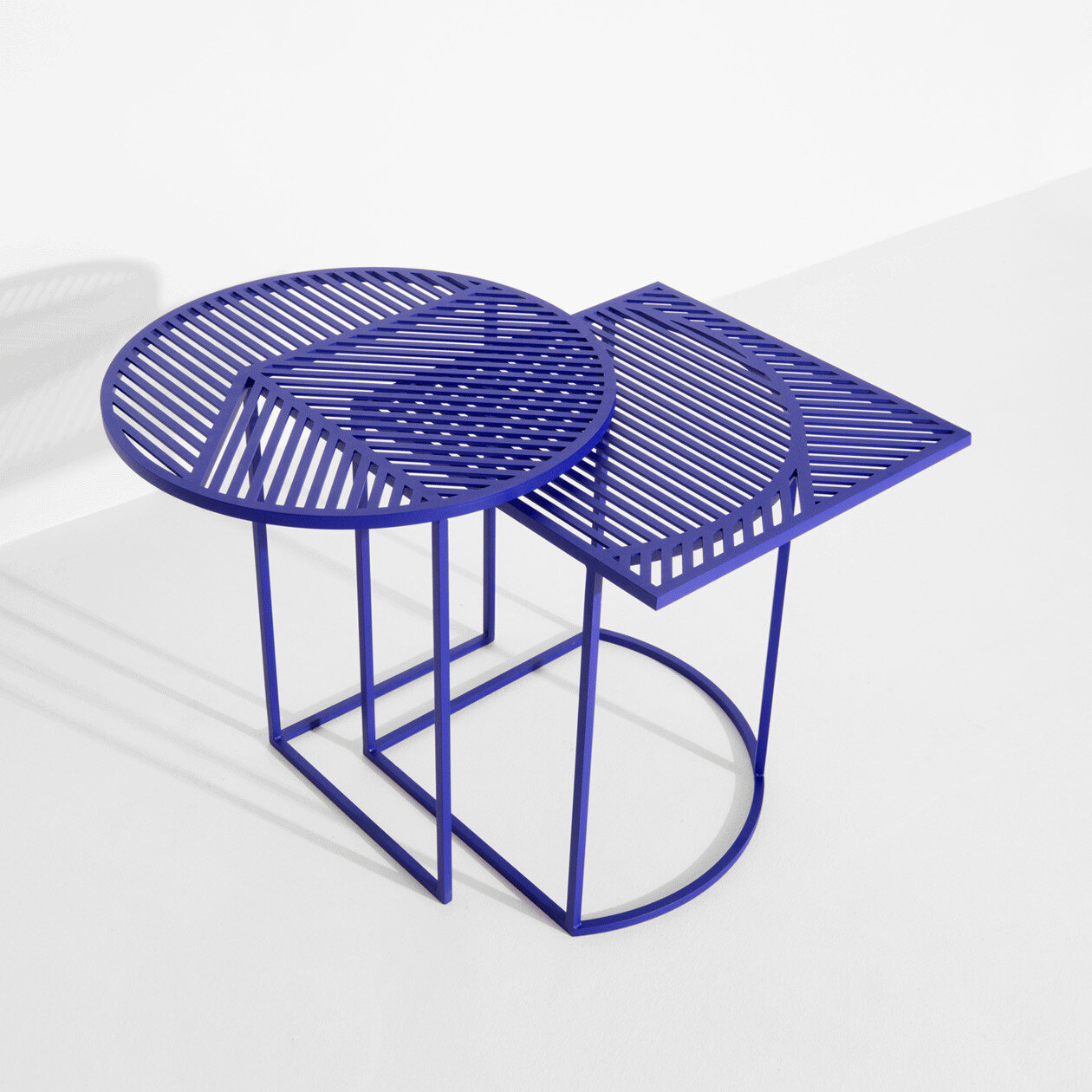
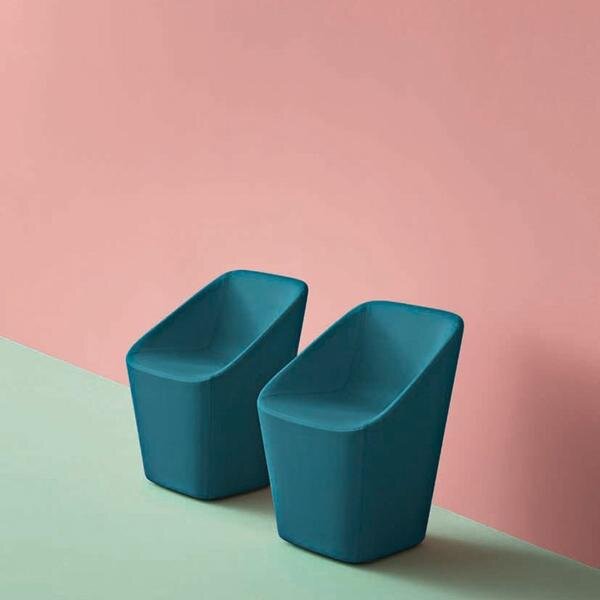
Trend Watch | Modern 80’s Furniture

@Laura Gonzalez
The 1980s are remember for many iconic cultural introductions. Legwarmers, scrunchies, high-waisted jeans - the list of 80s trends is long, and usually inspires a love or hate reaction. And as we keep an eye of emerging 2021 design trends, we can’t help but notice 80s-inspired interior design showing up more and more. Bright colors, geometric patterns, bold color-blocking - we’re seeing all this and more in new commercial design projects, and we’re loving the modern 80’s trend!
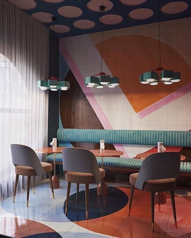
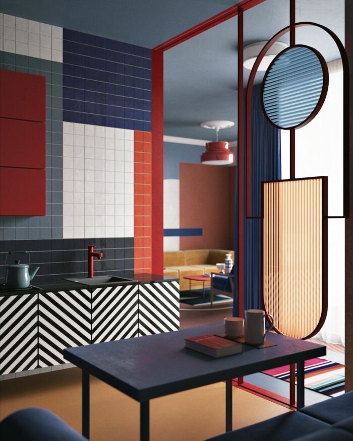
One place we’re seeing the modern influence of the 80’s is in furniture. There are a lot of amazing products reflecting this trend, and we love using these pieces to bring a bit of nostalgia and sophistication to any space. Take a look below to see some of our favorites!
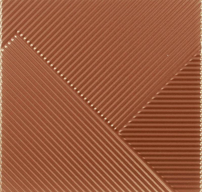
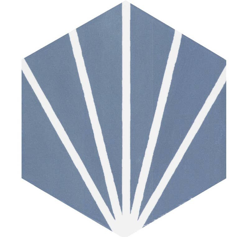
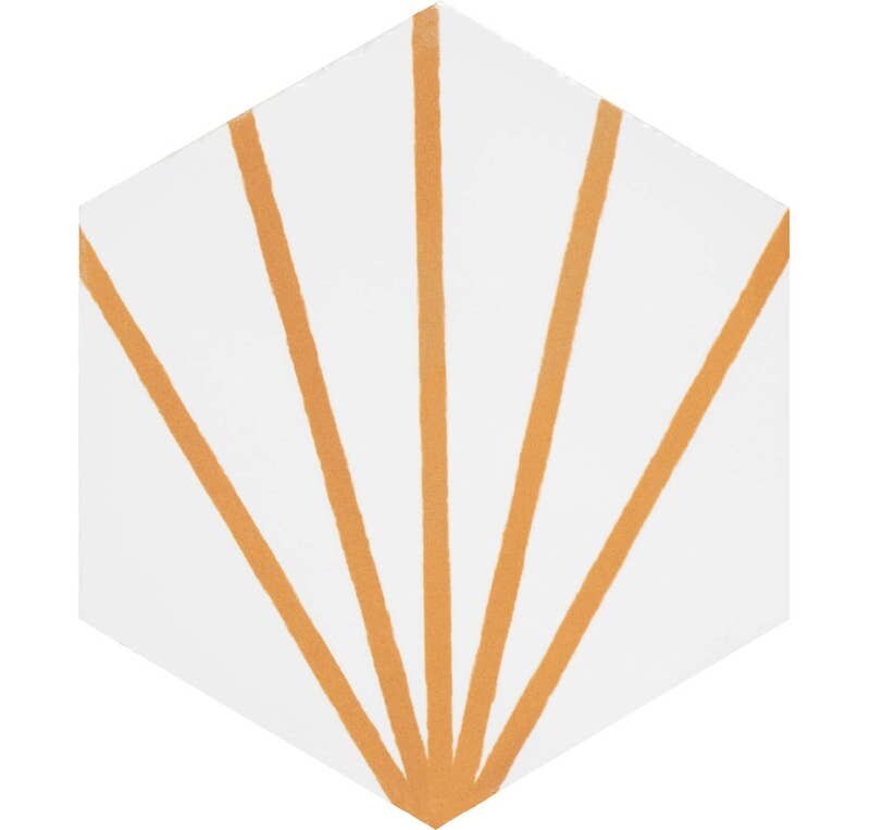
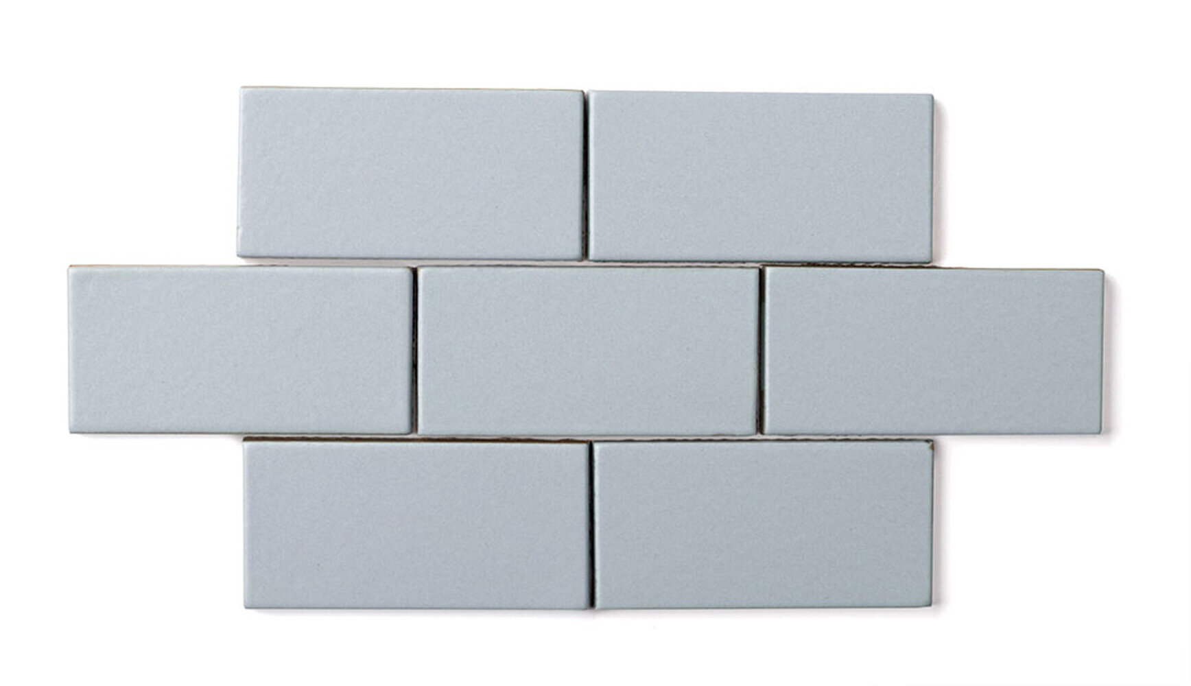
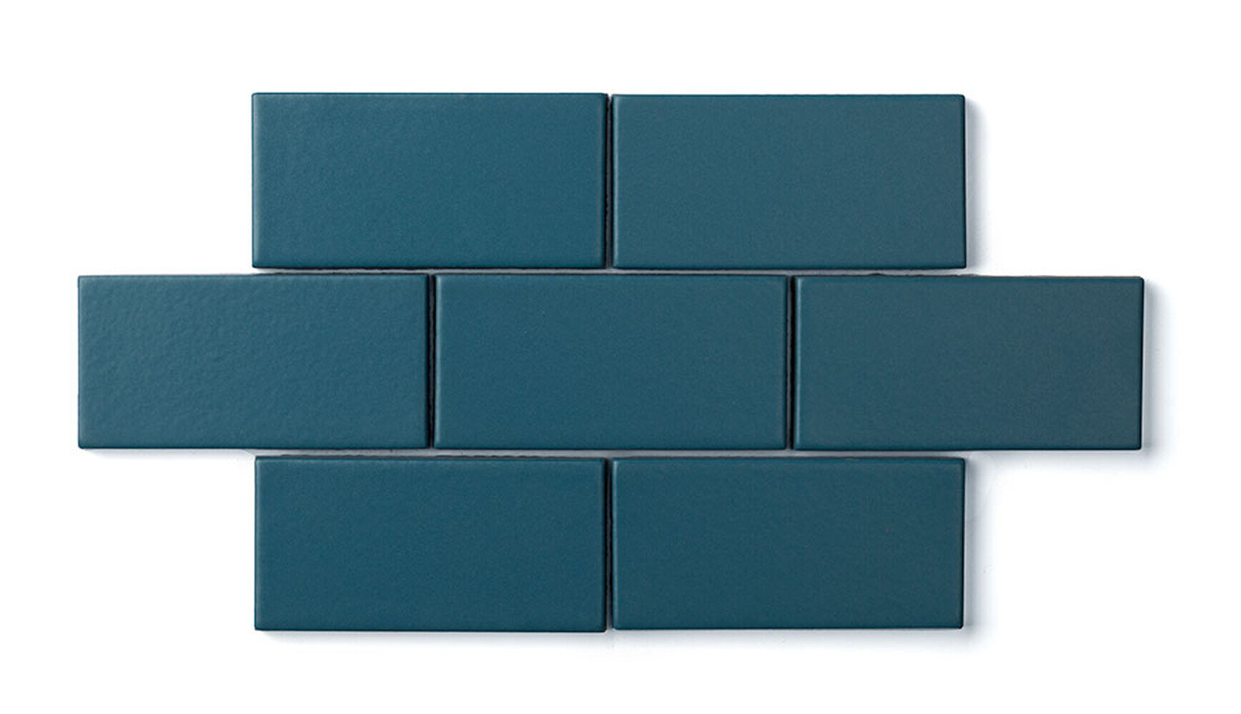
Spring Colors in Tile

As the weather gets warmer and the days get longer, we find ourselves getting inspired by the new spring season! Although we love the cool and tones of winter, spring is full of bright colors and interesting textures can add new life into a design.
And one of our favorite ways to do this is through tile - it’s variety and versatility make it a great material for introducing new colors and patterns. Take a look below at some of the spring-colored tiles that are inspiring us right now!


We love the different color color combinations you can make with the Technicolor line from Specialty Tile


The Focus line from Trinity Tile is a great mix of bright, energetic colors and bold geometry

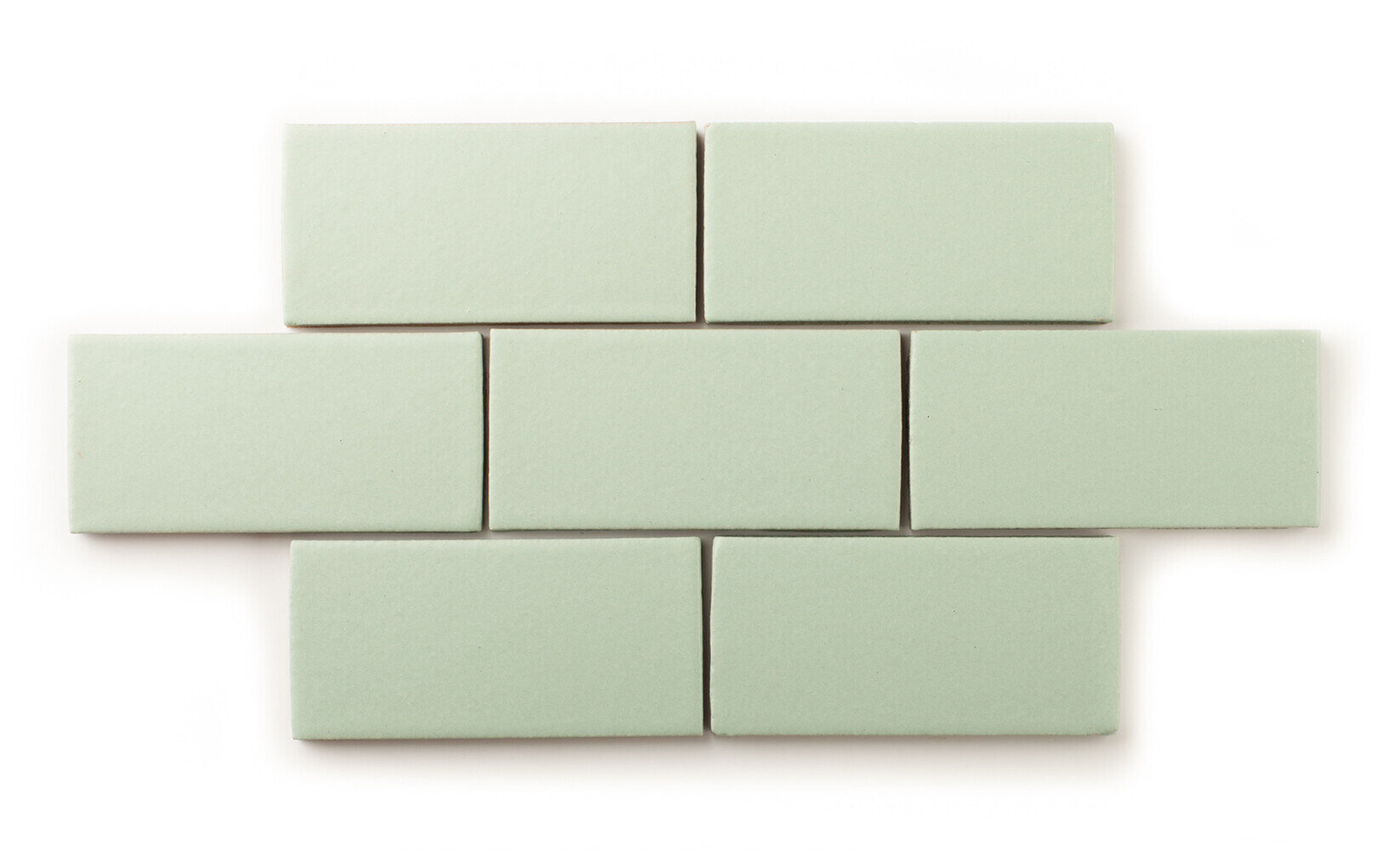
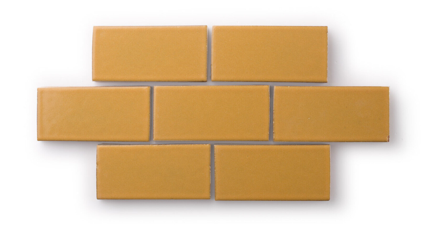
Fireclay Tile offers an amazing variety of tile shapes and hues as part of their Colors line - we love this install of spring-inspired colors!
What spring colors are inspiring you right now?
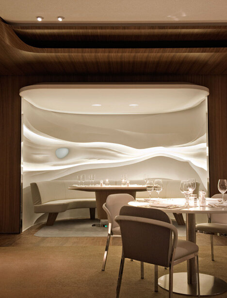
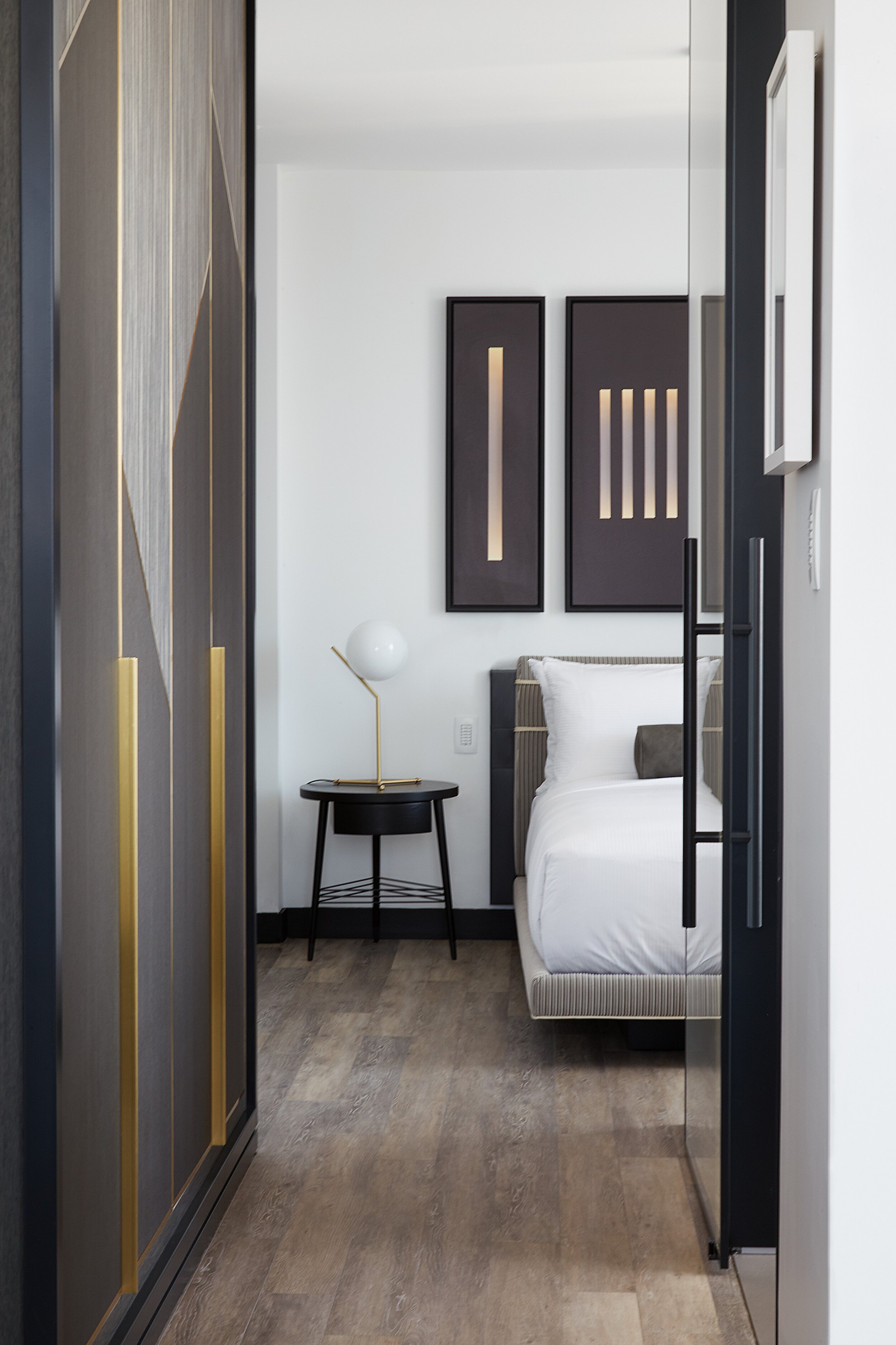
Luxury Minimalism in Hotels

Minimalism can be found in every type of design. Whether it’s residential, corporate, retail, hospitality, or even healthcare, minimalist design concepts can produce beautiful, timeless, and elegant results.
One word that doesn’t usually come to mind when thinking about minimal design is luxury; in fact, it’s easy to think that these concepts would be at odds with one another. But that doesn’t have to be the case! Fusing luxurious elements with minimalist design creates unique juxtapositions - simple and opulent, stark and soft, brutalist and glamorous.
Luxury minimalism has a classic and timeless appeal, and can be a wonderful look for hospitality spaces - hotels in particular. We’re constantly inspired by this aesthetic and love how much variety it offers! Take a look below at some of our favorite luxury minimalist design ideas for hotels!
LOBBY, LOUNGE, & RECEPTION
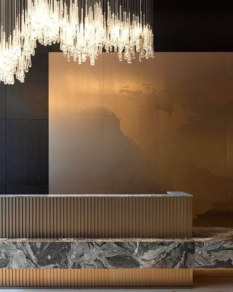
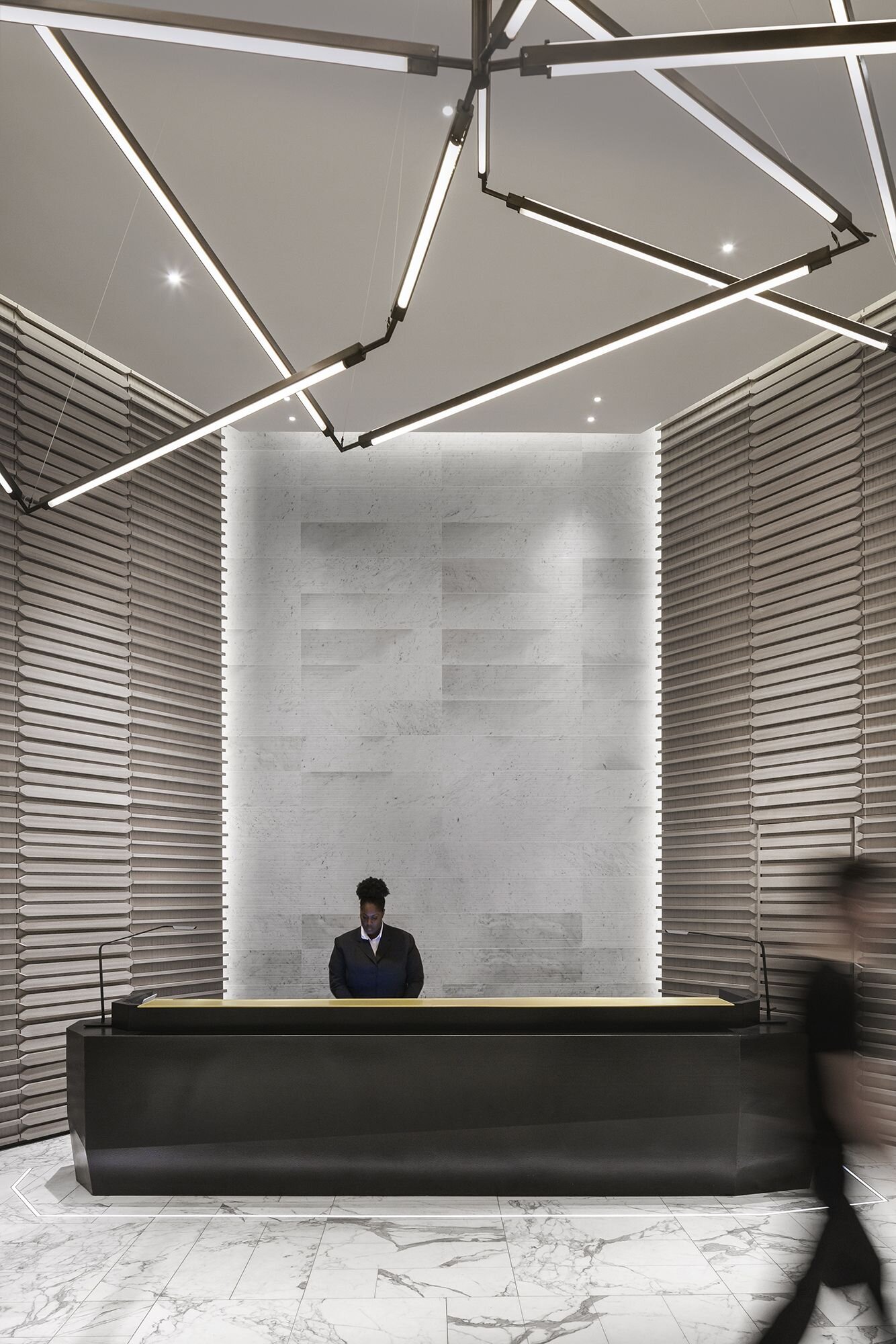
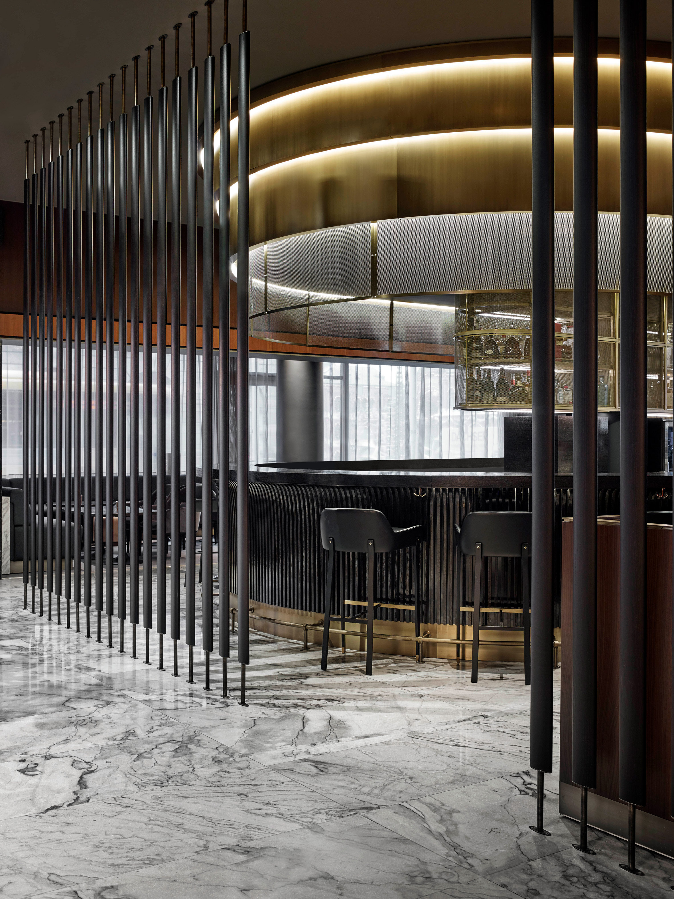

@Mechanismo
GUEST ROOMS
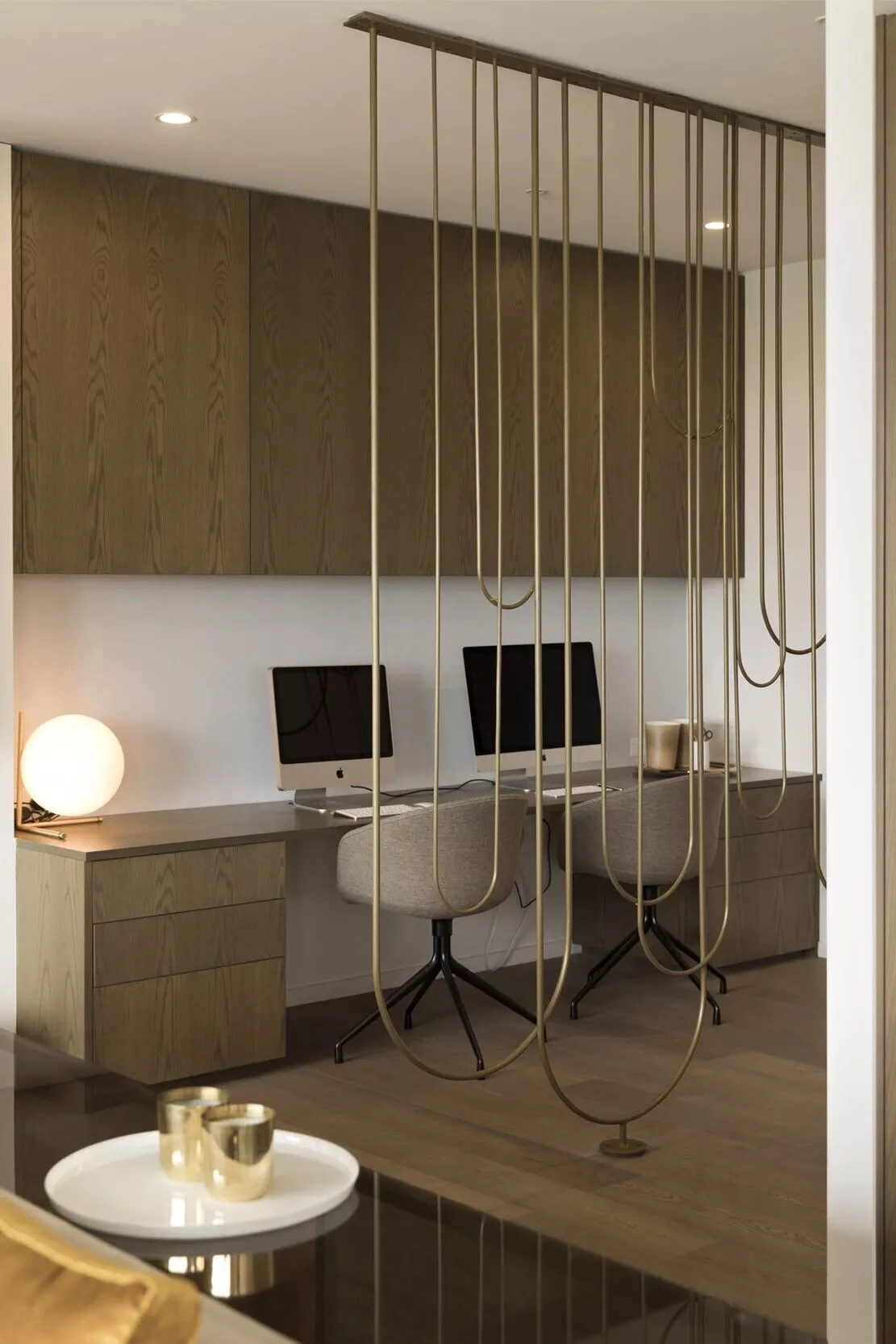
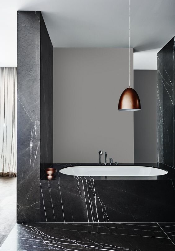
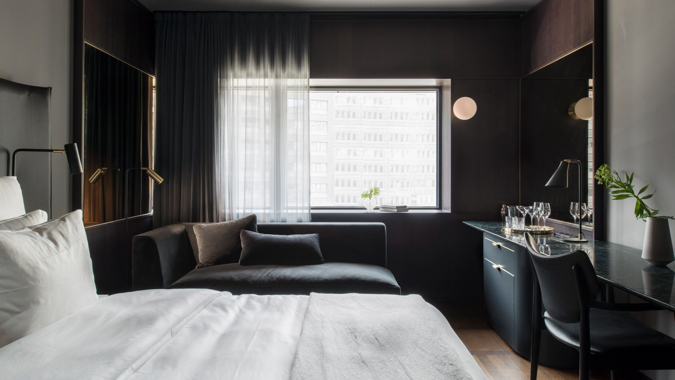
@Universal Design Studio
ELEVATORS & CORRIDORS
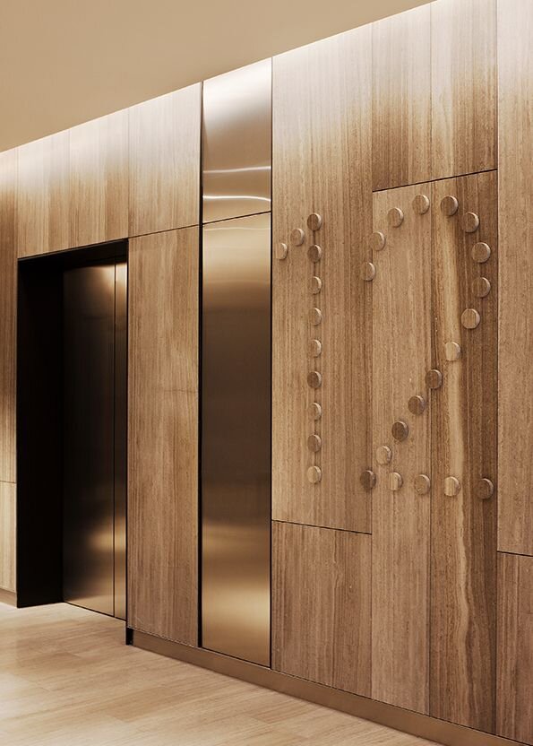
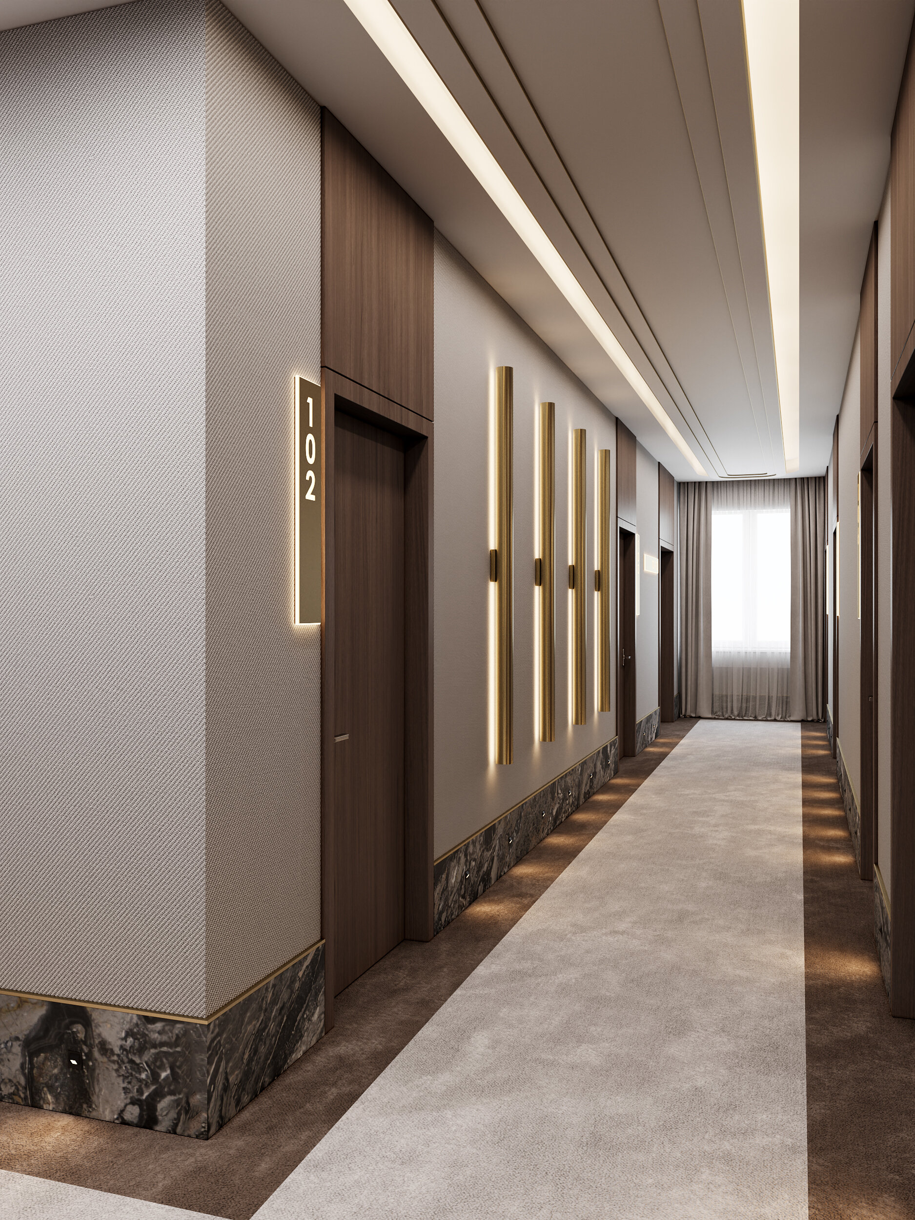
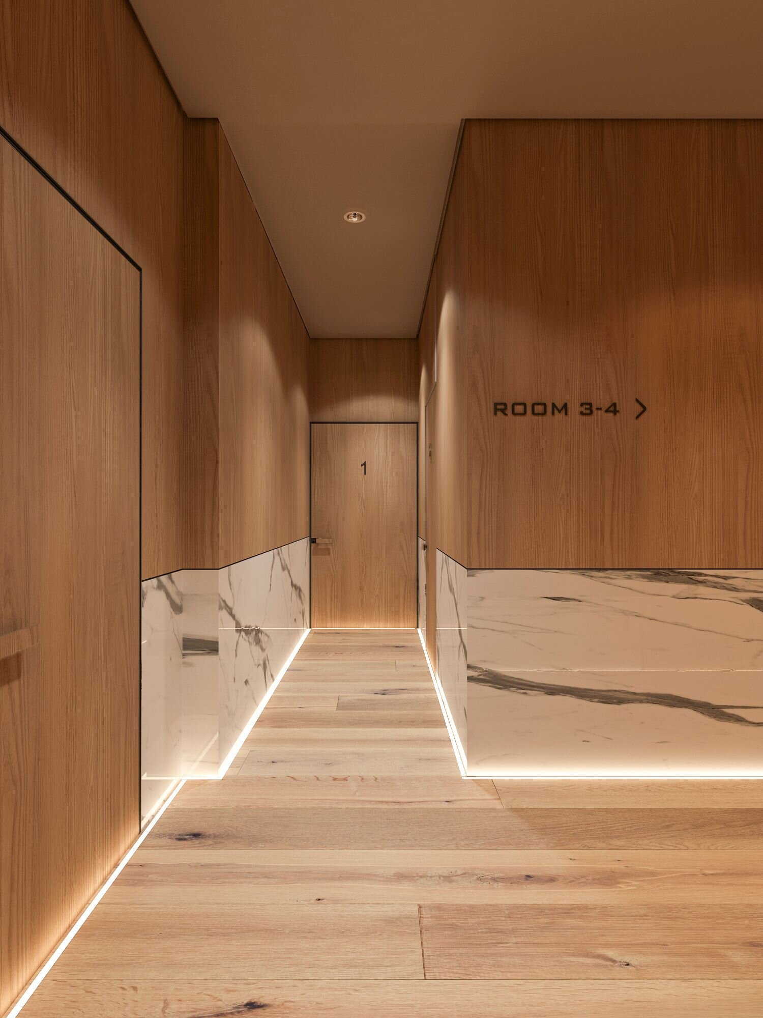
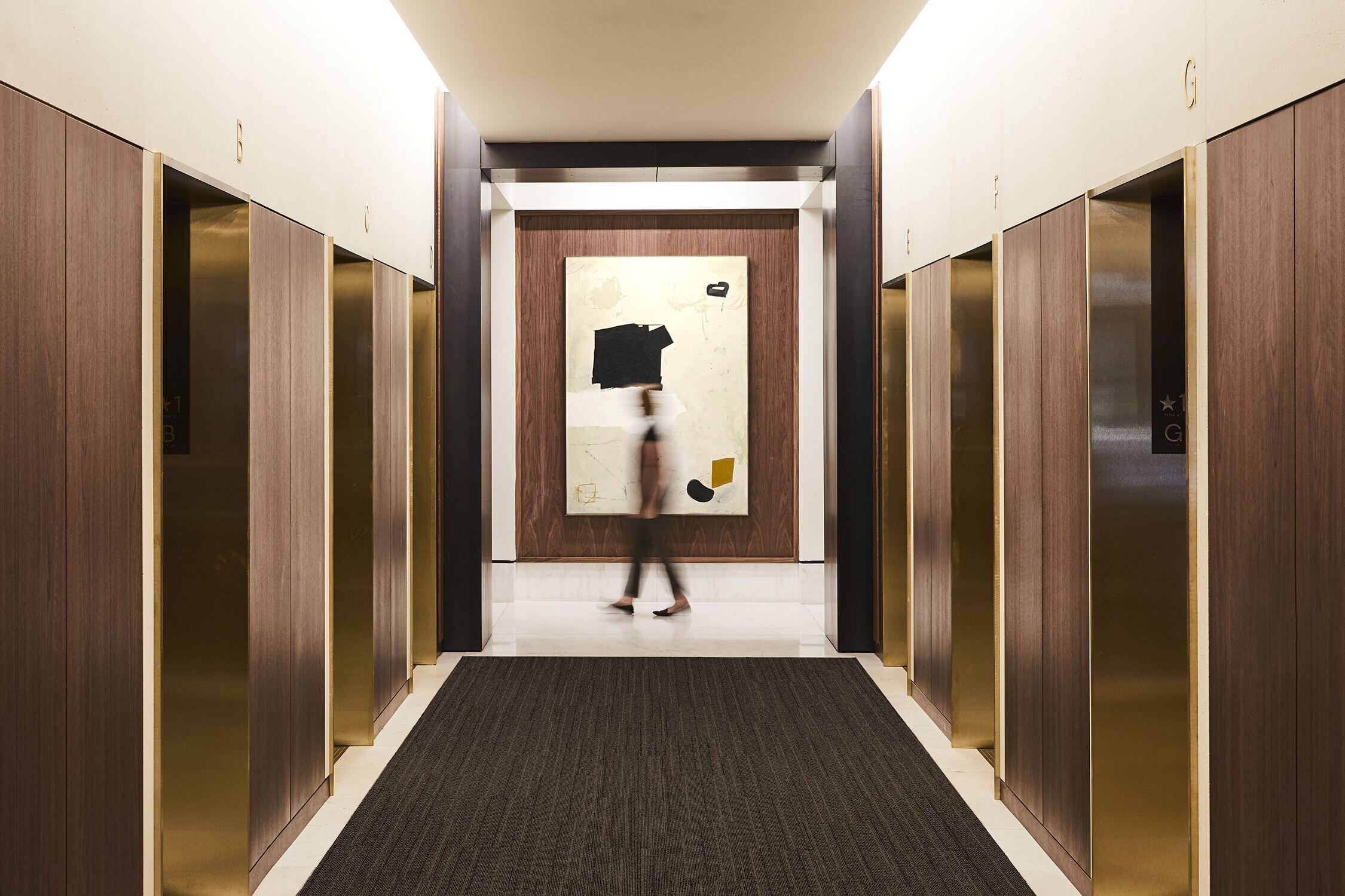
@Atelier Cho Thompson
What are your favorite ways to blend luxury and minimalism?
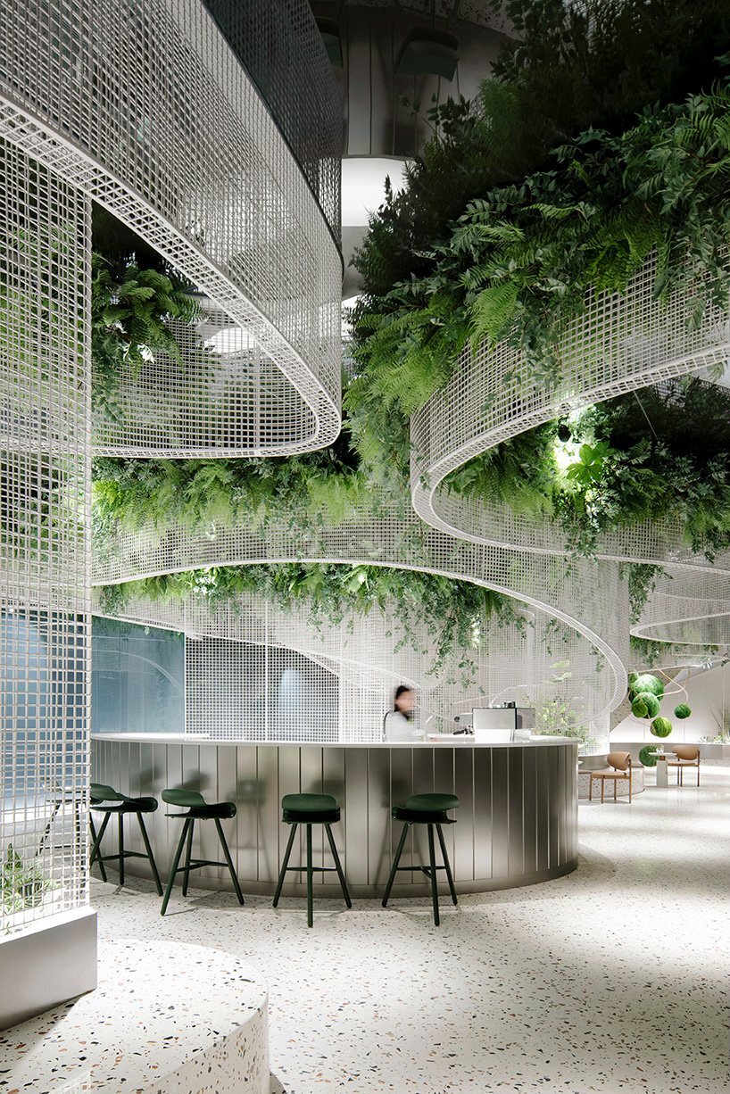
Sustainability | Interior Greenery
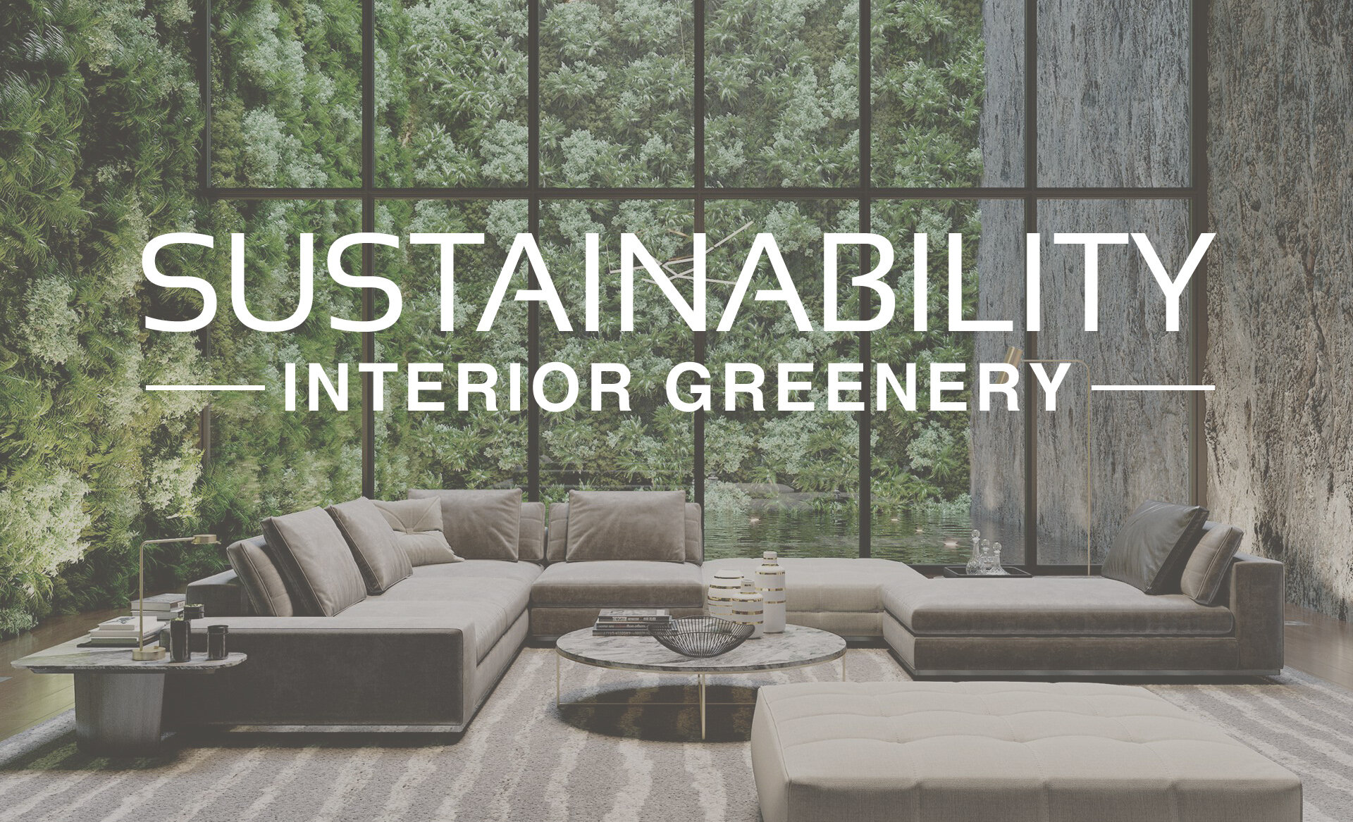
Image | PressRender
Sustainability has long been an important topic within the design industry and its significance continues to grow as part of the larger topic of wellbeing. This can be seen in the popularity of biophilic design, which incorporates nature into the built environment, creating restorative and connective spaces. There are many ways to incorporate concepts of sustainability and biophilic design into interiors. This includes using natural light, views of nature, natural textures, and of course, adding plants into a space!
Interior gardens and greenery have many health and wellness benefits! Live plants release additional oxygen, naturally purify the air, help reduce stress levels, and can brighten up a space. Take a look below to see some of our favorite ways to use greenery in interior design!
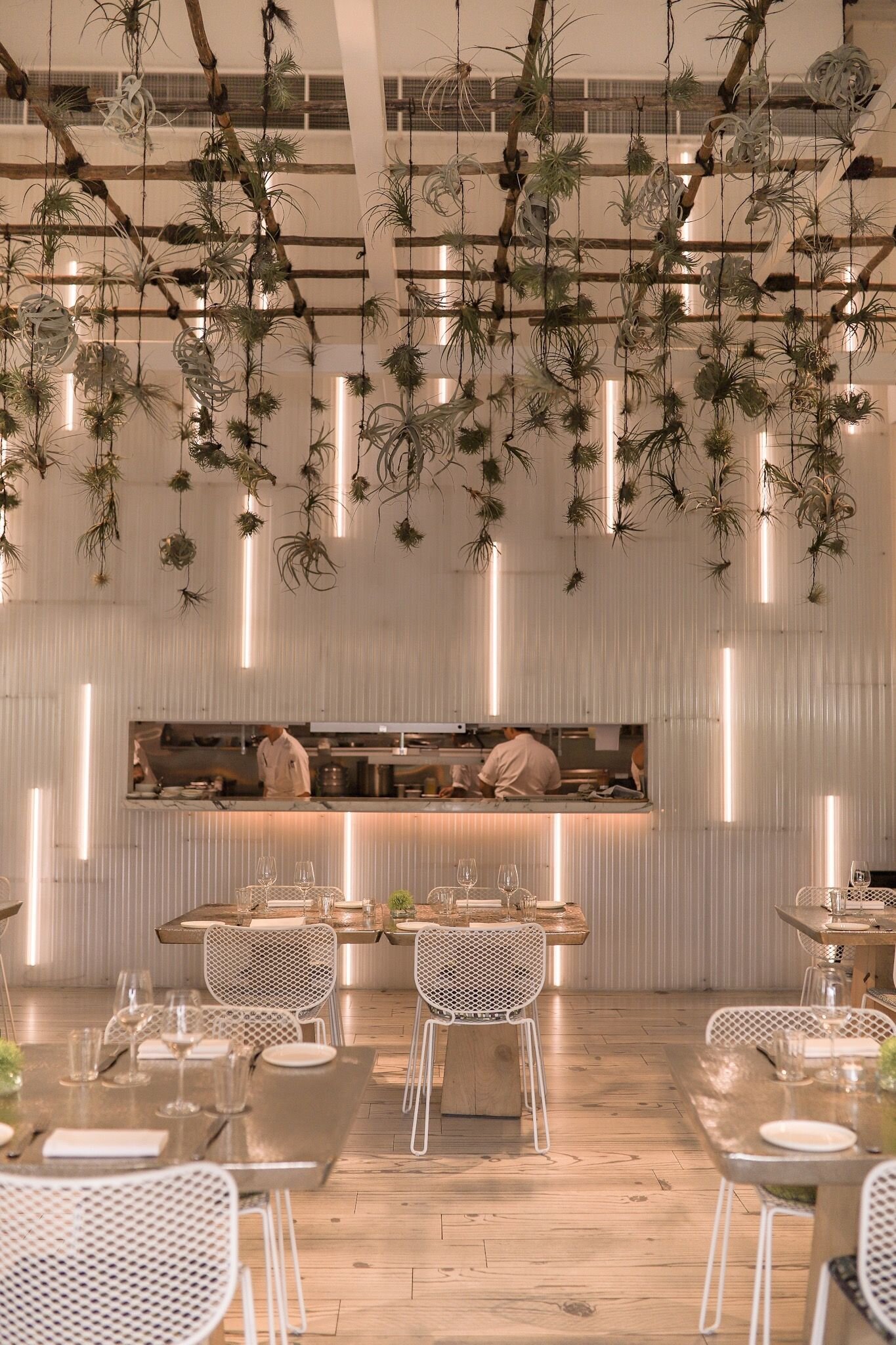
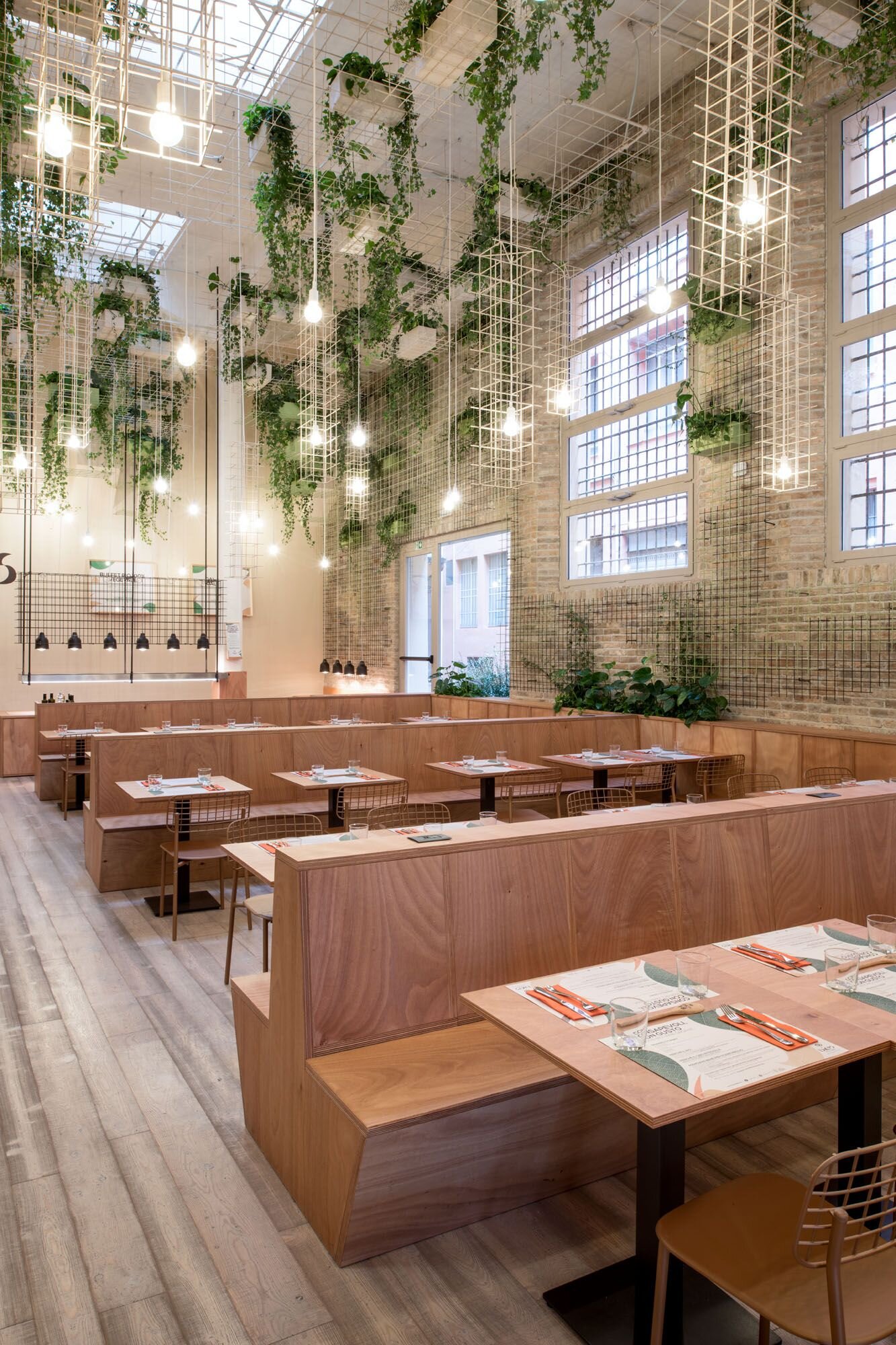
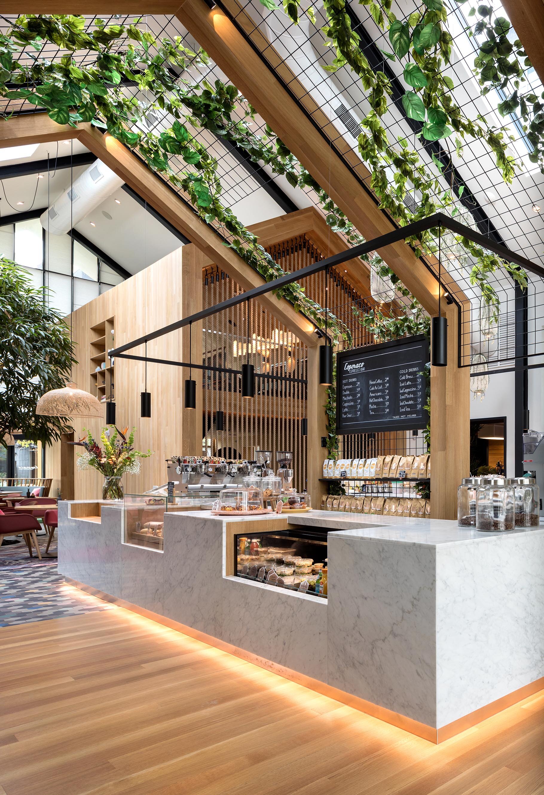
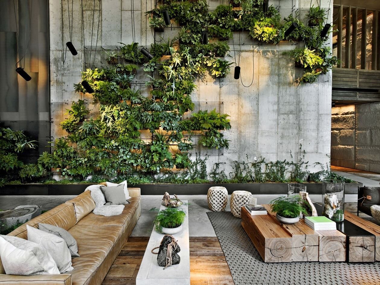
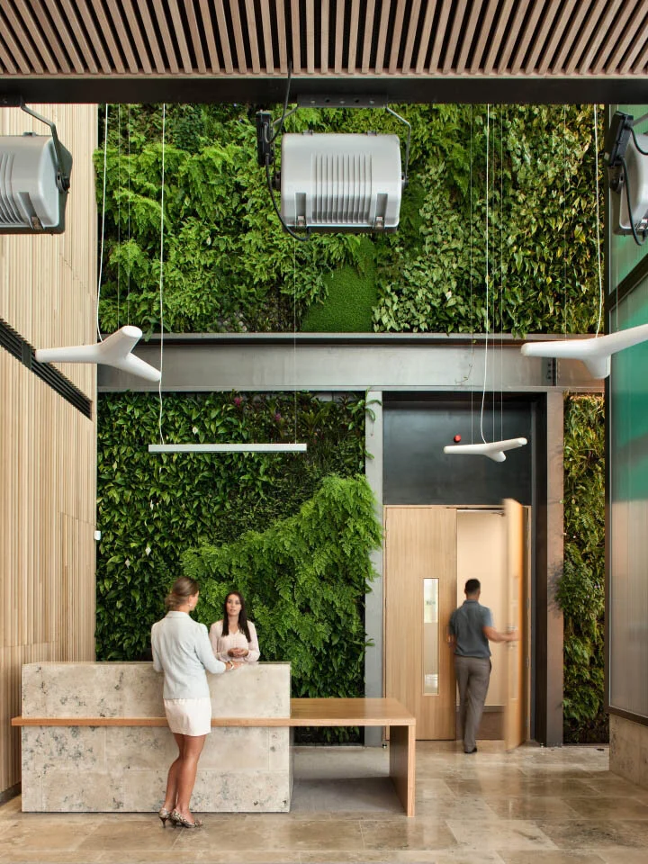
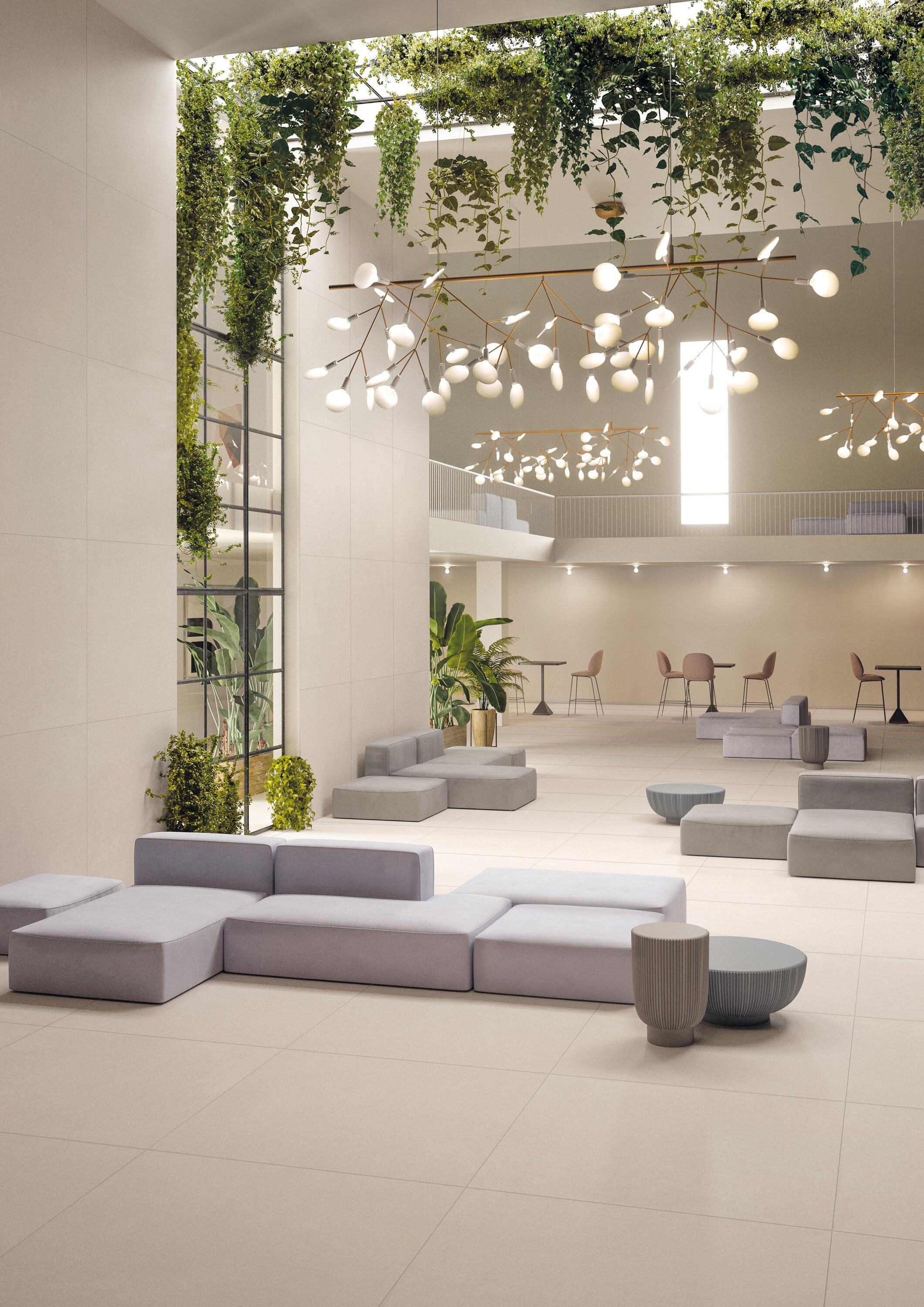
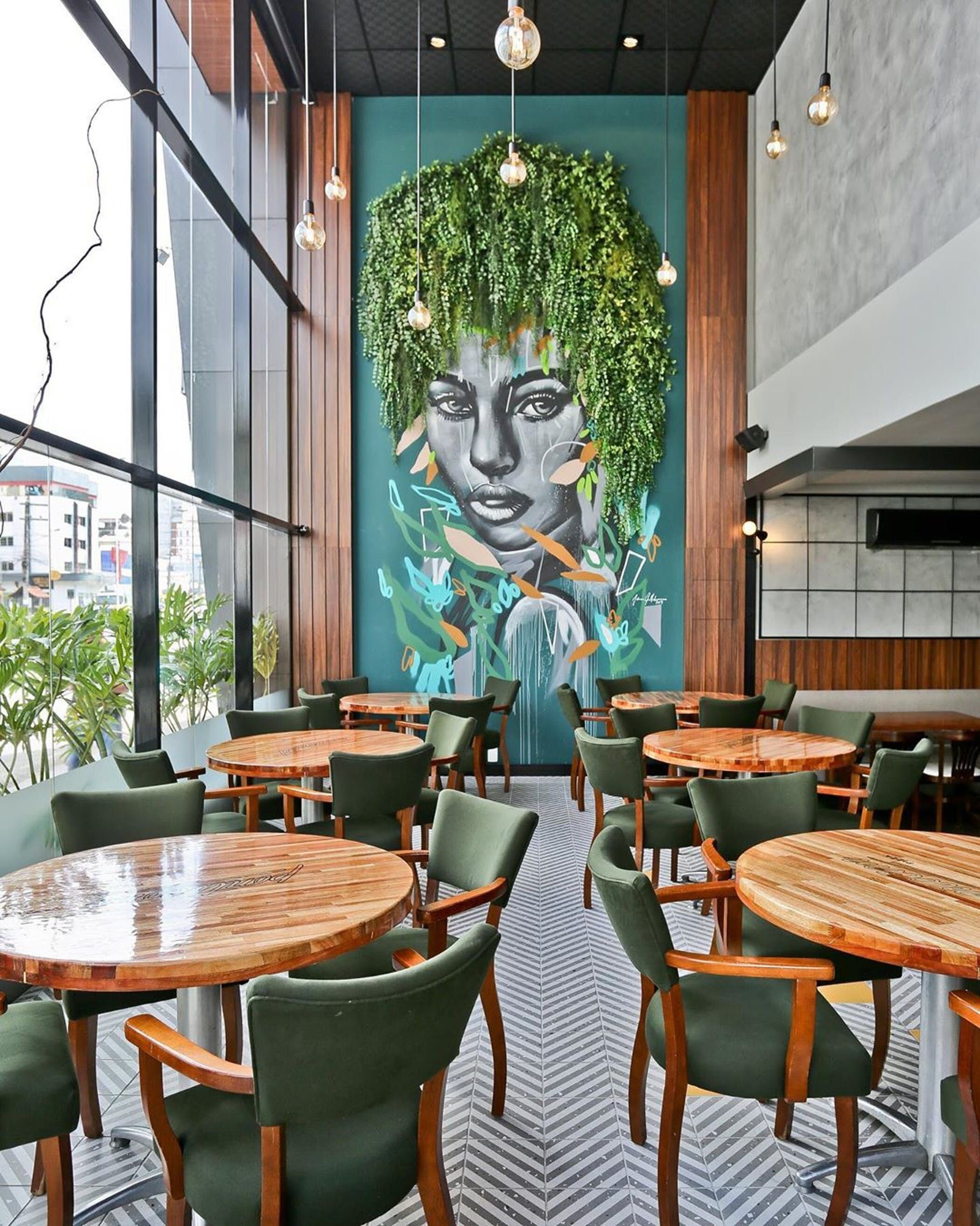
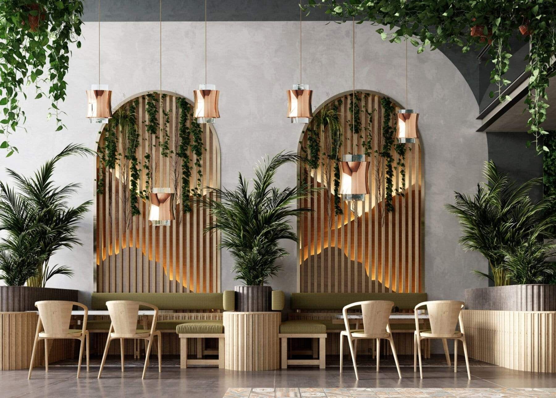
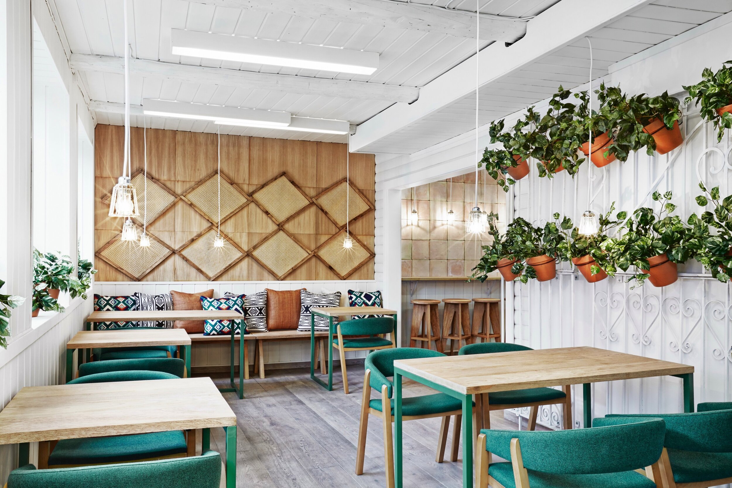
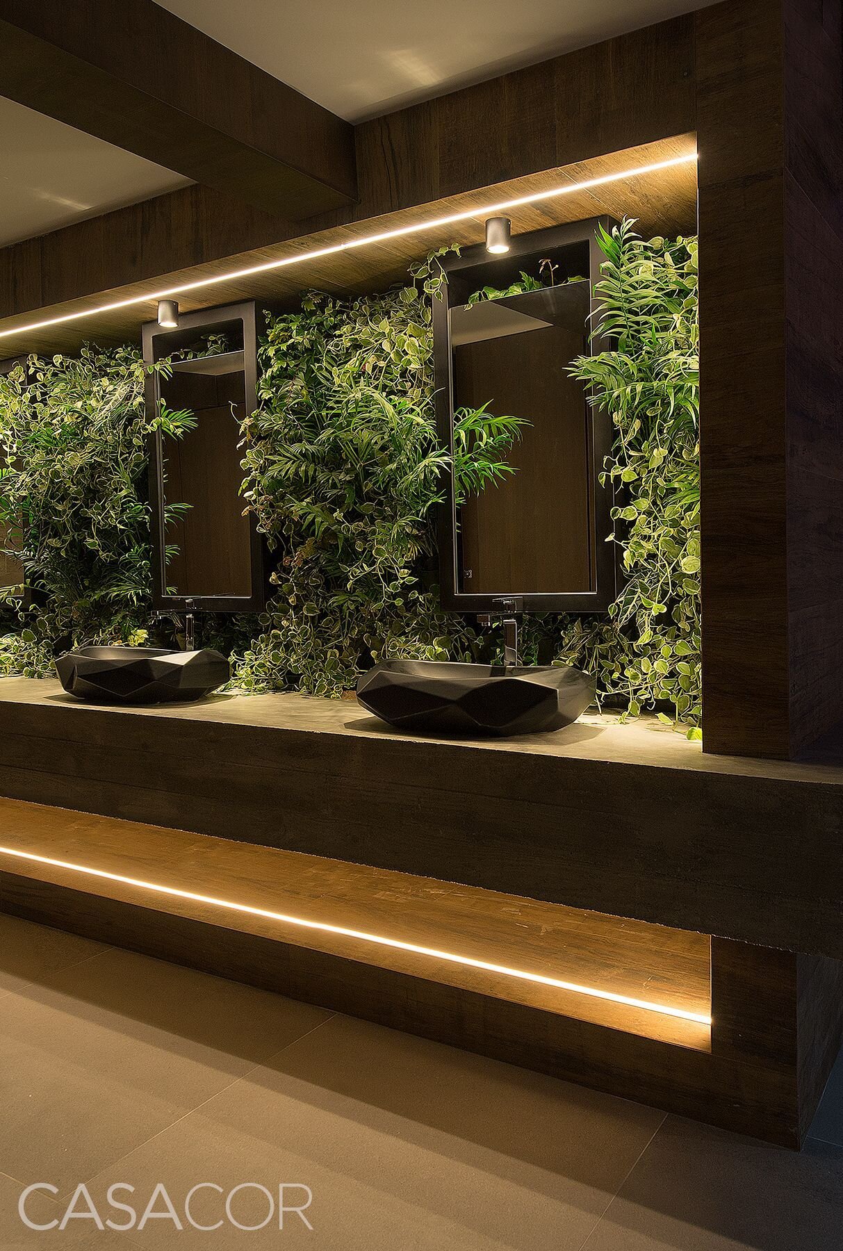
LIVING STRUCTURES + SUSPENDED GREENERY
Integrating plants into architectural wall structures or shelves adds a new texture and color to vertical design elements. Suspending greenery overhead adds drama, creating an unexpected but beautiful focal point!
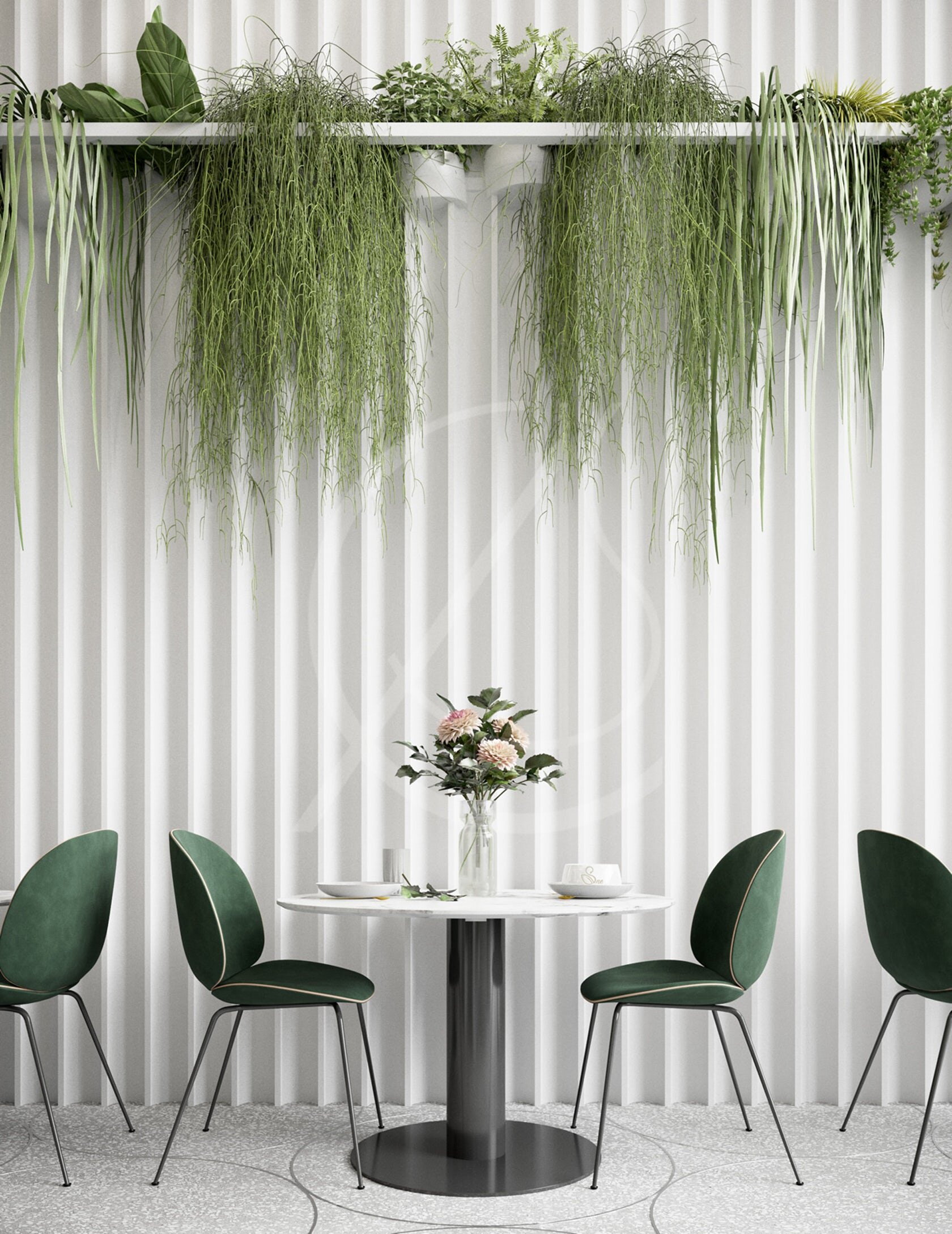
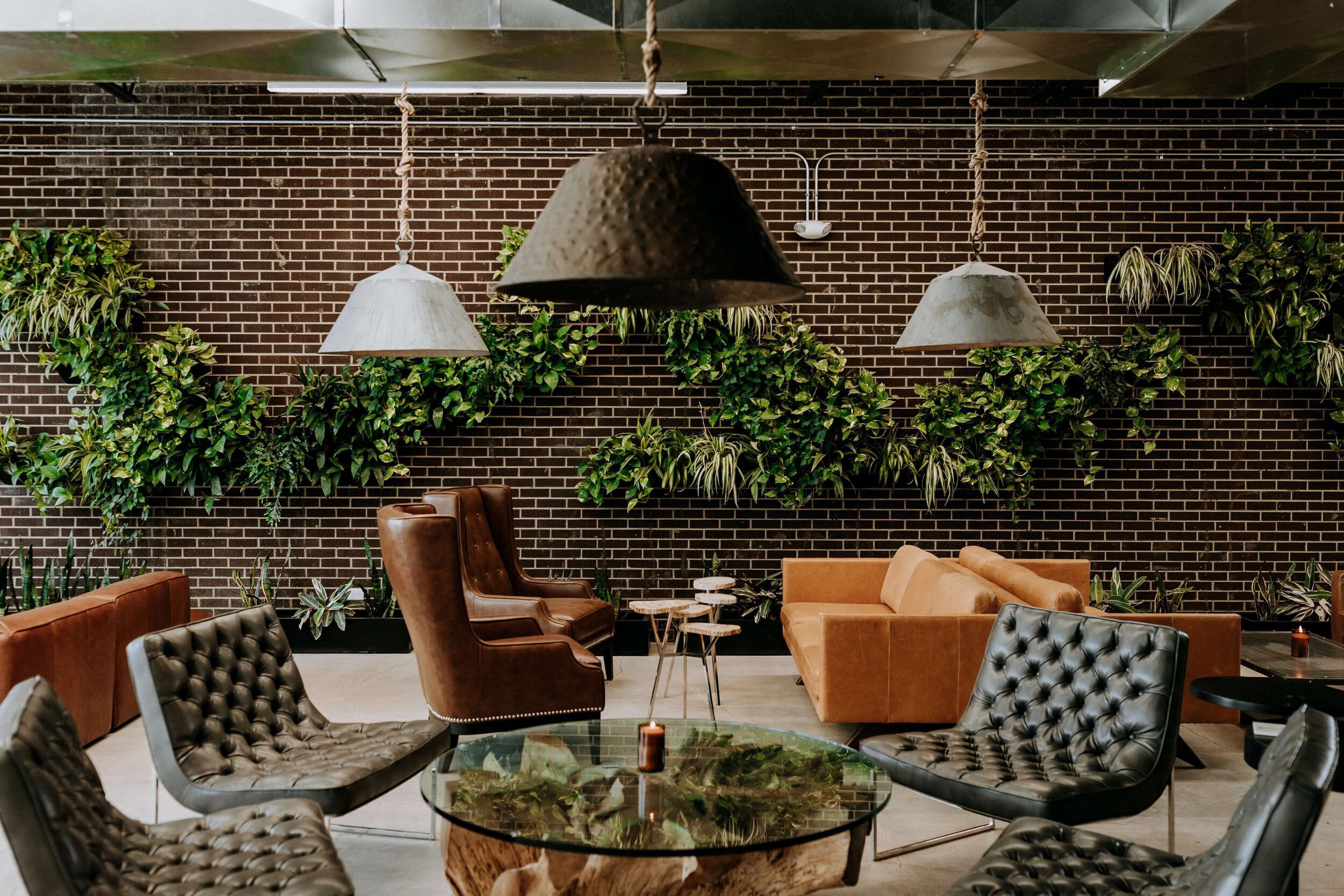
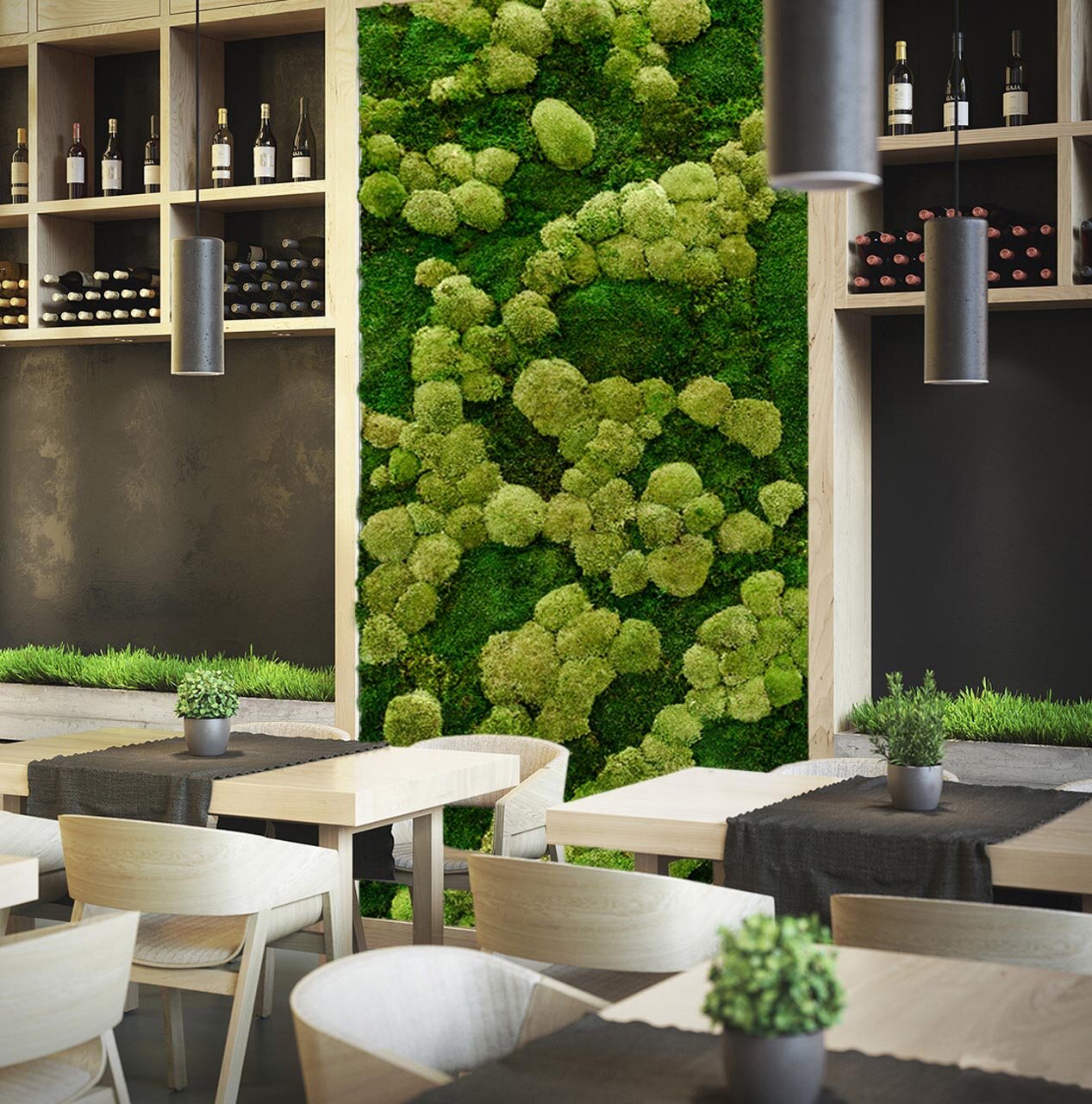
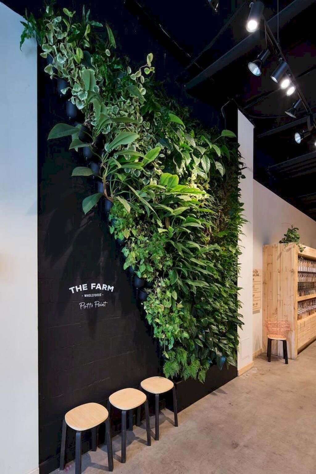
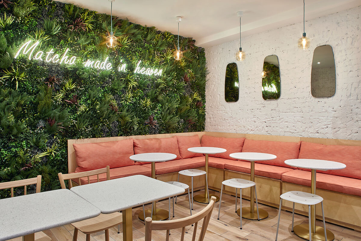
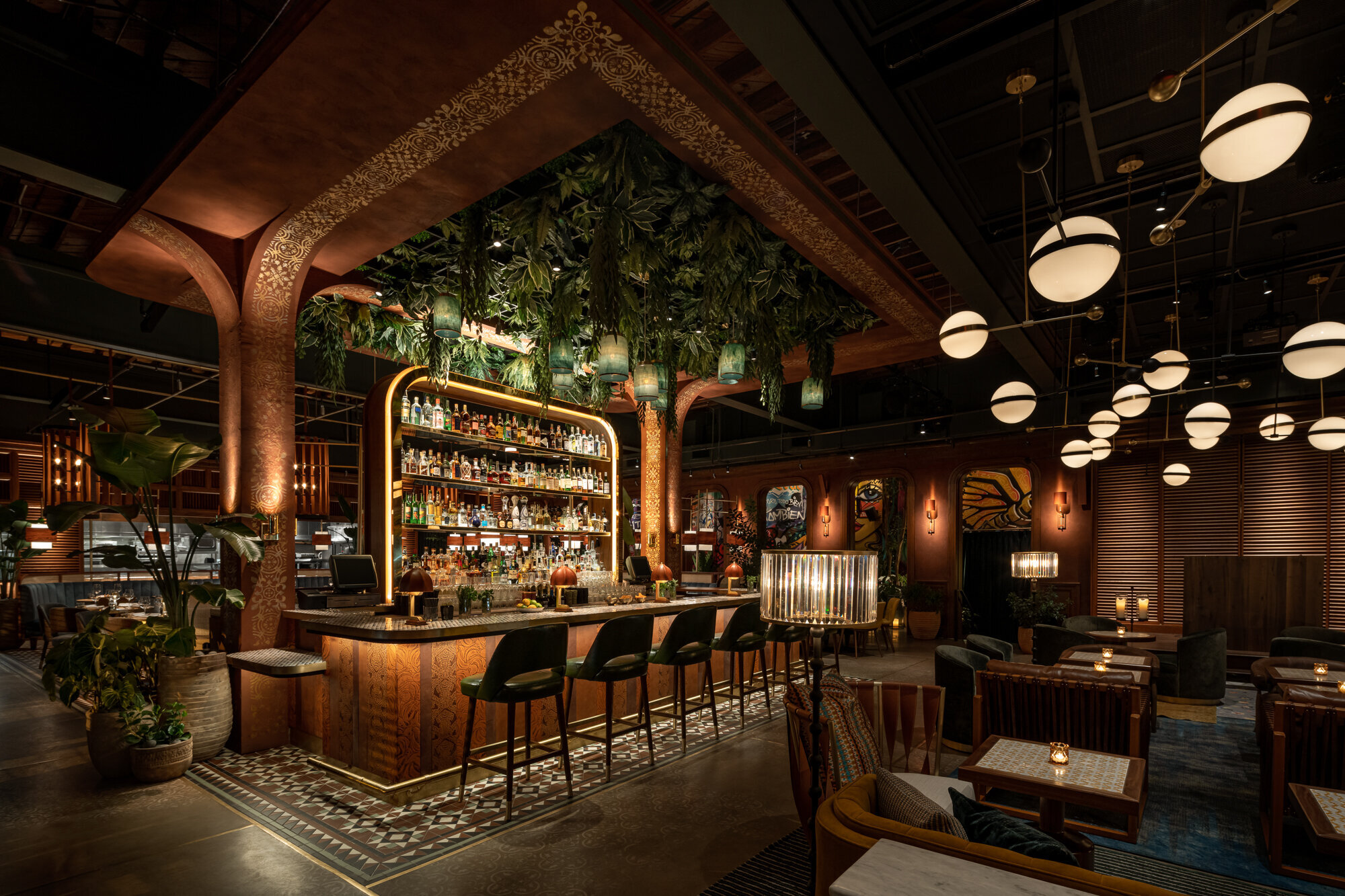
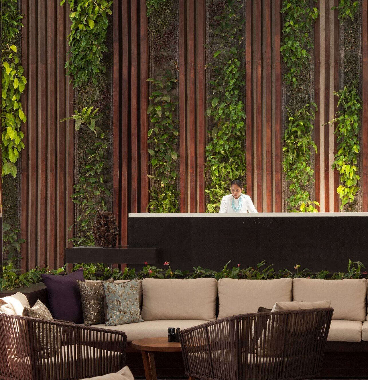
LIVE WALLS
Live walls are one of the most popular ways to turn interior spaces into living gardens! And design options for green walls are virtually endless - the ability to mix plant types, create interesting patterns, and install plants in unique shapes makes this one of the most versatile ways to add greenery to an indoor space!
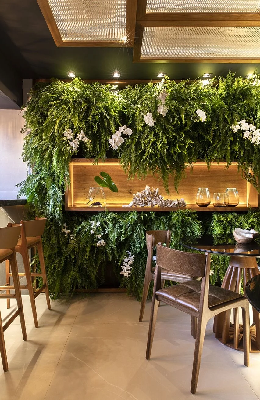
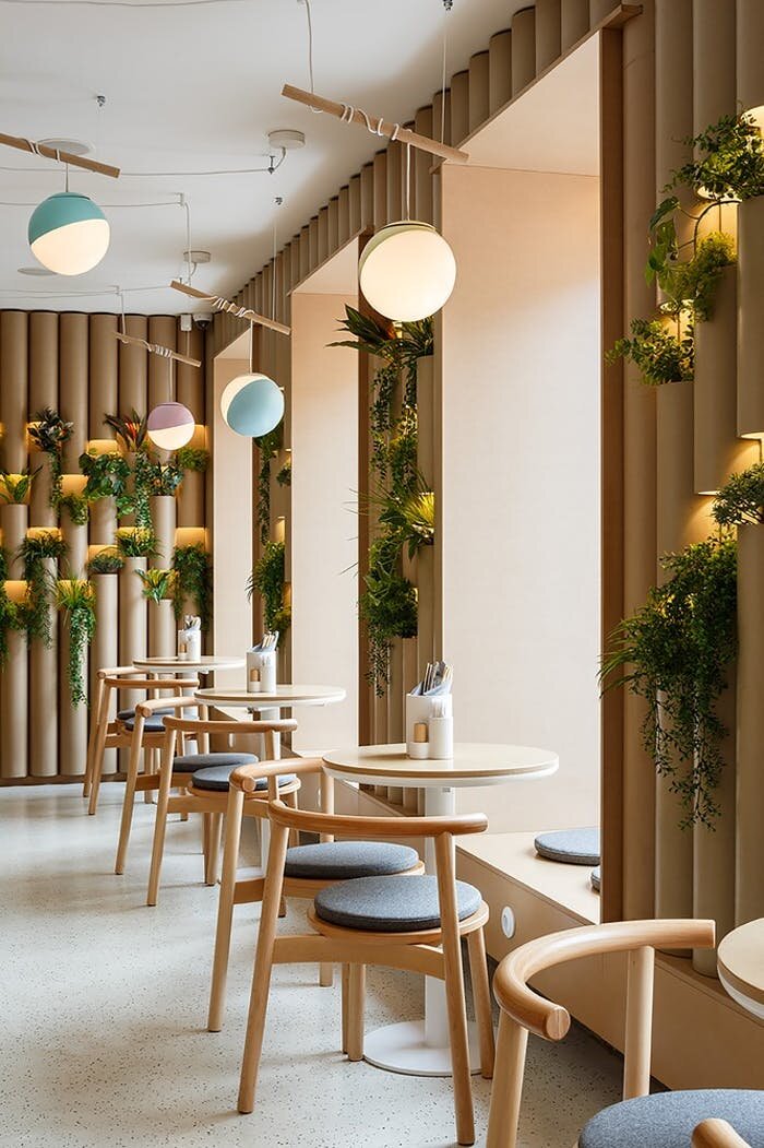
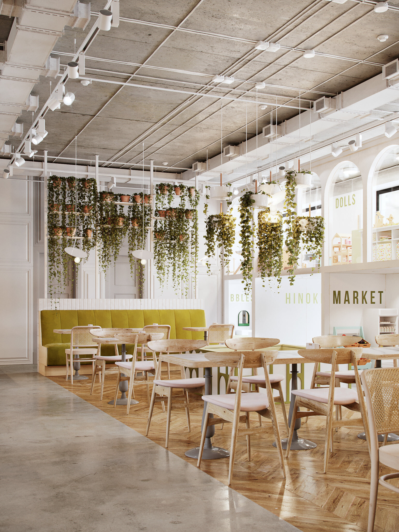
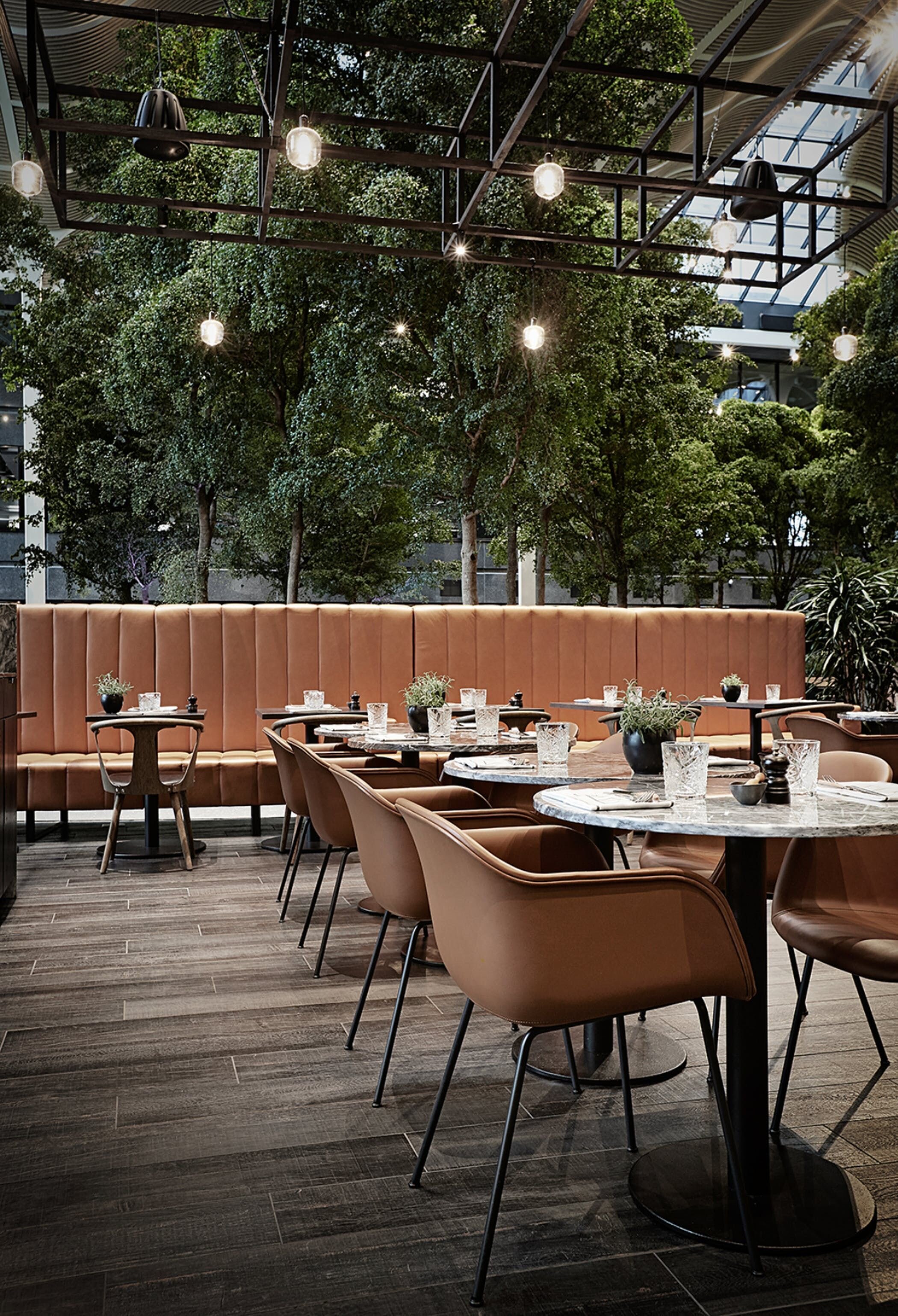
BRIGHT + COLORFUL INTERIOR GREENERY
Interior gardens can also set the tone for a space. As a natural and organic element, adding indoor plants is one of the easiest ways to make a space feel bright, vibrant, and colorful!
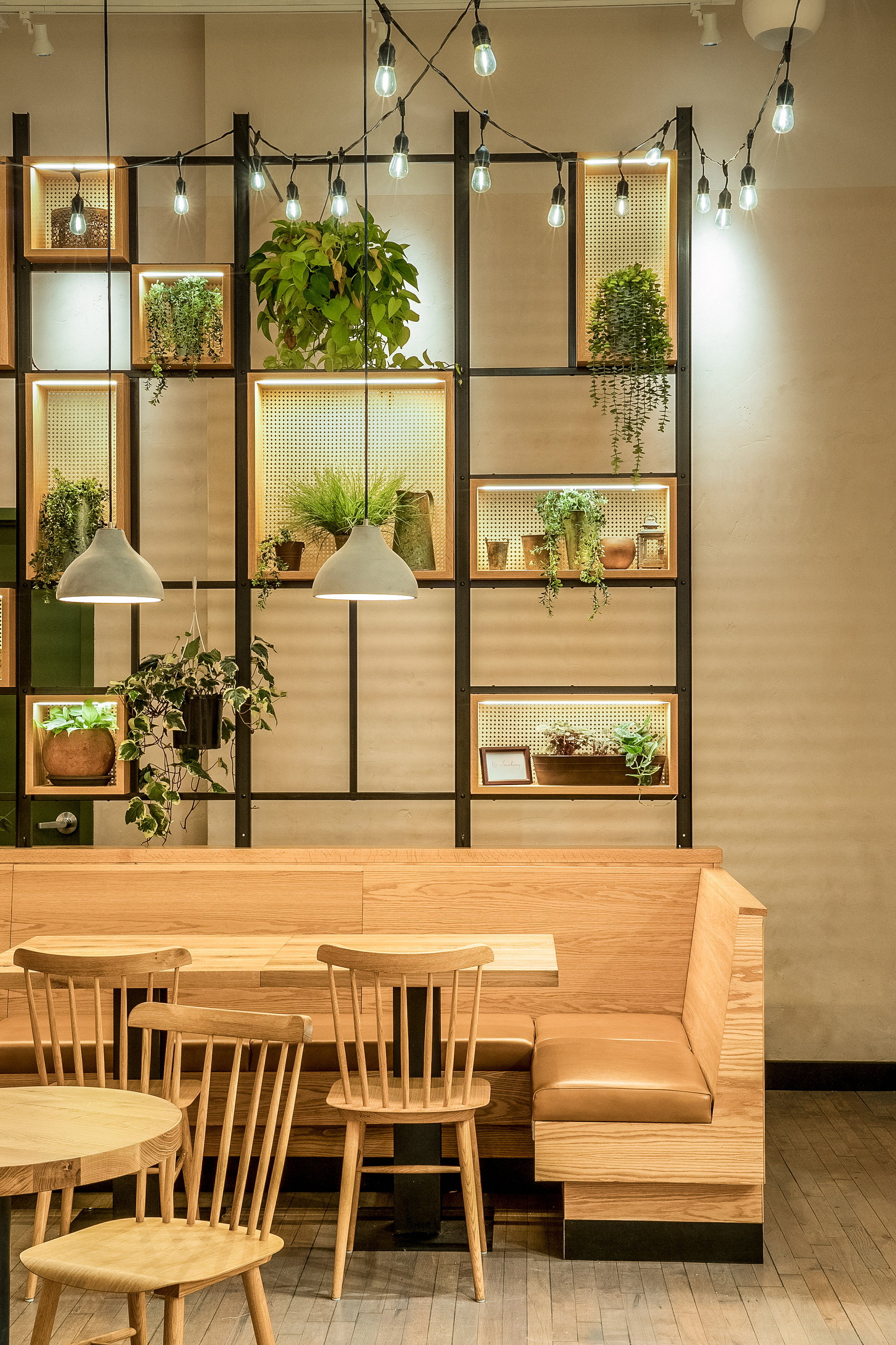
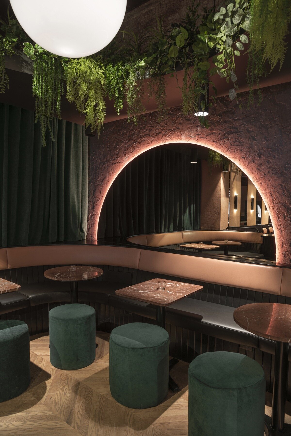
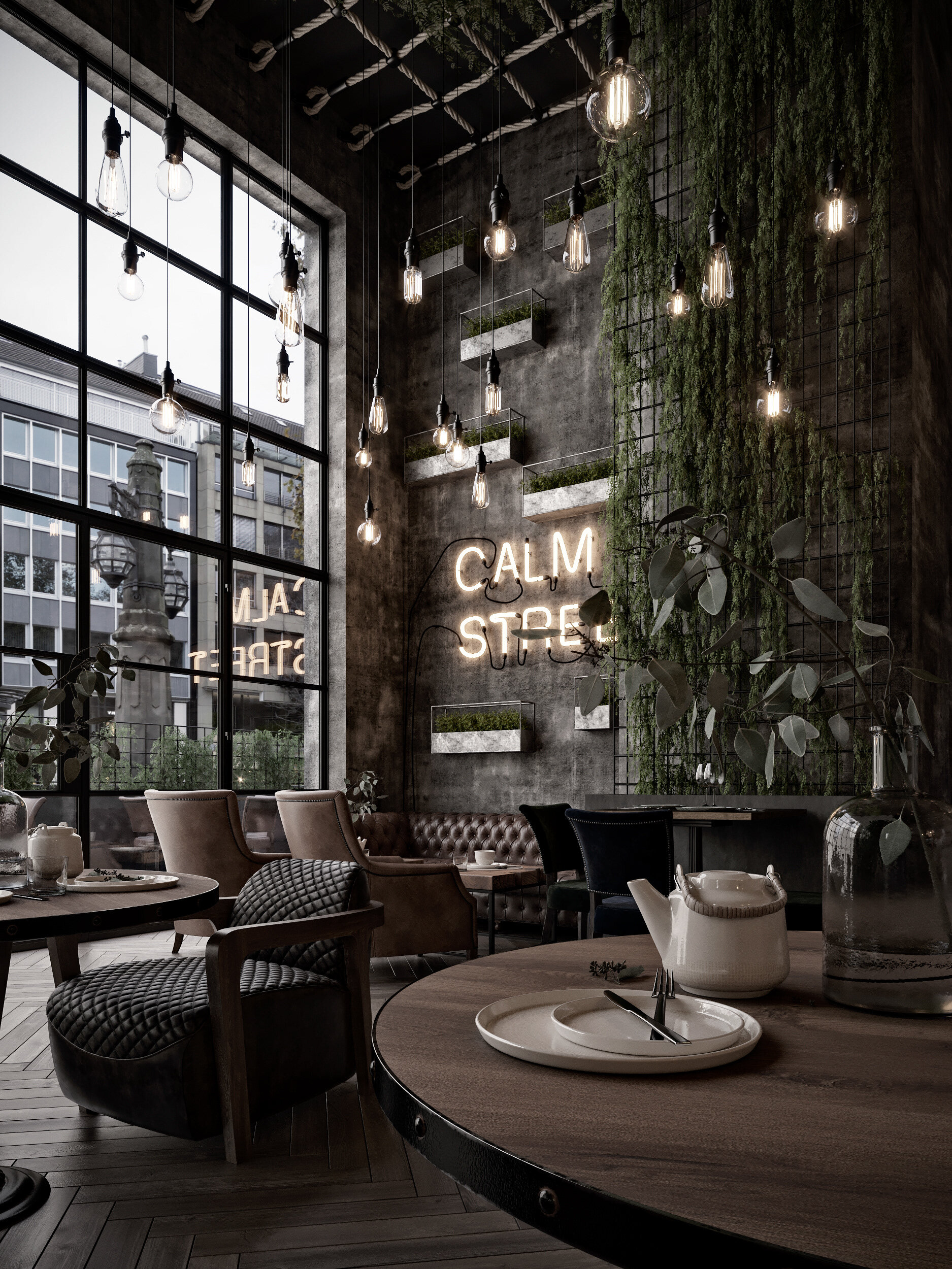
DARK + MOODY INTERIOR GARDENS
Interior greenery is also versatile - it’s not only able to make spaces brighter or more colorful, but can also fit perfectly with a dark and moody atmosphere. Adding plants can add depth and ambiance, making a space feel cozy, intimate, and intriguing.
What are some of your favorite ways to use greenery indoors?
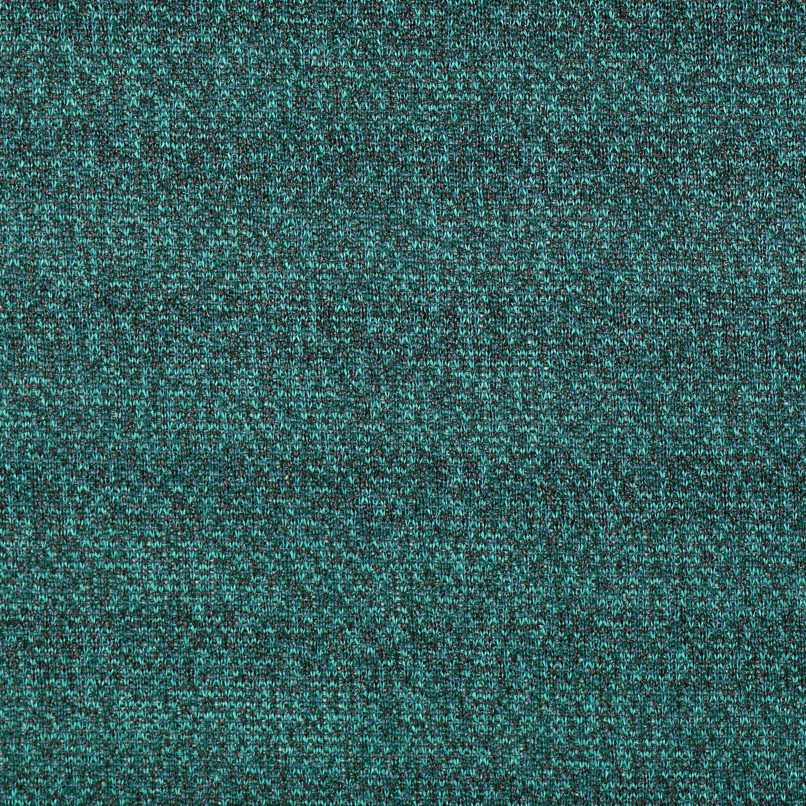
Best of Warm Neutrals | Paints

We know neutrals may seem boring, but they’re the base of any palette and an essential part of good design. Selecting the wrong neutral can throw off all other selections, but choosing the right one can tie a design together and make it great!
Options for neutrals are widespread and varied, there are lots of different color tones within the “neutral” family. Today we wanted to focus on warm neutrals and some of our favorite paints within that group - take a look below at the warm neutral paints we find most inspiring!
INSPIRATION 1 | PALE TONES

Photo: Chris Round | Paints: Benjamin Moore | Colors (top to bottom): Shoreline 1471, Taos Taupe 2111-40, Gray Huskie 1473, Lambskin 1051, Lingerie AF-200
INSPIRATION 2 | NATURE’S LANDSCAPES

Photo: Mike Irwin | Paints: Kelly Moore | Colors (top to bottom): Copper Blush KM4403, Bear Hug KM4510, Americano KM4512, Myrtle Pepper KM4406, Pink Scallop KM4408
INSPIRATION 3 | FASHION

Sweater: Stories.com | Paint: Sherwin Williams | Colors (top to bottom): Sanderling SW7513, Muslin SW6133, Arcade White SW7100, China Doll SW7517, Rockweed SW2735
INSPIRATION 4 | ARCHITECTURE

Photo: Alison Brooks | Paint: PPG | Colors (top to bottom): Molasses 1079-7, Warmstone 1015-3, Caramel Kiss 1083-6, Cotton Tail 0998-1, Warrior 1076-6
