International Design Trends
@Precht
Interior design trends are never a stationary target, and fresh concepts are constantly evolving to inspire and amaze. We love taking existing ideas and reinterpreting them in new ways, and appreciate seeing other designers do the same. But because creation is so often influenced by experience, we frequently like to expand our point of view and see what where design is headed on a more global level.
Today we’re taking a look at international design and the trends that we’re seeing aboard. Take a look below to get an overview of these trends and some of our favorite projects that use them!
ENBRACING A SOFTER SIDE
We’re seeing more and more international design with softer concepts, colors, and textures - check out a few of our favorites below!
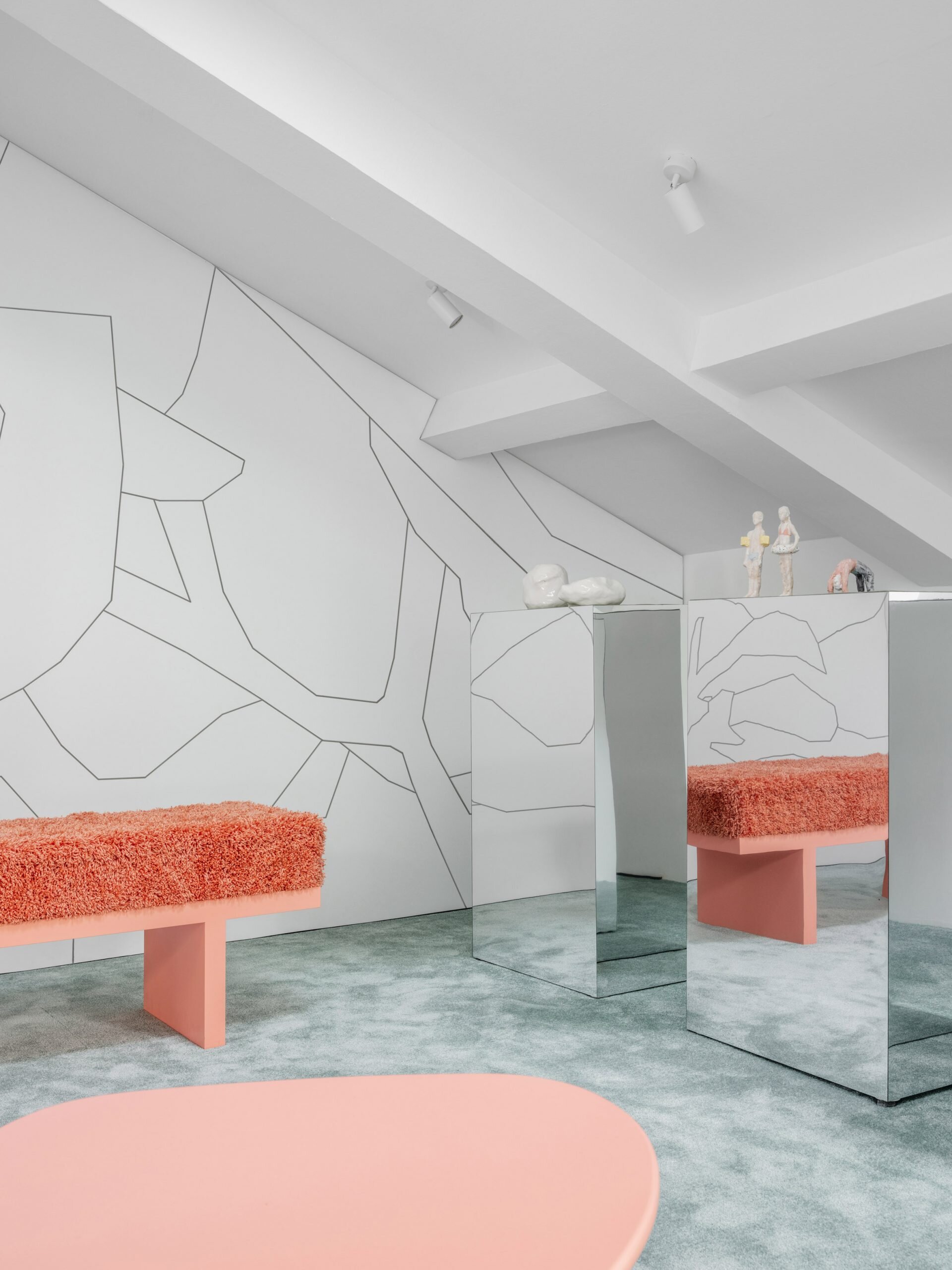
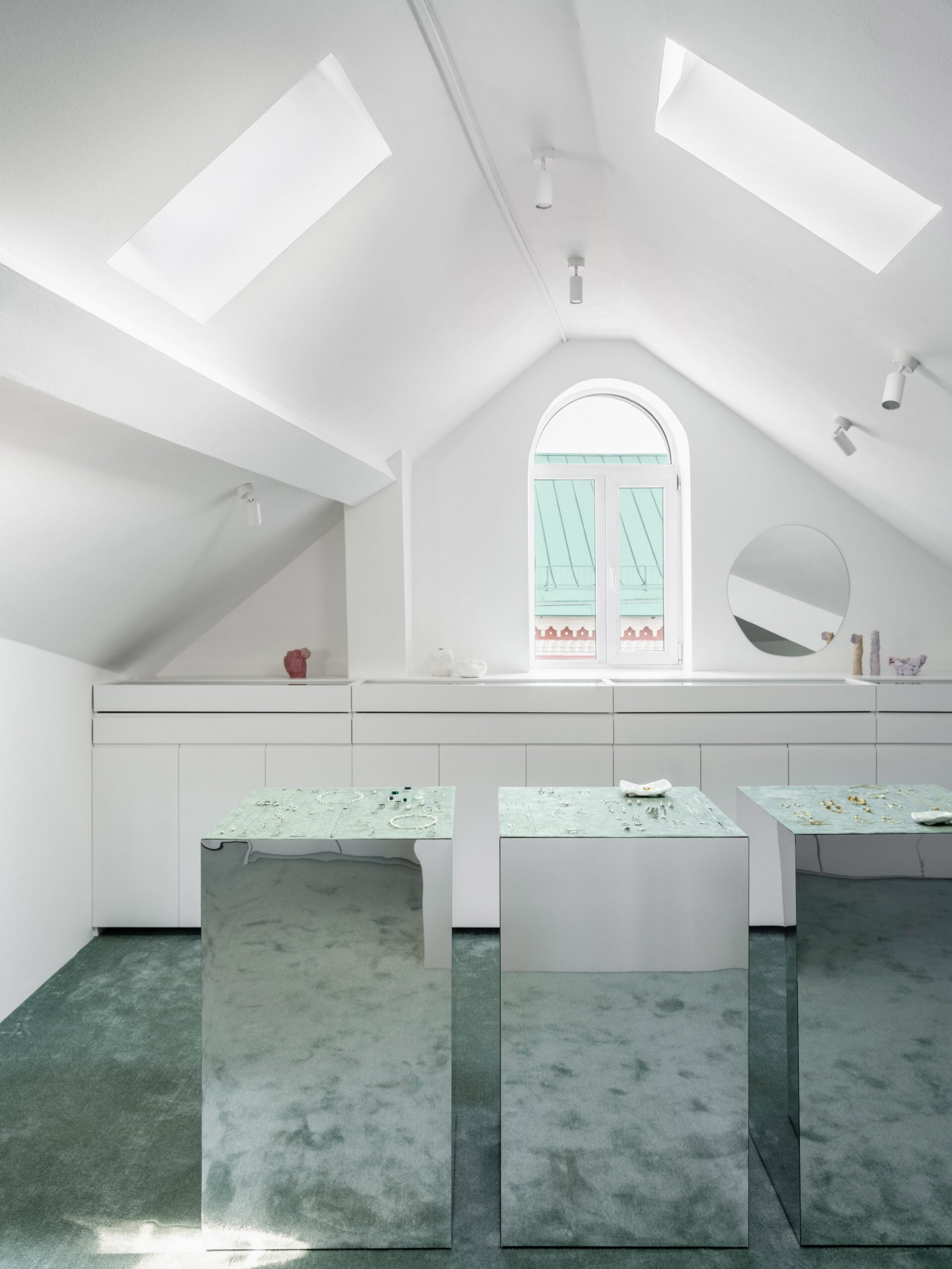
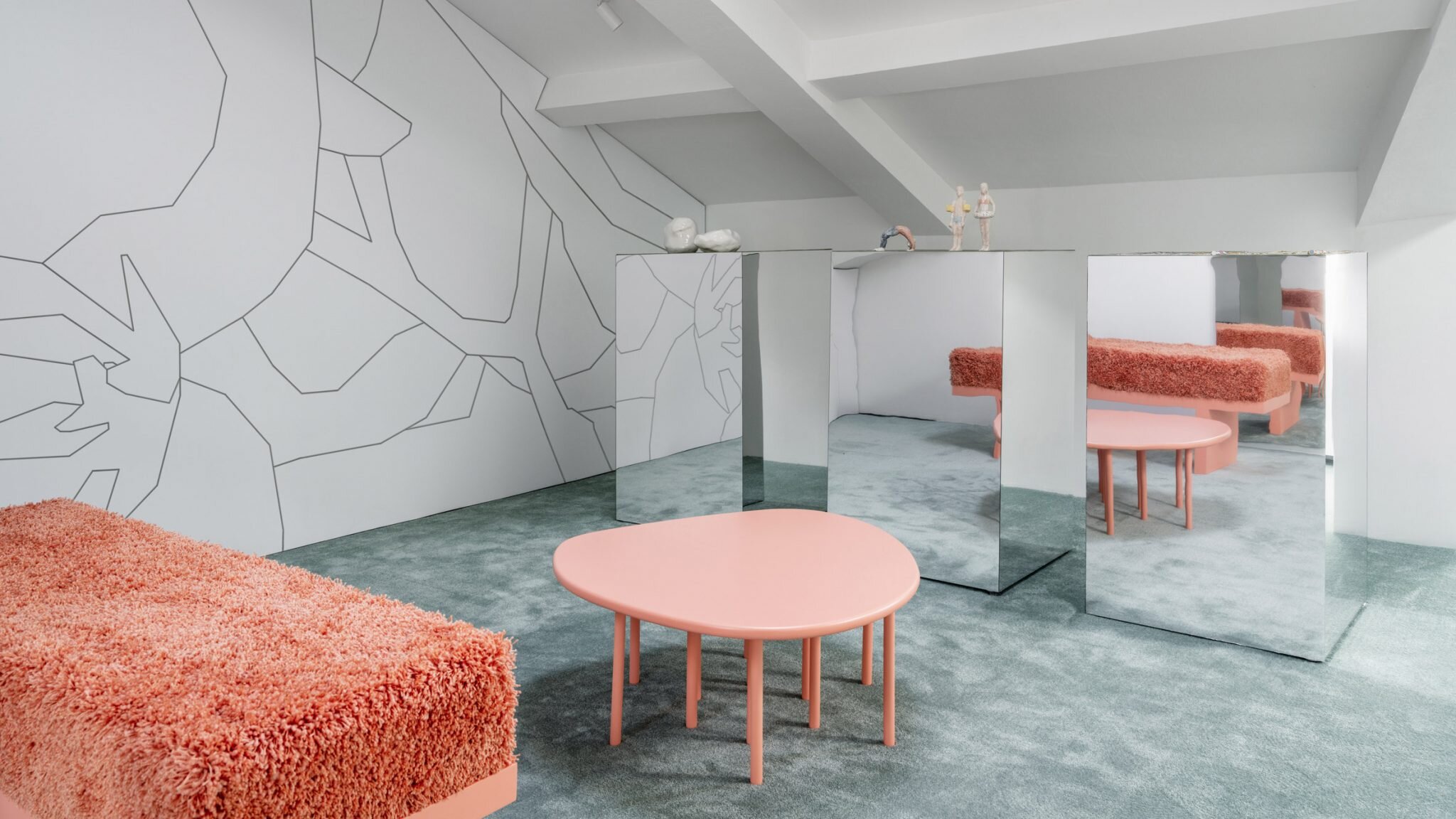
@Elena Lokastova
A Moscow jewelry store has achieves a soft and luxurious feel using pastel colors inspired by local architecture and plush textures.
@Bryan O’Sullivan
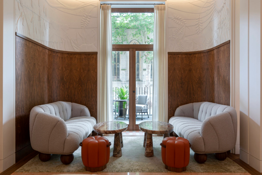
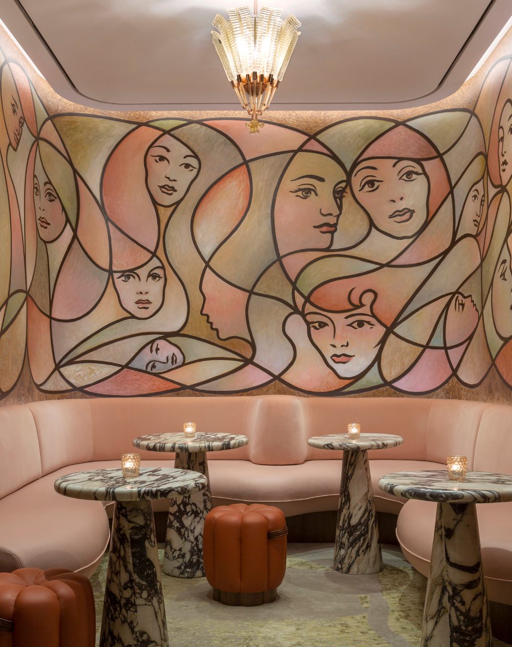
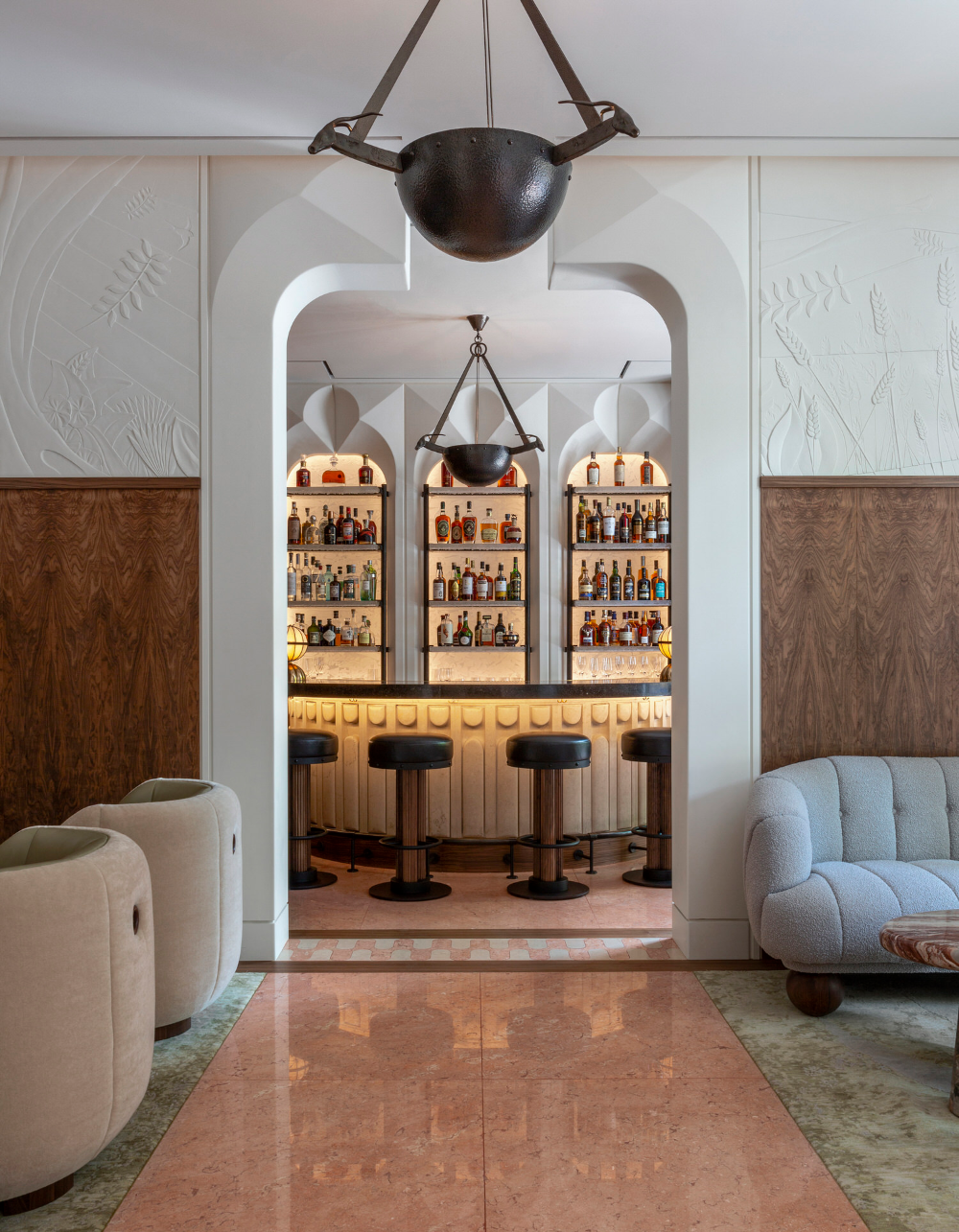
The Berkeley Bar in London strikes a perfect balance by mixing masculine materials like wood and tone with feminine colors and forms
@PAVE Architects
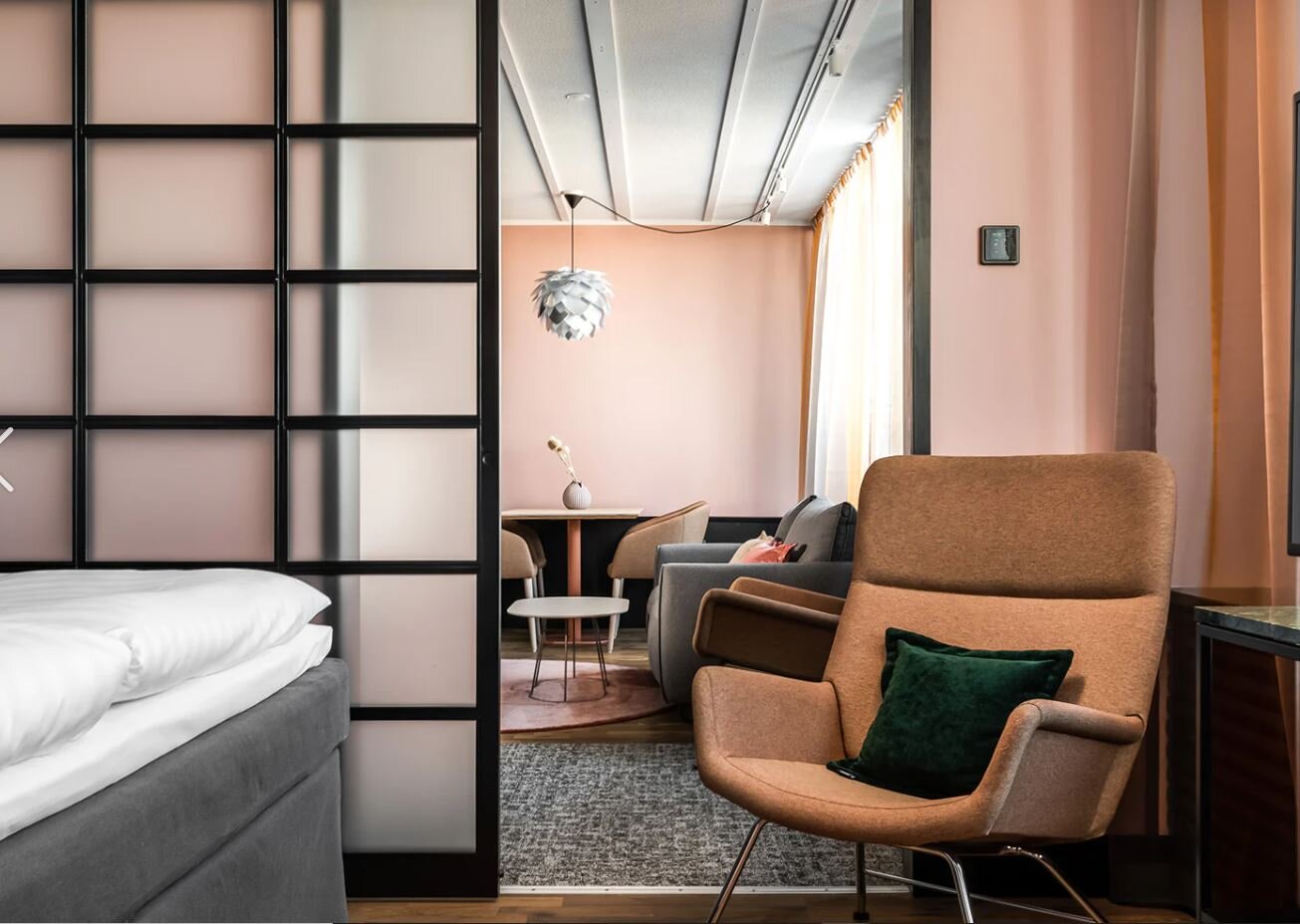
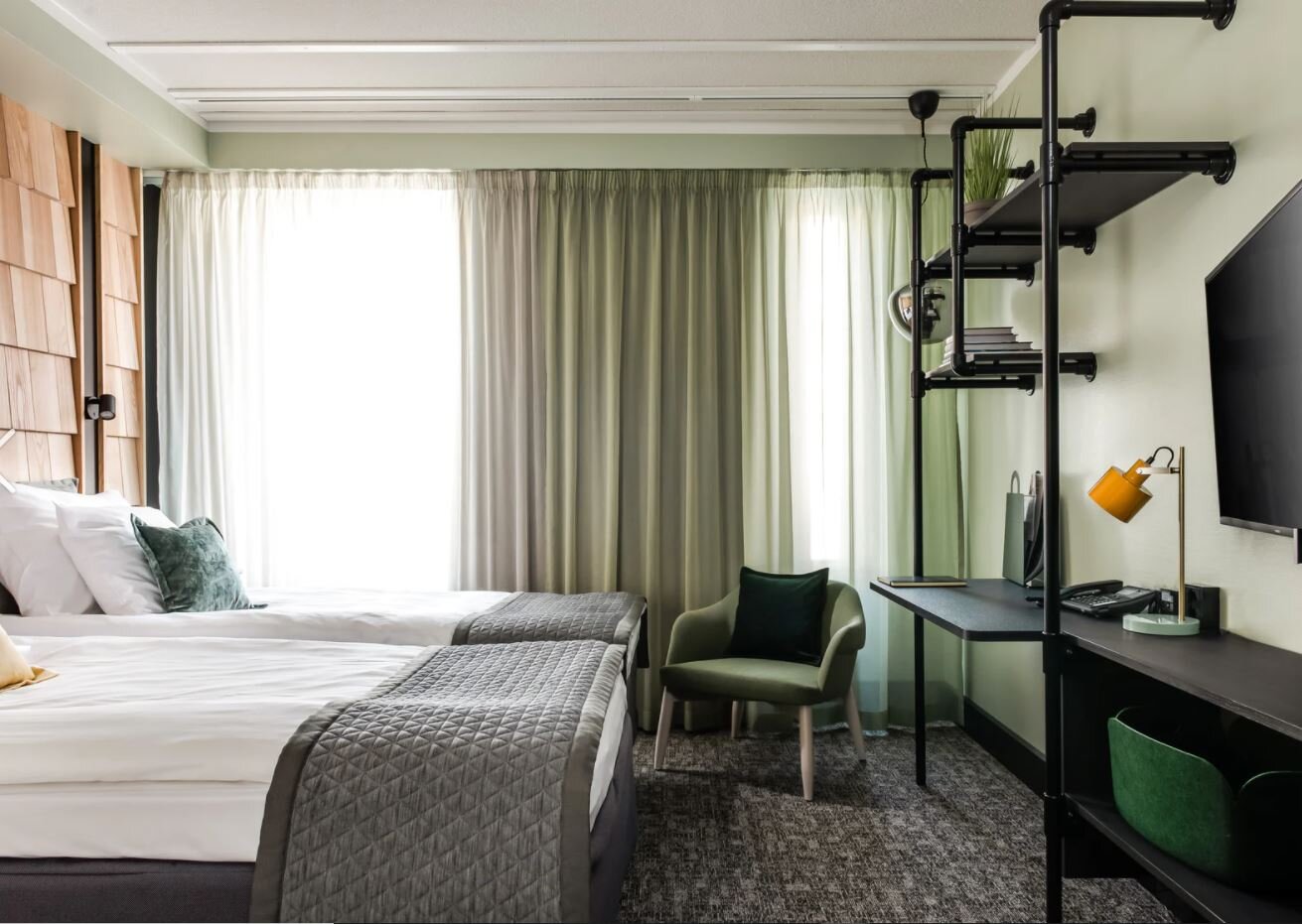
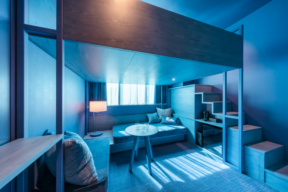
A recent remodel at the Original Sokos Hotel Arina in Finland introduced locally-inspired theme rooms, which are based on whimsical concepts like as Summer Night and Salmon and Tar
REFINED + MINIMAL
A refined and minimalist aesthetic has been quite prominent in many international projects this year. We love the clean lines, sophisticated palettes, natural textures, and impeccable lighting used in these spaces - take a look below to see a collection of our favorites!
@YuQiang & Partners
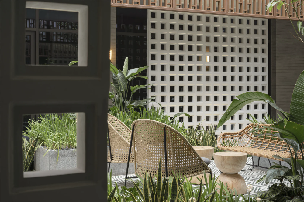
A beautiful, minimalist hotel, the Hainan Nanyang Meili Hui in Danzhou, China uses a combination of simple yet engaging geometry and natural elements to create refined and elegant spaces
@Roar Studio
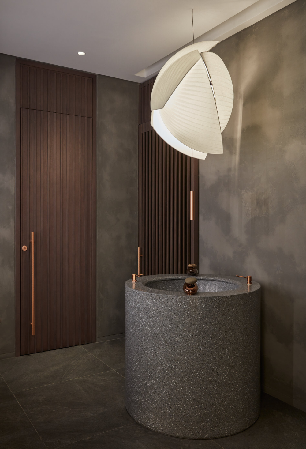
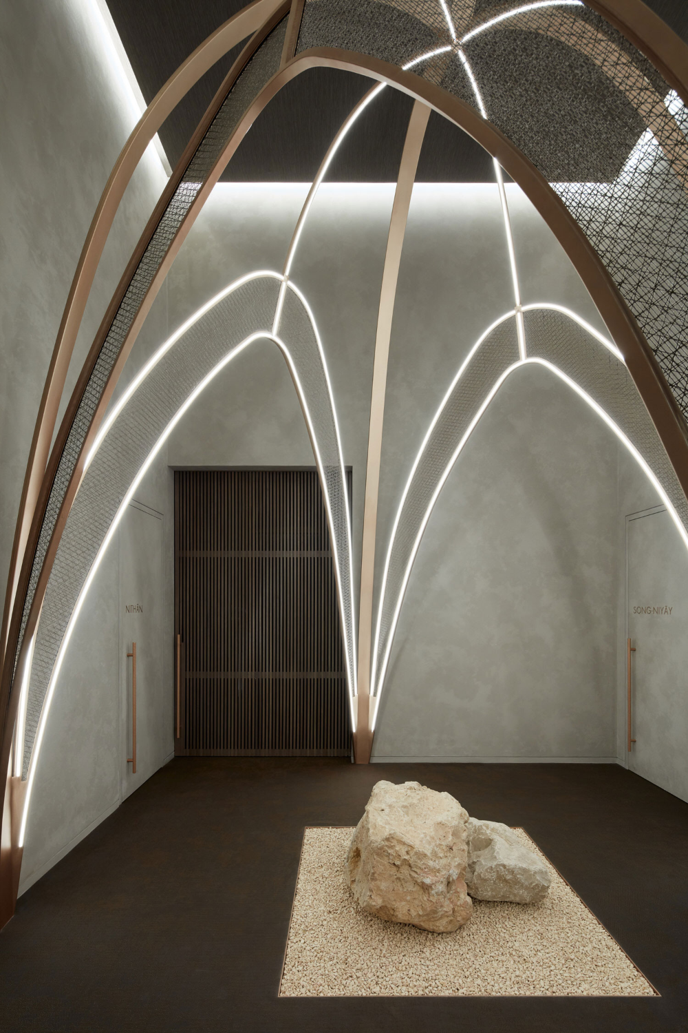
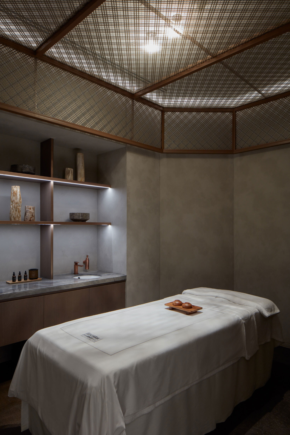
The Sensasia Stories Spa in Dubai juxtaposes brutalist elements with natural materials, ethereal lighting, and glamorous details
@Cumulus Studio
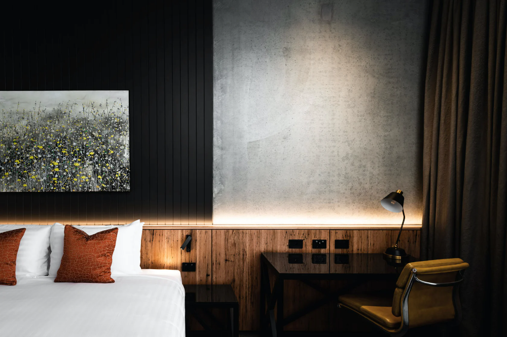
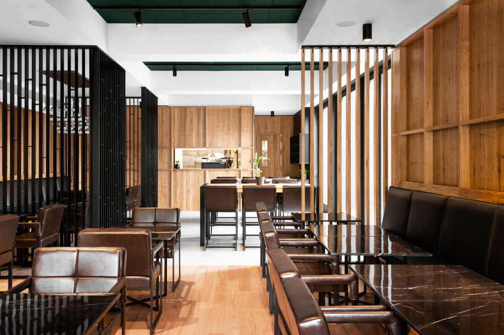
The design team behind Hotel Verge wanted to project to fit purposefully within the heritage and context of it’s location in Launceston, Australia. The area’s industrial history informed their use of sleek, raw materials and sophisticated forms.
BOLD COLORS
A new trend in bold, playful colors and can be seen in many recent international projects - check out a few favorites below!
@Masquespacio
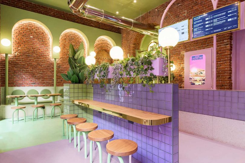
A Milan location for the the Italian hamburger chain Bun mixes vintage elements, bright colors, and sophisticated details to appeal to a new generation of younger customers
@Dvekati
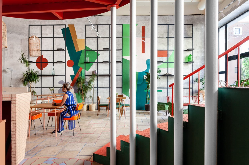
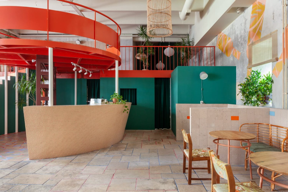
A Moscow wine bar provides a fun and playful atmosphere using bold shapes and bright colors
@Klein Dytham Architecture
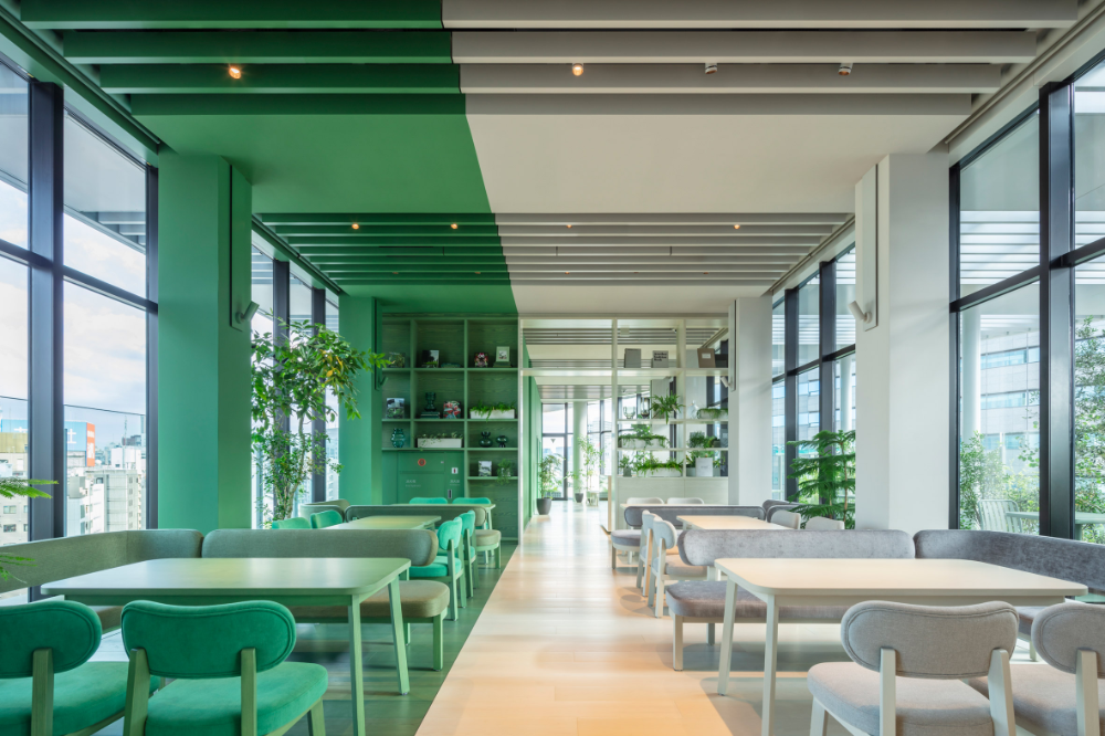
The Toggle Hotel in Tokyo makes bold use of color-blocking, mixing clean lines with bright tones for a sophisticated but playful atmosphere
What international design trends are inspiring you lately?

