Photo-Inspired Palettes
@Tiago Murano
Inspiration can come from anything - ideas, stories, objects, even an interesting phrase. As designers working in a visual medium, we’re often inspired by things that are visual and a source of almost constant inspiration for us are images.
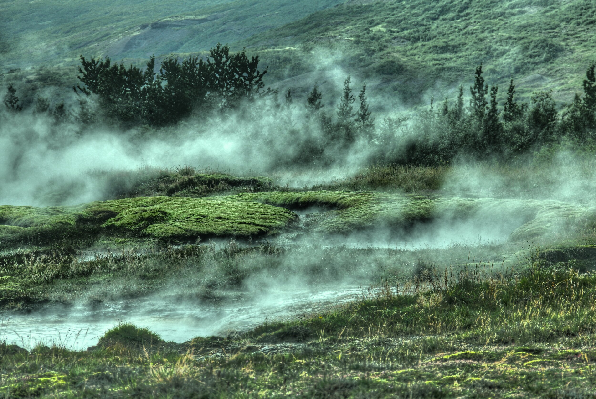
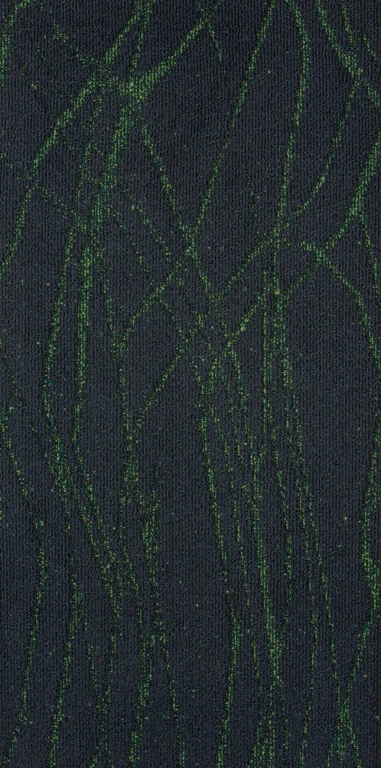
Today, we’re taking a look at several amazing photographs and the palettes they inspired - take a look below to see how these beautiful images can be the catalyst for wonderful design concepts!
@Gian Reto Tarnutz
@Muhammed Kara
@Lermakovas
What photos are inspiring you?
Patriotic Palettes | 3 Ways
Everyone knows the colors of the American flag are red, white and blue. And at this time of year when Independence Day draws close, these colors seem to be everywhere from decorations, to clothing, to retail displays. And while this trend always fades as the summer holidays pass, there’s no denying that these classic colors aren’t limited to holiday merchandise.
Red, white, and blue is a classic combination. It has both warm and cool tones for interest, with a bright neutral to balance them out. Moreover, this color combination can be interpreted in countless different ways, either by playing with the colors themselves or by adding new textures, materials, and patterns into the mix.
Today, we’re taking inspiration from the upcoming holiday and sharing a few ideas for Independence Day material palettes - take a look below at some of our favorite patriotic-inspired combinations!
PALETTE 1
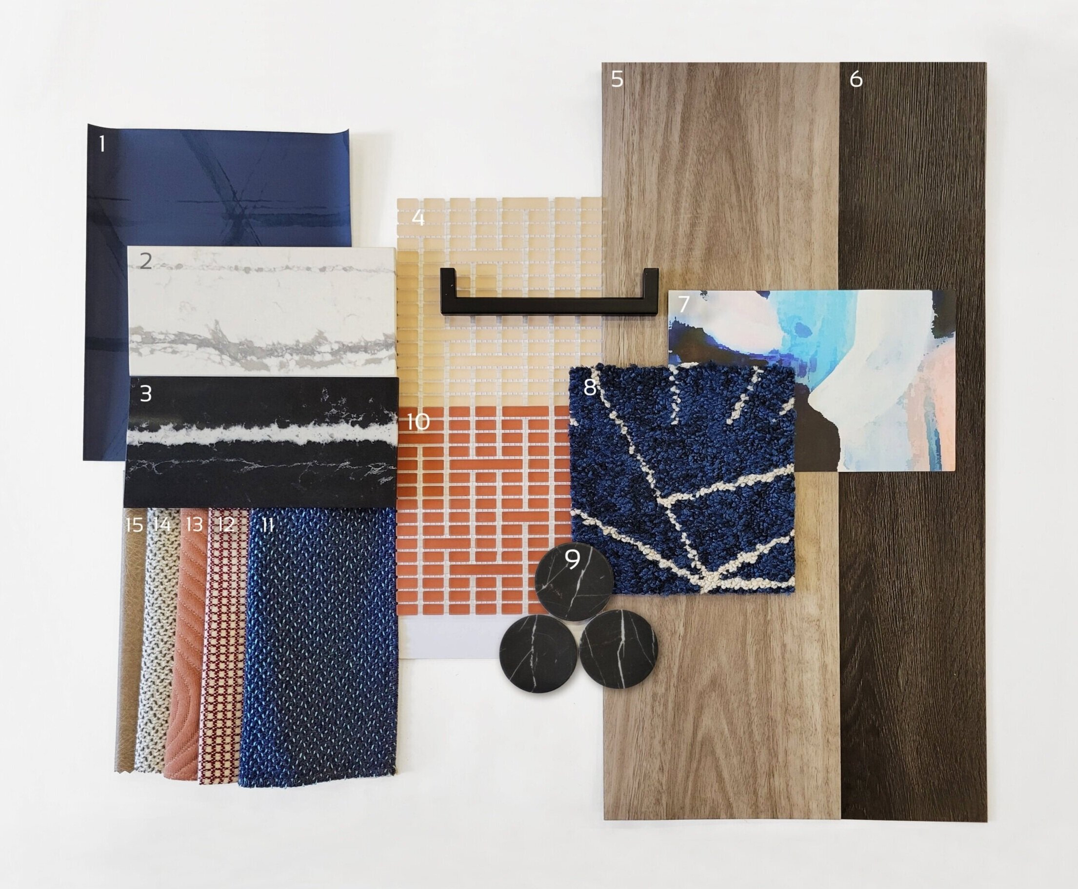
1) Triad, Midnight Blue | @Arc-Com 2) Et Bella | @Silestone 3) Eternal Marquina | @Silestone 4) Mist, Peach | @Mosaico+ 5) Eucalyptus Saligna | @Milliken 6) Woodlands, Ebony | @EF Contract 7) Tilda, Blush Lapel | @Mitchell Black 8) Skyfall, Cobalt | @Flor 9) Nero Marquina Dots | @Roca Tile 10) Mist, Paprika | @Mosaico+ 11) Quill, Swan | @HBF 12) Theo, Dark Red | @Brentano 13) Ms. Quilty, Fickle | @HBF 14) Quill, Goose | @HBF 15) Cow House, Pavement | @Valley Forge
For a sophisticated spin on the traditional 4th of July palette, red can be swapped for elegant peach tones to add whimsey. Including very saturated blues (both light and dark) helps to ground this palette while adding variety. The wood tones bring warmth and texture, balanced by timeless stone materials. When put together, this palette is a playful and sophisticated combination of styles, textures, and color tones.
PALETTE 2
1) Sommalier | @Sherwin Williams 2) Yohen Border, White | @Inax Tile 3) Bars | @Audrey Lane 4) Olaria, Blue Steel | @Roca Tile 5) Walnut | @Bacon Veneer Company 6) Skara Brae | @Cambria 7) Duet, Blueprint | @Brentano 8) Merit, Cabernet | @Maharam 9) Sideways, Blanc | @HBF 10) Theo, Dark Red | @Brentano 11) Mist, Avio | Mosaico+ 12) Walnut Tambour | @Surfacing Solution 13) To the Point, All Nighter | @D.L. Couch 14) To the Point, Gold | @D.L. Couch 15) To the Point, Graphite | @D.L. Couch 16) To the Point, Inky | @D.L. Couch
Classic red, white, and blue never goes out of style! This ensemble is an modern take on a timeless palette, with beautiful colors and sophisticated accents that elevate it to a new level. Warm, textured woods juxtapose, sleek, gold metallics to create balance. Stone with a large-scale veining pattern add elegance, while fun geometric wallcoverings add an element of playfulness.
PALETTE 3
1) Maple Tambour | @Surfacing Solution 2) Sunbeam, Matador | @Sina Pearson 3) Prime, Iceberg | @Maharam 4) Gem, Lapis | @Brentano 5) Bright Angle, Cyan | @Maharam 6) Lines, Black & White | @Olivia + Poppy 7) Deconstructed Stripe, Ivory on Black | @Schumacher 8) Maddox Deco, Black | @Stacy Garcia 9) Penny Rounds, Aqua Blue | @Artistic Tile 10) Penny Rounds, Steel Blue | @Artistic Tile 11) Penny Rounds, Coral Red | @Artistic Tile 12) White Oak Planked Groove | @Treefrog 13) Tre Super Jag, Black | @Somer Tiler 14) Marble Breach | @Florim 15) Gem I, Midnight Ocean | @Ann Sacks
Using bold corals and aqua blues, our final concept is a bright and modern interpretation of a 4th of July palette! In addition to the unique colors, mixing in graphic black and white patterns and materials adds a playful element. Geometric tiles, wallcovering, and textiles are balanced by the natural patterns of woodgrains and marble-look stone. Finally, the light wood tones tie the palette together with warmth and texture.
How are you inspired by the colors of Independence Day?


