
What is Bespoke?
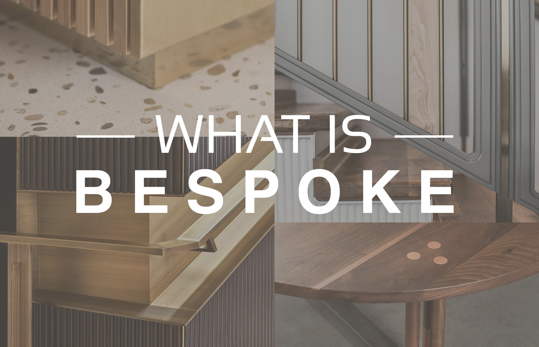
Bespoke Interior Design – a topic that can fill entire books, and the approach behind every blocHaus project. But it can also be an elusive concept and something that’s difficult to fully define. There are always a few questions that go with the idea of bespoke design: What is bespoke? What does it mean for a space to be bespoke? And what does it take to create bespoke spaces?
On the surface, bespoke is typically used as a synonym for customized. Customization may be part of the process, but there’s more to creating bespoke spaces than just adapting existing items or ideas for the task at hand.
So what does it mean for design to be bespoke rather than simply custom?


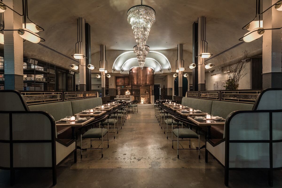
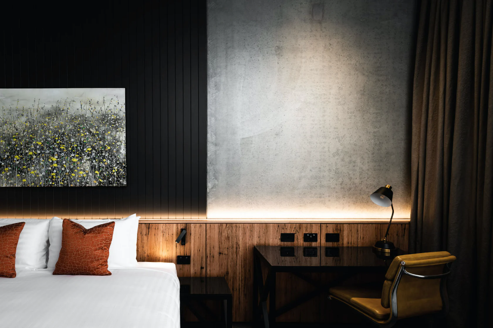
Bespoke interior design is tailor-made and individual to each client - no two projects are alike! This starts with a strong story or concept focused on the identity of the client and their brand. From there, unique ideas and concept-specific details are used to create individualized design solutions.

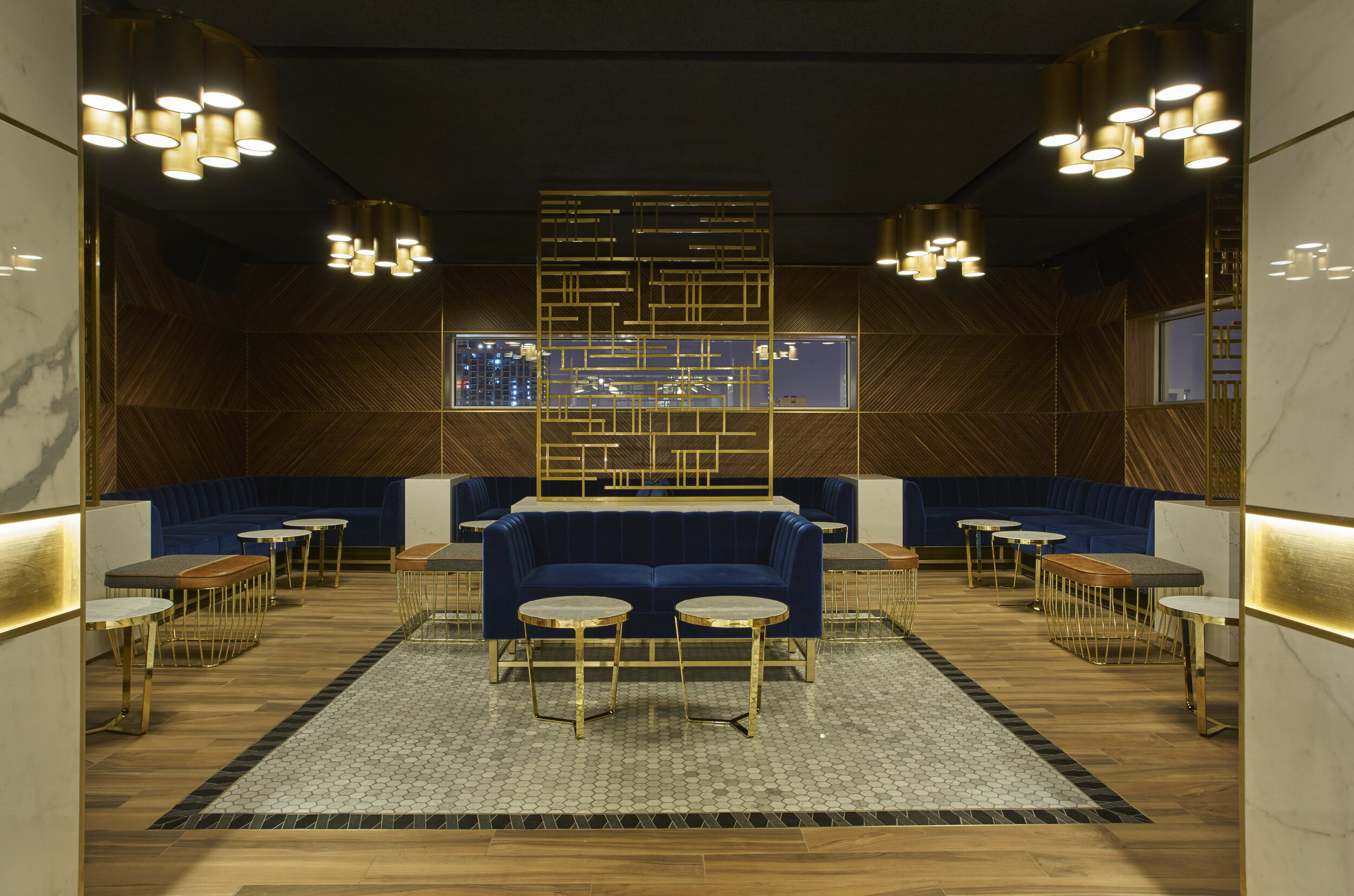
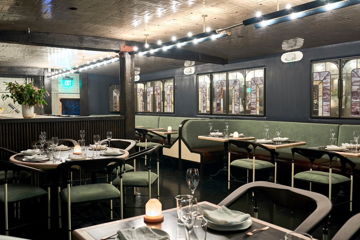
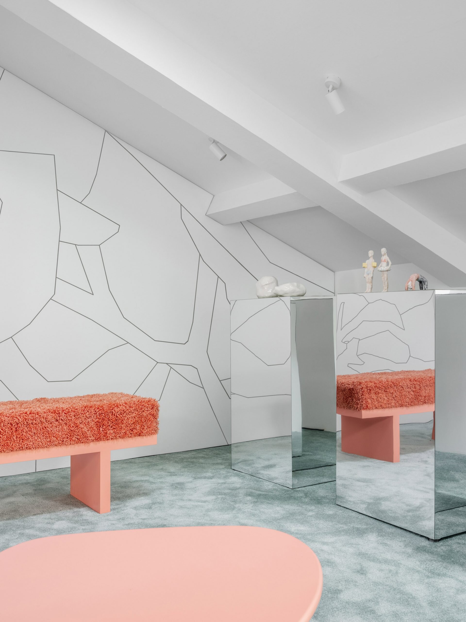
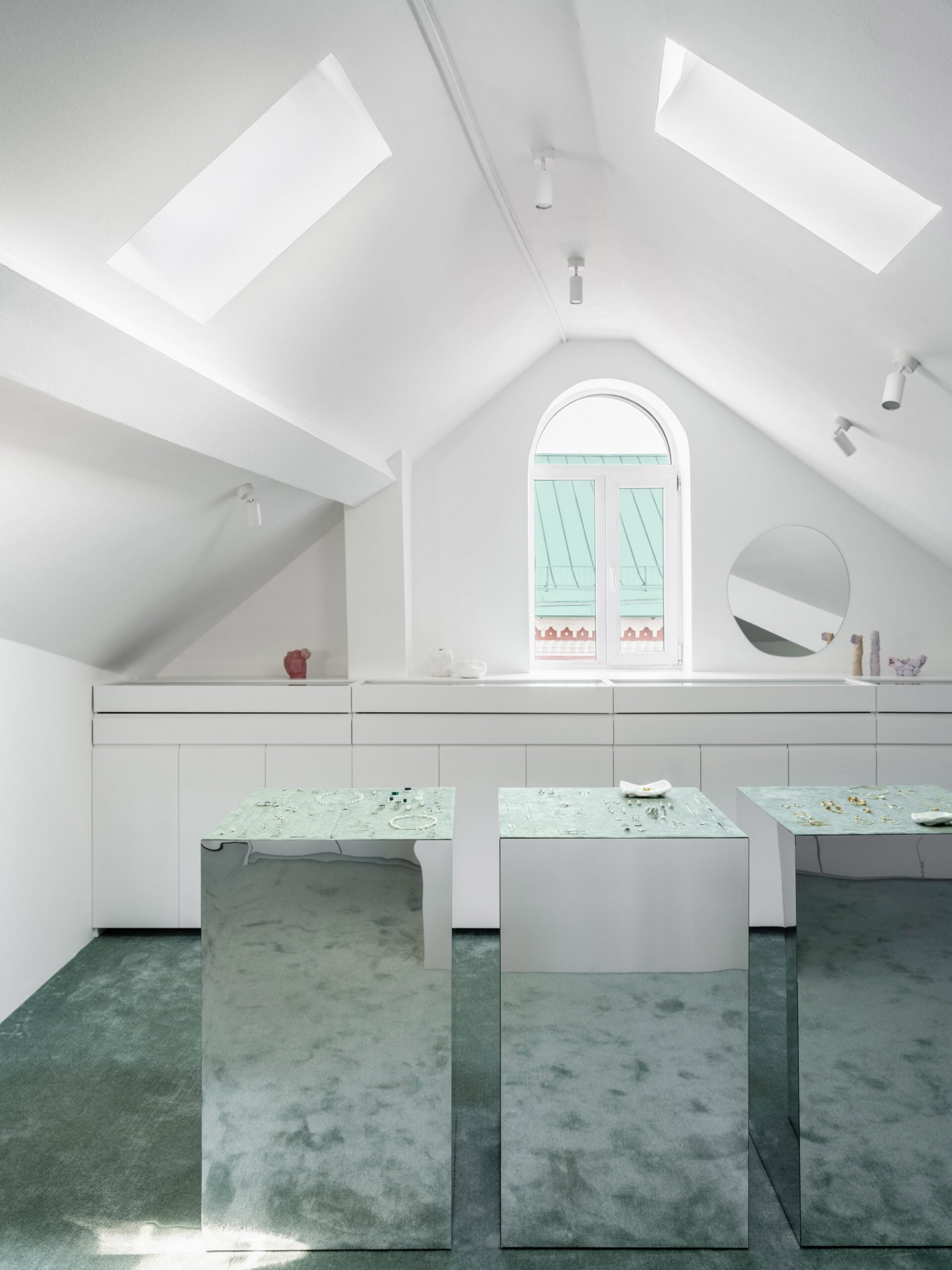
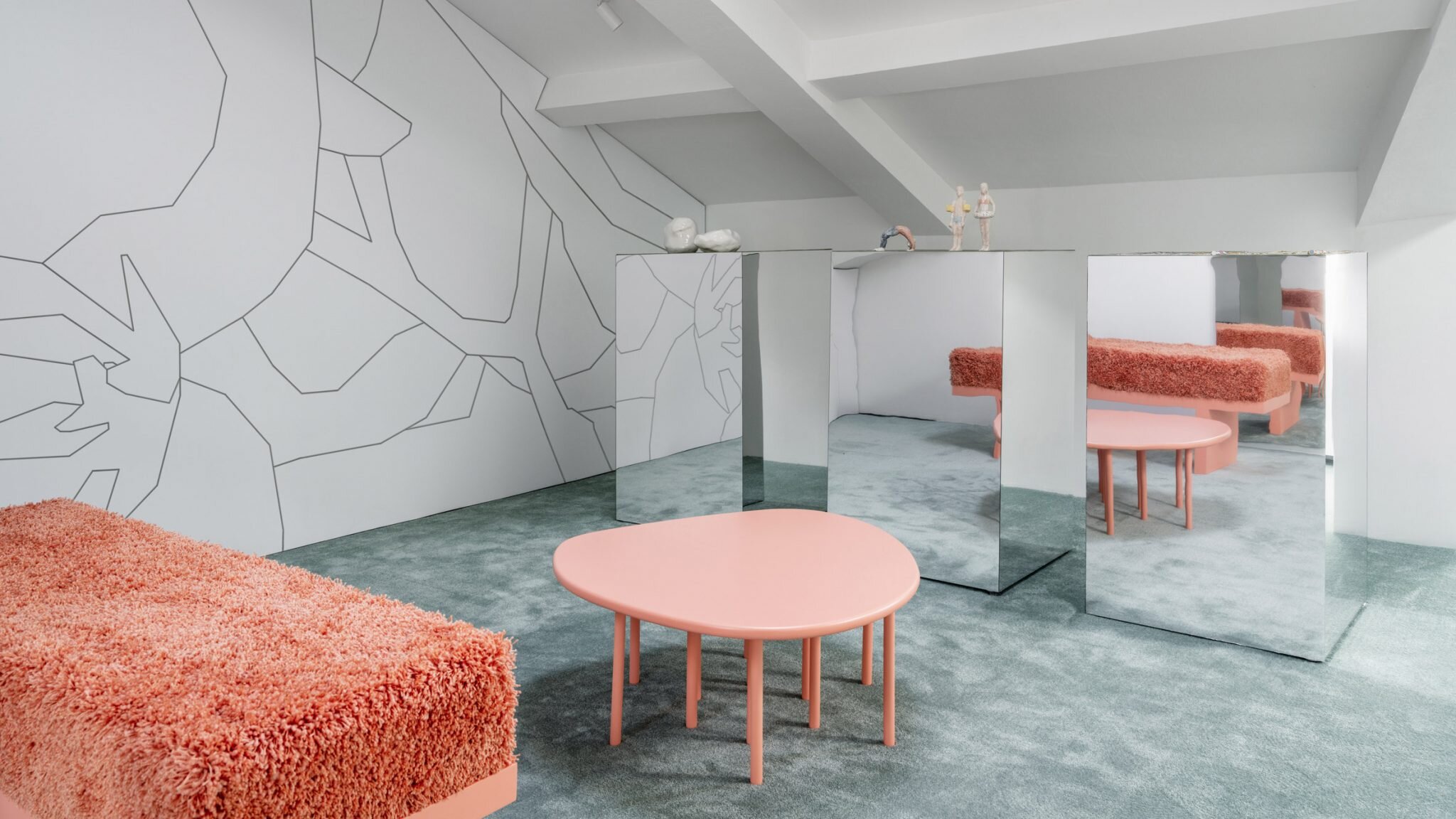
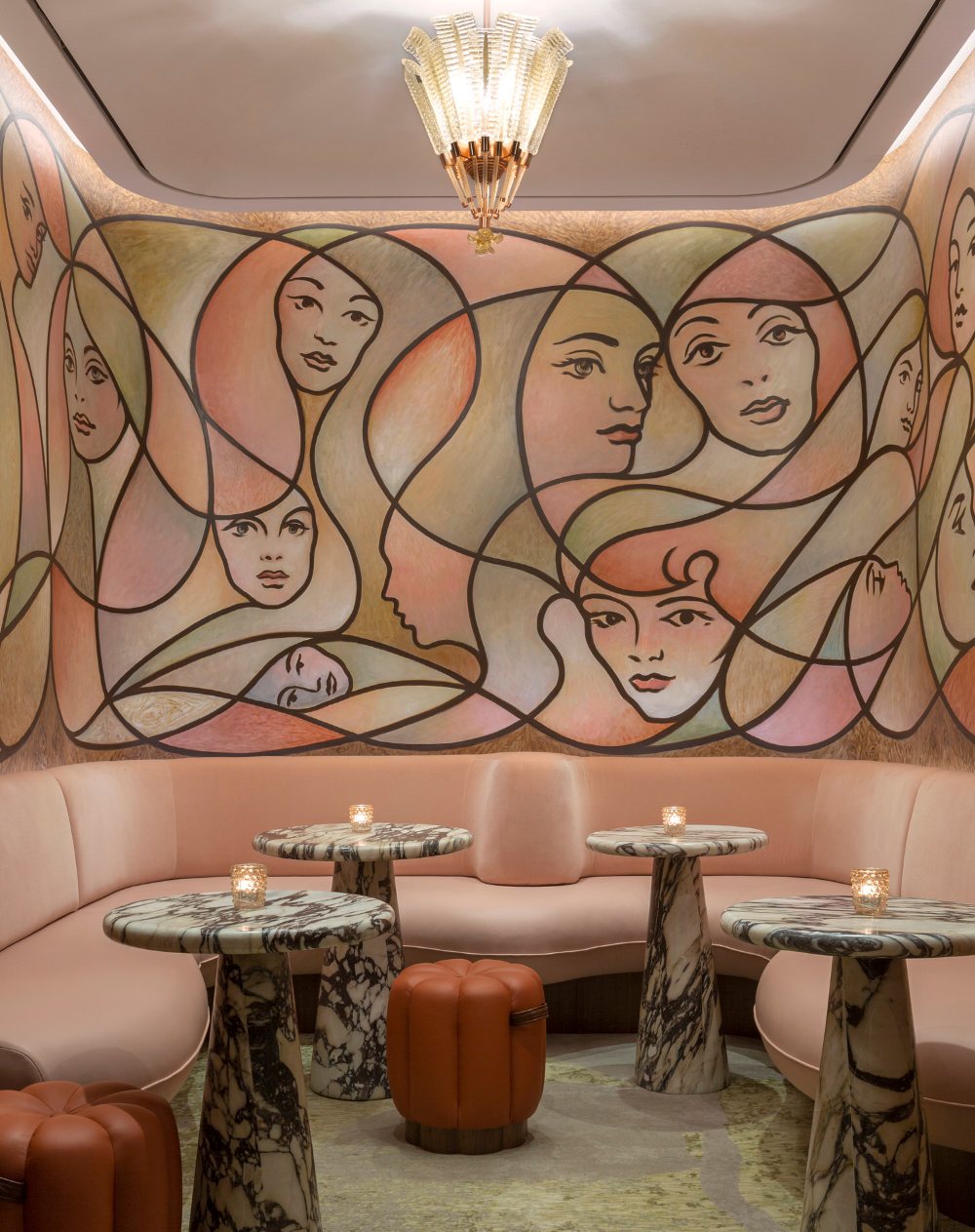
Unique oyster-inspired gilded artwork was used as a focal point at Dixie & 1952 1/2 Liquorette | design by blocHaus

Individually-curated art groupings created a unique experience for each seating alcove at Dixie & 1952 1/2 Liquorette | design by blocHaus

Lighting solutions were tailored to each specific area at Dixie & 1952 1/2 Liquorette | design by blocHaus
This is the approach we take for every project at blocHaus – we tailor each project to our client, creating designs specific to their individual needs and brand vision. This is done throughout the design process, starting from the initial concept and planning. We then carry these personalized design solutions into to fully-custom fixtures, furnishings, and details.
We love knowing that our projects are as unique as our clients and their brands - having the opportunity to create bespoke interior design inspires us, and it allows us to push our creative boundaries on every project!


Telling the story of the sea, the unique shape of Portsmith’s bar was designed as an abstract interpretation of a whale | design by blocHaus
How does bespoke design inspire you?
Photo-Inspired Palettes

@Tiago Murano
Inspiration can come from anything - ideas, stories, objects, even an interesting phrase. As designers working in a visual medium, we’re often inspired by things that are visual and a source of almost constant inspiration for us are images.
Today, we’re taking a look at several amazing photographs and the palettes they inspired - take a look below to see how these beautiful images can be the catalyst for wonderful design concepts!
@Gian Reto Tarnutz


@Muhammed Kara


@Lermakovas

What photos are inspiring you?
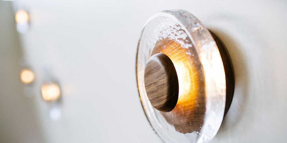
Best of Brass Applications

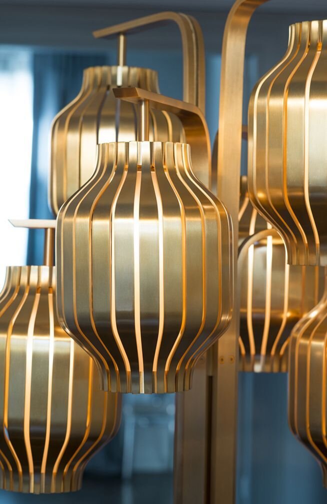
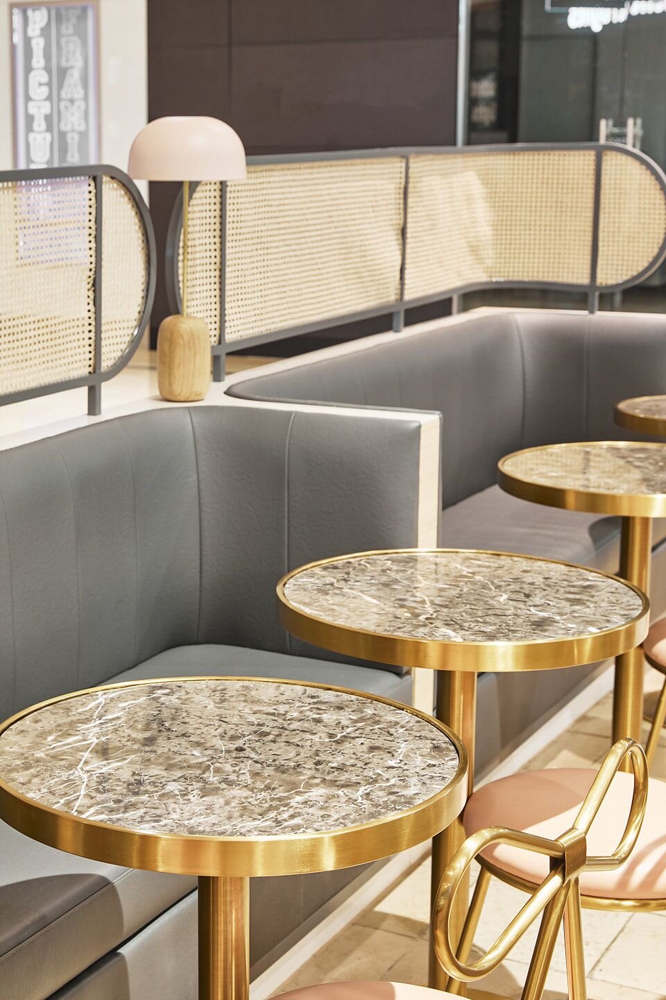
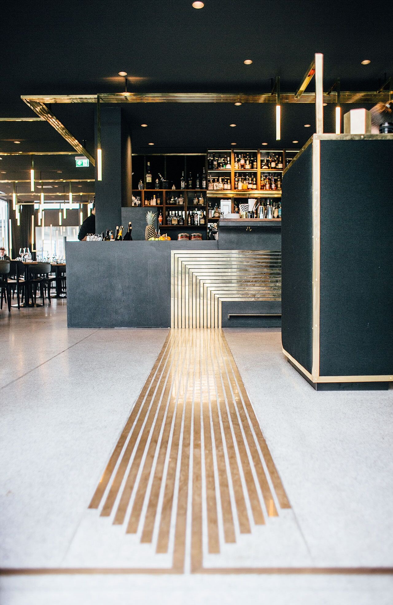
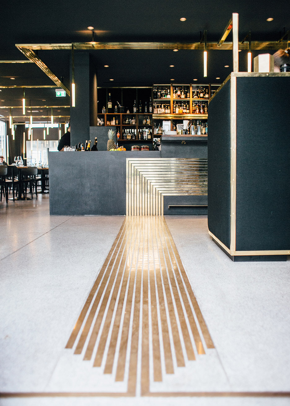
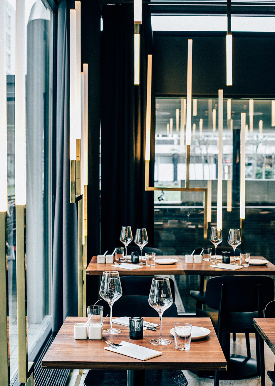
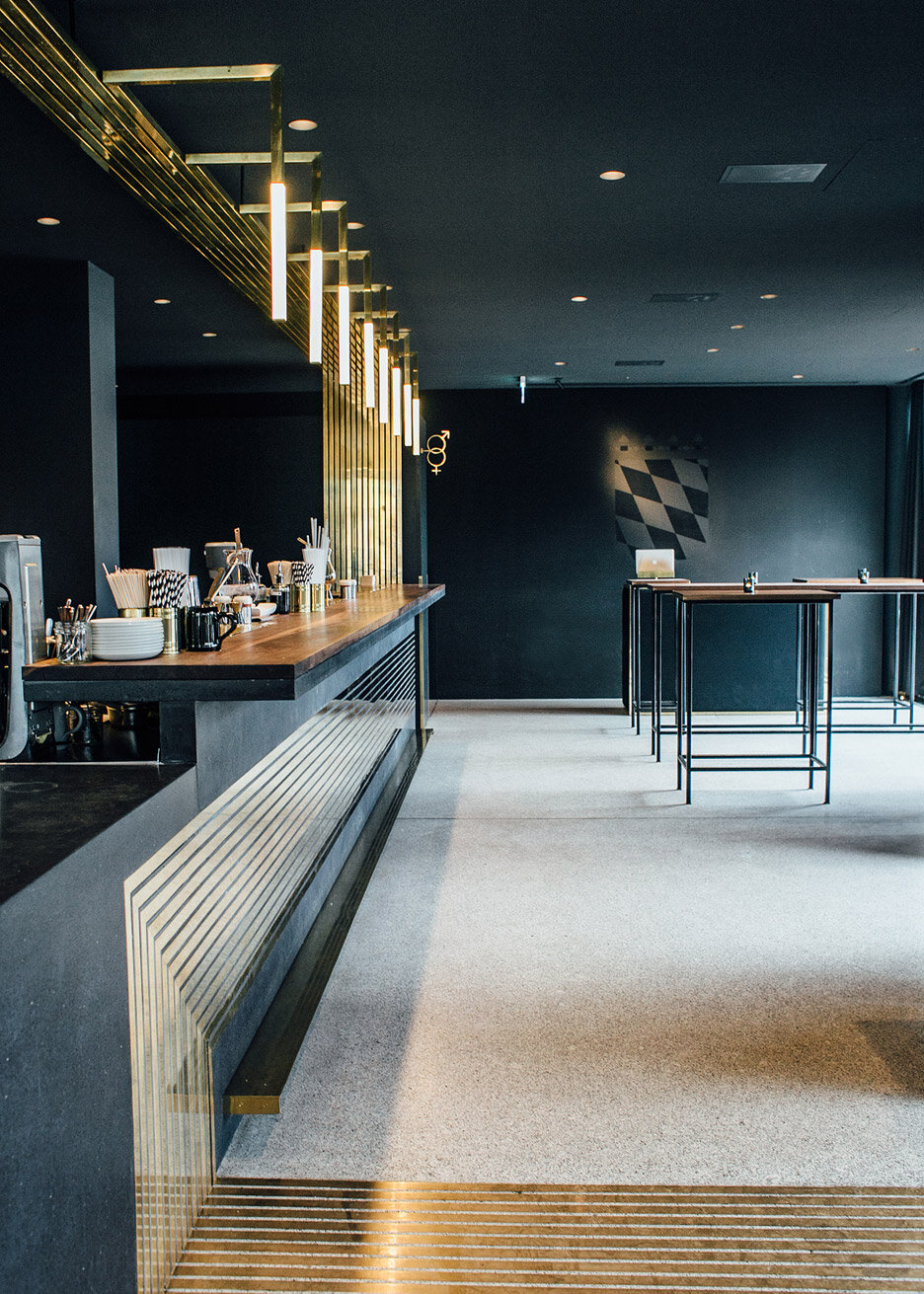
Brass is not a new material; in fact, it’s been “trending” for years now, appearing across residential, commercial, and hospitality design. But the fact that brass has grown so popular doesn’t mean that it’s been overdone or that it’s on its way out - brass is an elegant, timeless, and warm material. It pairs well with tons of other materials like wood, stone, and glass, and is very malleable and ideal for casting.
We often use brass in our own blocHaus projects to add sophistication and warmth, and we love seeing it used in other products and spaces as well - take a look below to see some of our favorite brass applications!
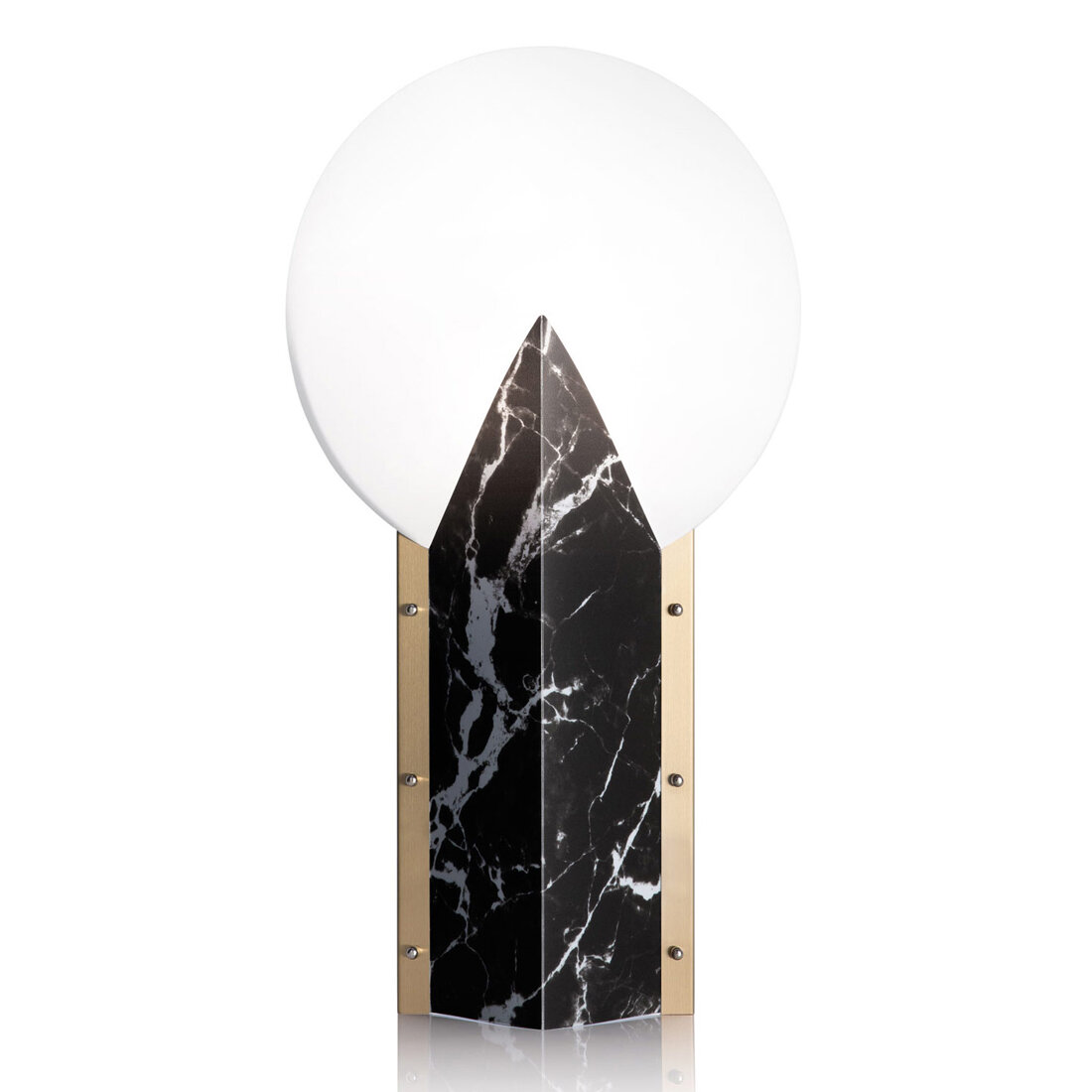
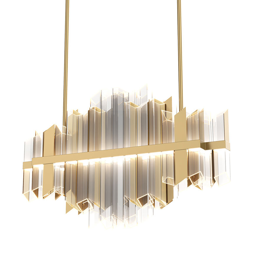
FIXTURES


DETAILS

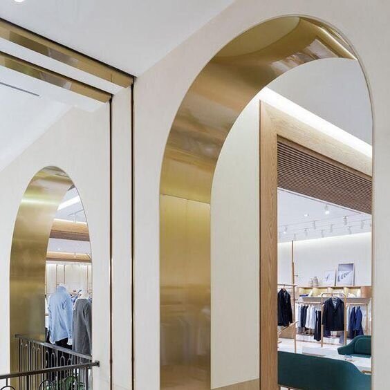
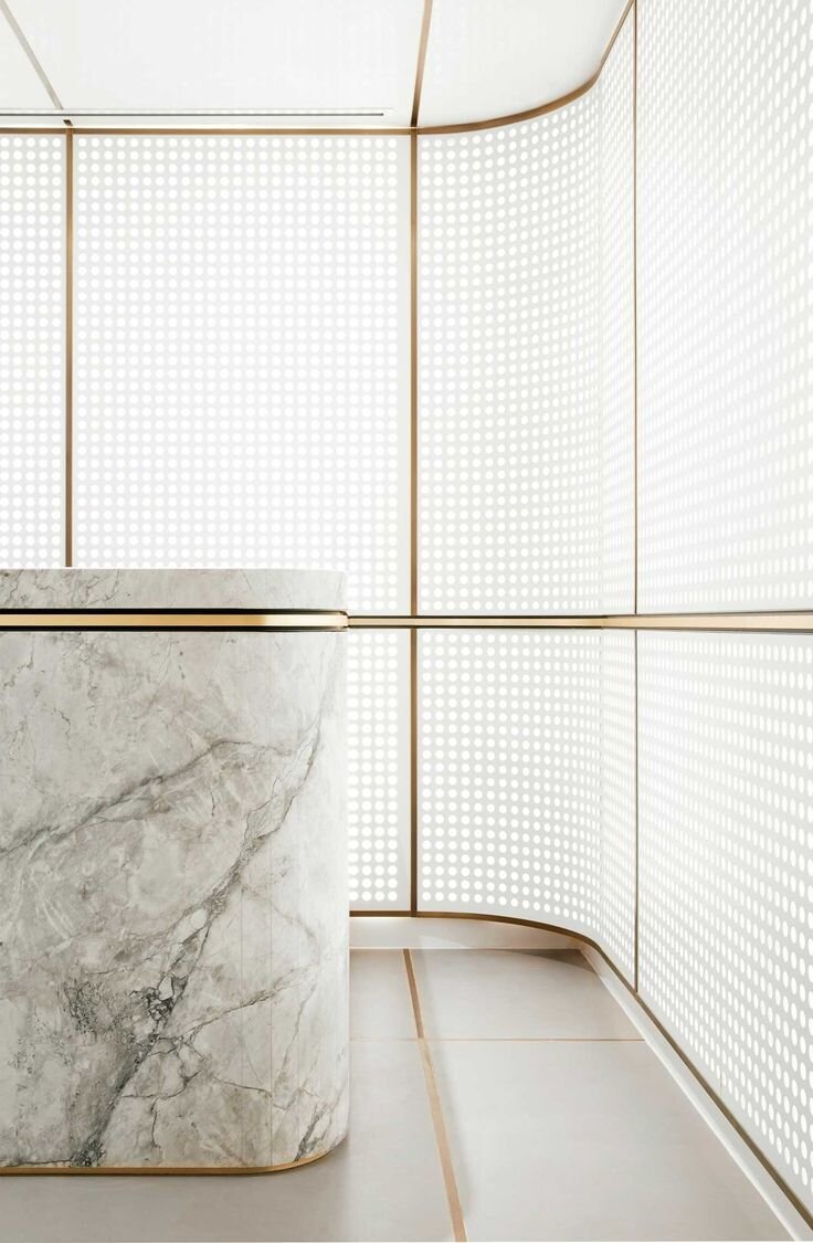
FOCAL POINTS


@Architecture + Information
What are some of your favorite brass applications?
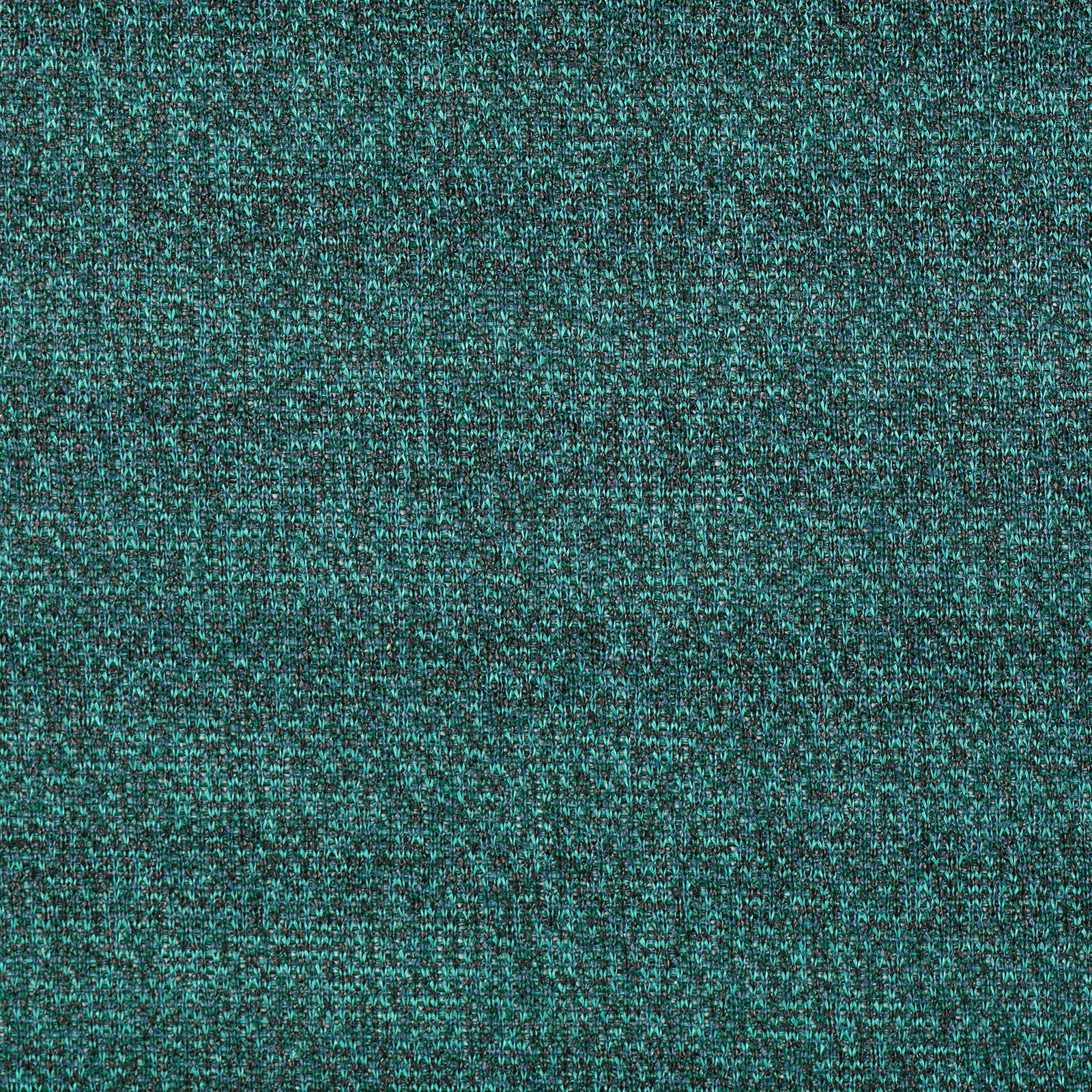
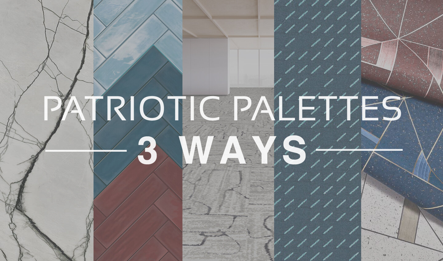
Patriotic Palettes | 3 Ways
Everyone knows the colors of the American flag are red, white and blue. And at this time of year when Independence Day draws close, these colors seem to be everywhere from decorations, to clothing, to retail displays. And while this trend always fades as the summer holidays pass, there’s no denying that these classic colors aren’t limited to holiday merchandise.
Red, white, and blue is a classic combination. It has both warm and cool tones for interest, with a bright neutral to balance them out. Moreover, this color combination can be interpreted in countless different ways, either by playing with the colors themselves or by adding new textures, materials, and patterns into the mix.
Today, we’re taking inspiration from the upcoming holiday and sharing a few ideas for Independence Day material palettes - take a look below at some of our favorite patriotic-inspired combinations!
PALETTE 1
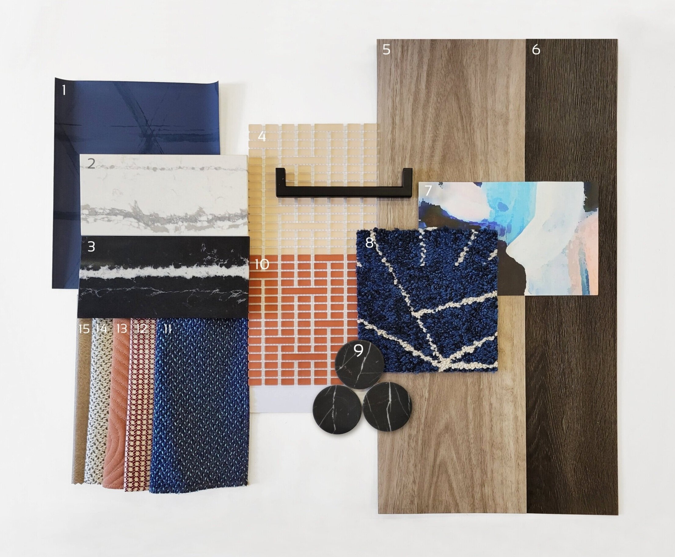
1) Triad, Midnight Blue | @Arc-Com 2) Et Bella | @Silestone 3) Eternal Marquina | @Silestone 4) Mist, Peach | @Mosaico+ 5) Eucalyptus Saligna | @Milliken 6) Woodlands, Ebony | @EF Contract 7) Tilda, Blush Lapel | @Mitchell Black 8) Skyfall, Cobalt | @Flor 9) Nero Marquina Dots | @Roca Tile 10) Mist, Paprika | @Mosaico+ 11) Quill, Swan | @HBF 12) Theo, Dark Red | @Brentano 13) Ms. Quilty, Fickle | @HBF 14) Quill, Goose | @HBF 15) Cow House, Pavement | @Valley Forge
For a sophisticated spin on the traditional 4th of July palette, red can be swapped for elegant peach tones to add whimsey. Including very saturated blues (both light and dark) helps to ground this palette while adding variety. The wood tones bring warmth and texture, balanced by timeless stone materials. When put together, this palette is a playful and sophisticated combination of styles, textures, and color tones.
PALETTE 2

1) Sommalier | @Sherwin Williams 2) Yohen Border, White | @Inax Tile 3) Bars | @Audrey Lane 4) Olaria, Blue Steel | @Roca Tile 5) Walnut | @Bacon Veneer Company 6) Skara Brae | @Cambria 7) Duet, Blueprint | @Brentano 8) Merit, Cabernet | @Maharam 9) Sideways, Blanc | @HBF 10) Theo, Dark Red | @Brentano 11) Mist, Avio | Mosaico+ 12) Walnut Tambour | @Surfacing Solution 13) To the Point, All Nighter | @D.L. Couch 14) To the Point, Gold | @D.L. Couch 15) To the Point, Graphite | @D.L. Couch 16) To the Point, Inky | @D.L. Couch
Classic red, white, and blue never goes out of style! This ensemble is an modern take on a timeless palette, with beautiful colors and sophisticated accents that elevate it to a new level. Warm, textured woods juxtapose, sleek, gold metallics to create balance. Stone with a large-scale veining pattern add elegance, while fun geometric wallcoverings add an element of playfulness.
PALETTE 3

1) Maple Tambour | @Surfacing Solution 2) Sunbeam, Matador | @Sina Pearson 3) Prime, Iceberg | @Maharam 4) Gem, Lapis | @Brentano 5) Bright Angle, Cyan | @Maharam 6) Lines, Black & White | @Olivia + Poppy 7) Deconstructed Stripe, Ivory on Black | @Schumacher 8) Maddox Deco, Black | @Stacy Garcia 9) Penny Rounds, Aqua Blue | @Artistic Tile 10) Penny Rounds, Steel Blue | @Artistic Tile 11) Penny Rounds, Coral Red | @Artistic Tile 12) White Oak Planked Groove | @Treefrog 13) Tre Super Jag, Black | @Somer Tiler 14) Marble Breach | @Florim 15) Gem I, Midnight Ocean | @Ann Sacks
Using bold corals and aqua blues, our final concept is a bright and modern interpretation of a 4th of July palette! In addition to the unique colors, mixing in graphic black and white patterns and materials adds a playful element. Geometric tiles, wallcovering, and textiles are balanced by the natural patterns of woodgrains and marble-look stone. Finally, the light wood tones tie the palette together with warmth and texture.
How are you inspired by the colors of Independence Day?
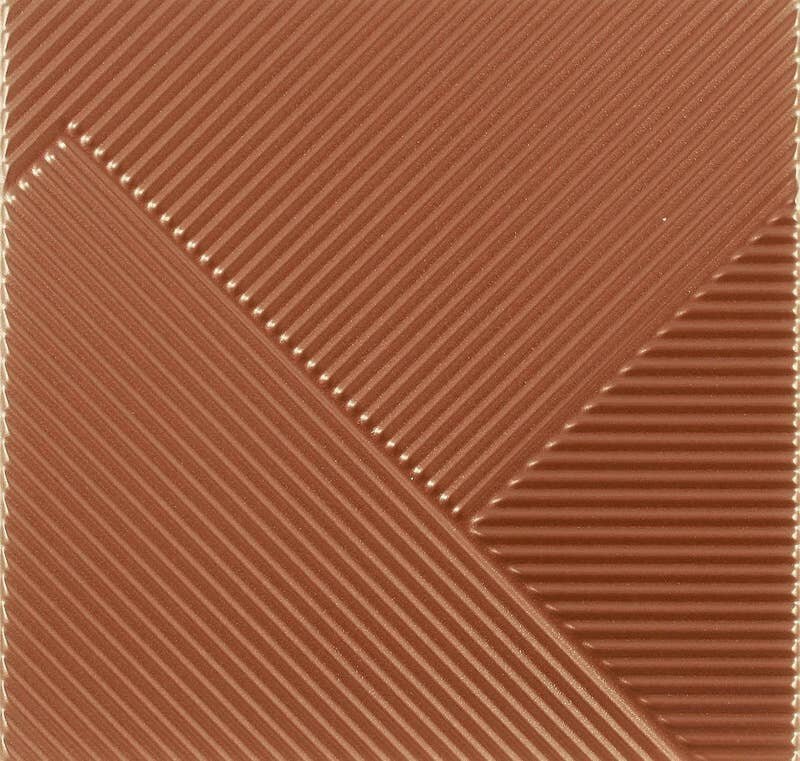
LAB | Logo Applications
Branding is an important part of any commercial space; from the moment you walk in, a business’s interior should reflect the company’s ethos, aesthetic, attitude, and personality, giving you a tangible introduction to what the brand is all about!
We frequently use interior design to help support these efforts, and love collaborating with clients to ensure all design elements in the space (down to the smallest details) work with their brand vision. But sometimes, the space calls for more than visual reinforcement of the company brand through materials, lighting, or FF&E selections. Often, there are spaces that need a more direct implementation of the brand and when that happens, it provides an opportunity for us to explore creative logo applications!
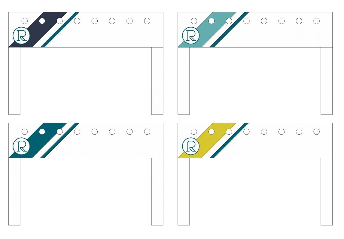
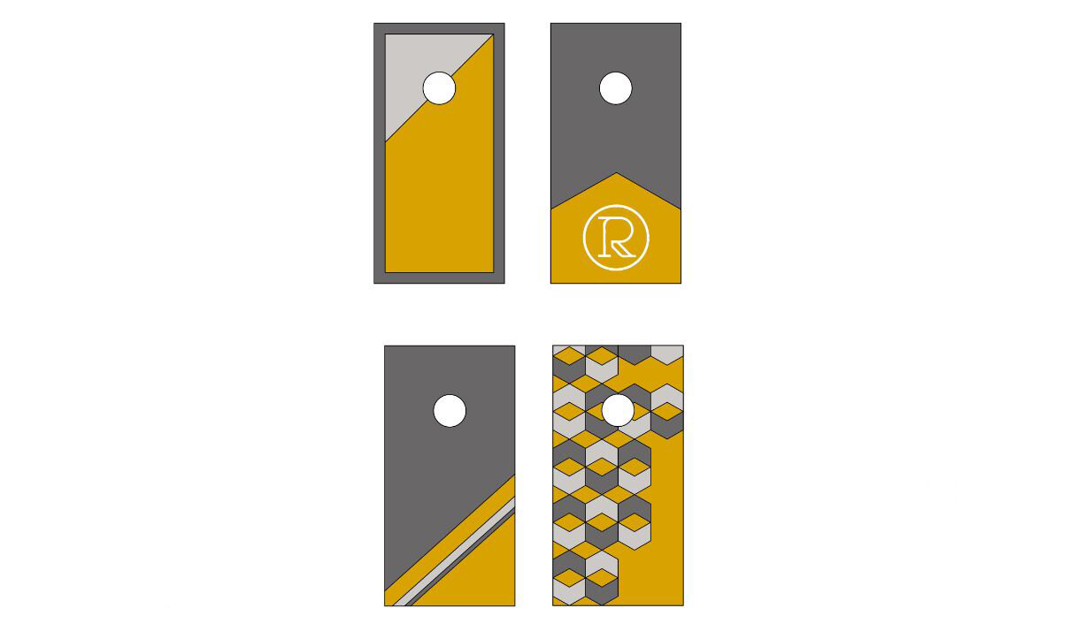

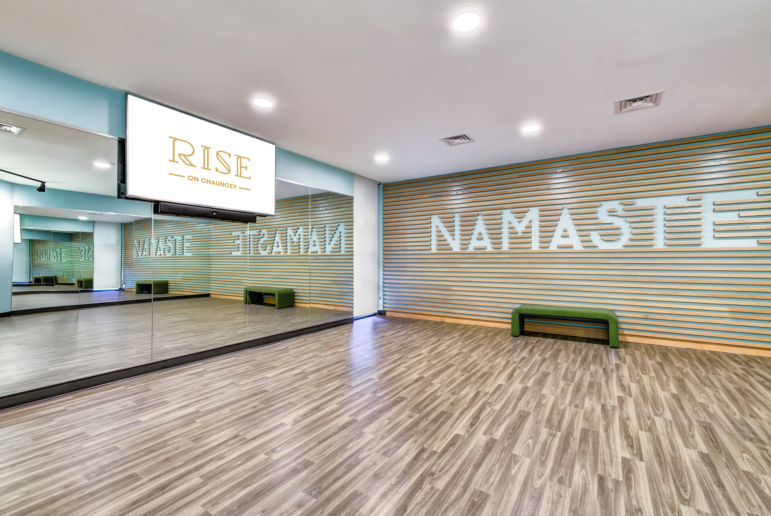
It all starts with a full exploration of the brand - initial concepts, sketches, and a complete understanding of the visual identity are all vitally important parts of the process! Sometimes a logo can be applied throughout a project to reinforce the brand in subtle ways. At Rise on Chauncey, we were able to incorporate the project logo as part of the wall signage, in furniture, and even on outdoor lawn games.


We had an opportunity to fully explore the concept behind Sparrow Coffee when working through the project’s logo design and branding. Everything from feature art walls, signage, and packaging were part of the logo applications utilized in this project, allowing us to reinforce the brand concept in a very unique and tangible way!
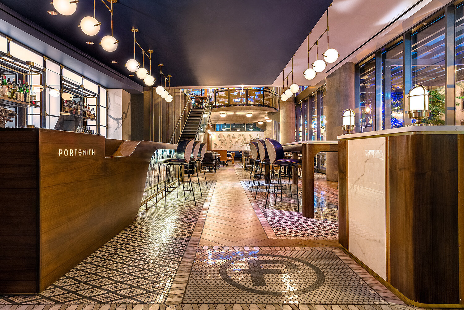
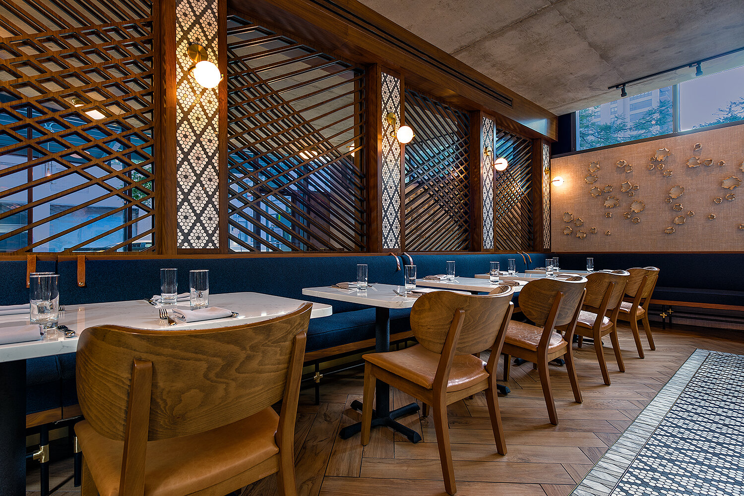
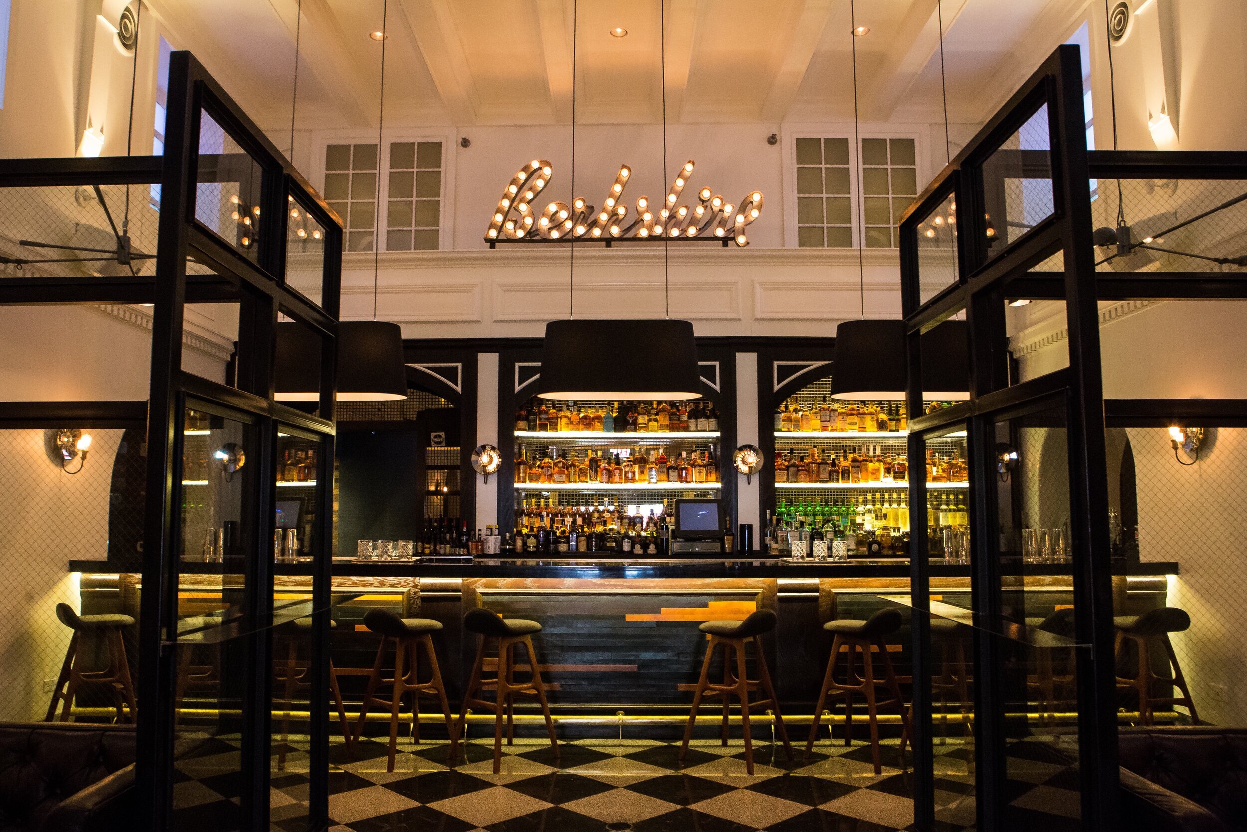
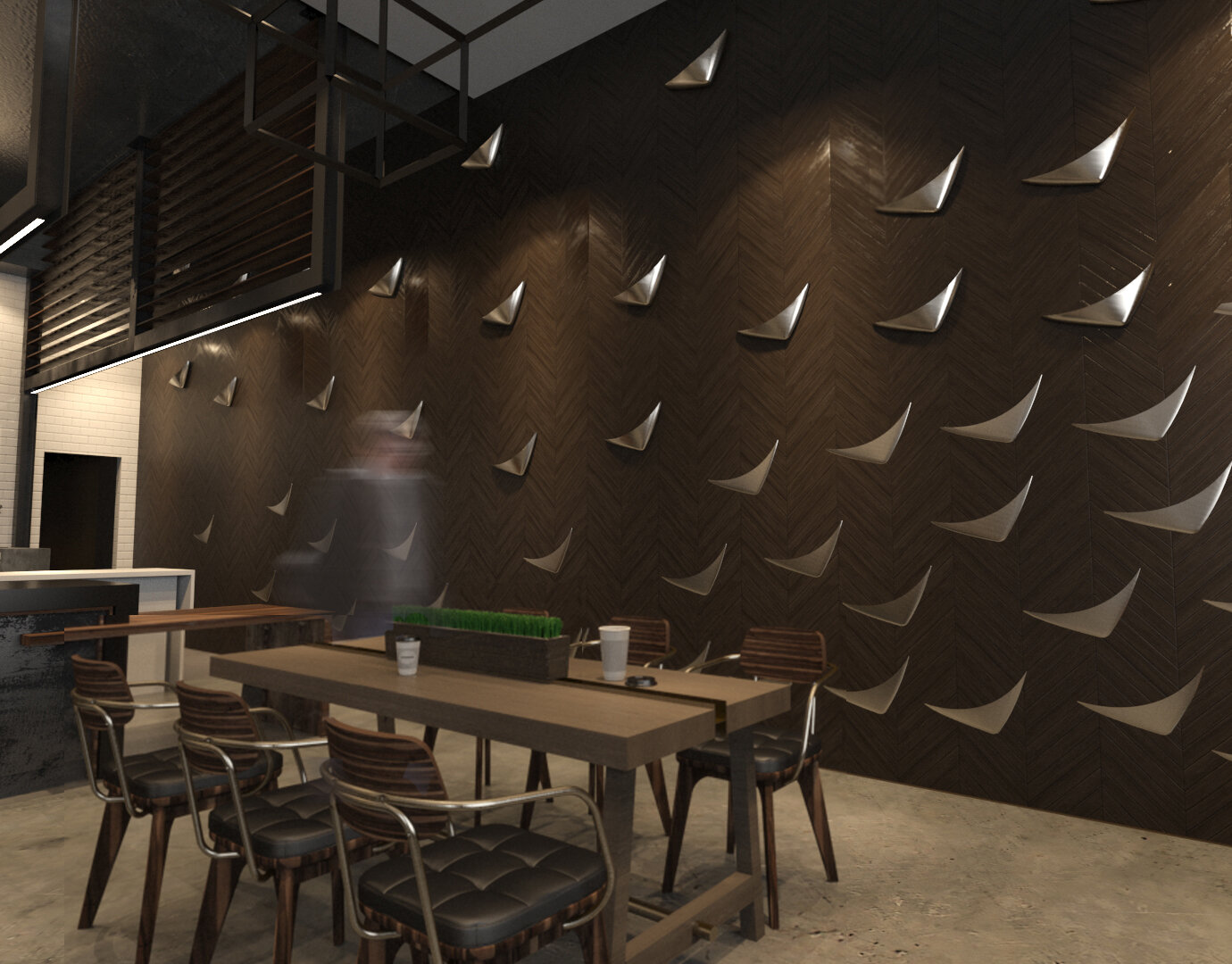
Even the simplest elements from a logo can become part of the interior and reinforce the brand! At Portsmith, we not only incorporated the logo into a custom bar design and floor mosaic, but also integrated the isometric line patterns from logo into a beautiful wood & mirror feature wall.


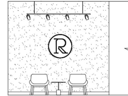
Of course, there are lots of creative ways to include a logo in a design. But sometimes the simplest applications are the best - a focal area featuring the logo can be a great addition to the design, as well as a way to reinforce the brand!
What creative logo applications are inspiring you lately?
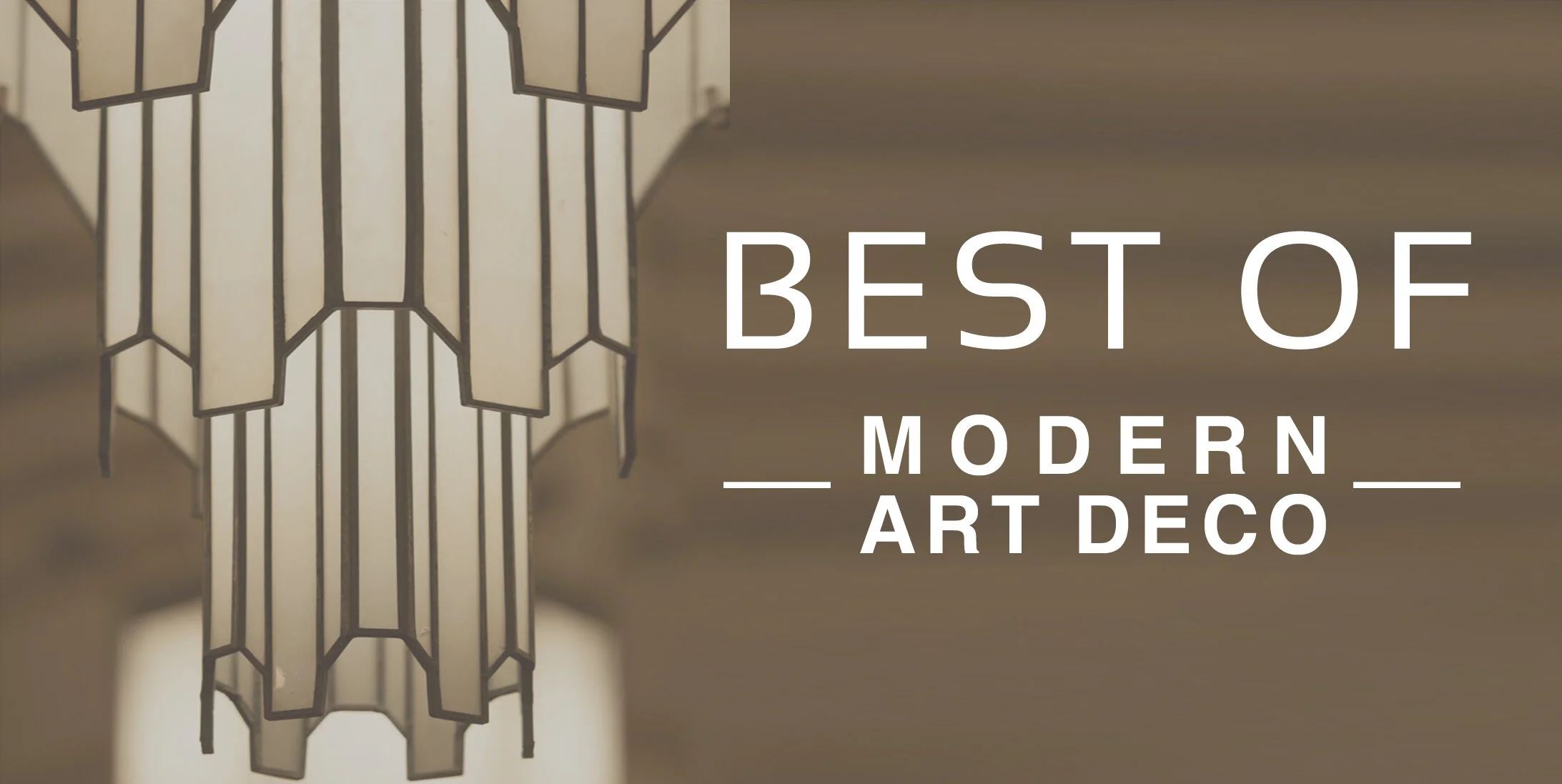
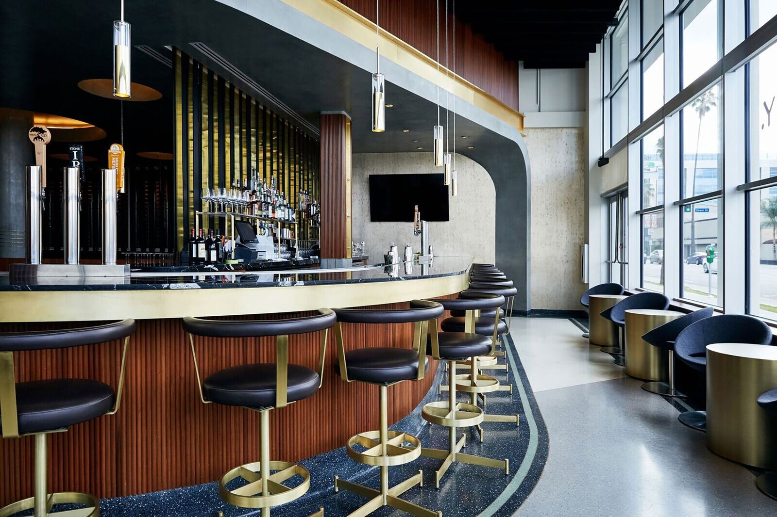
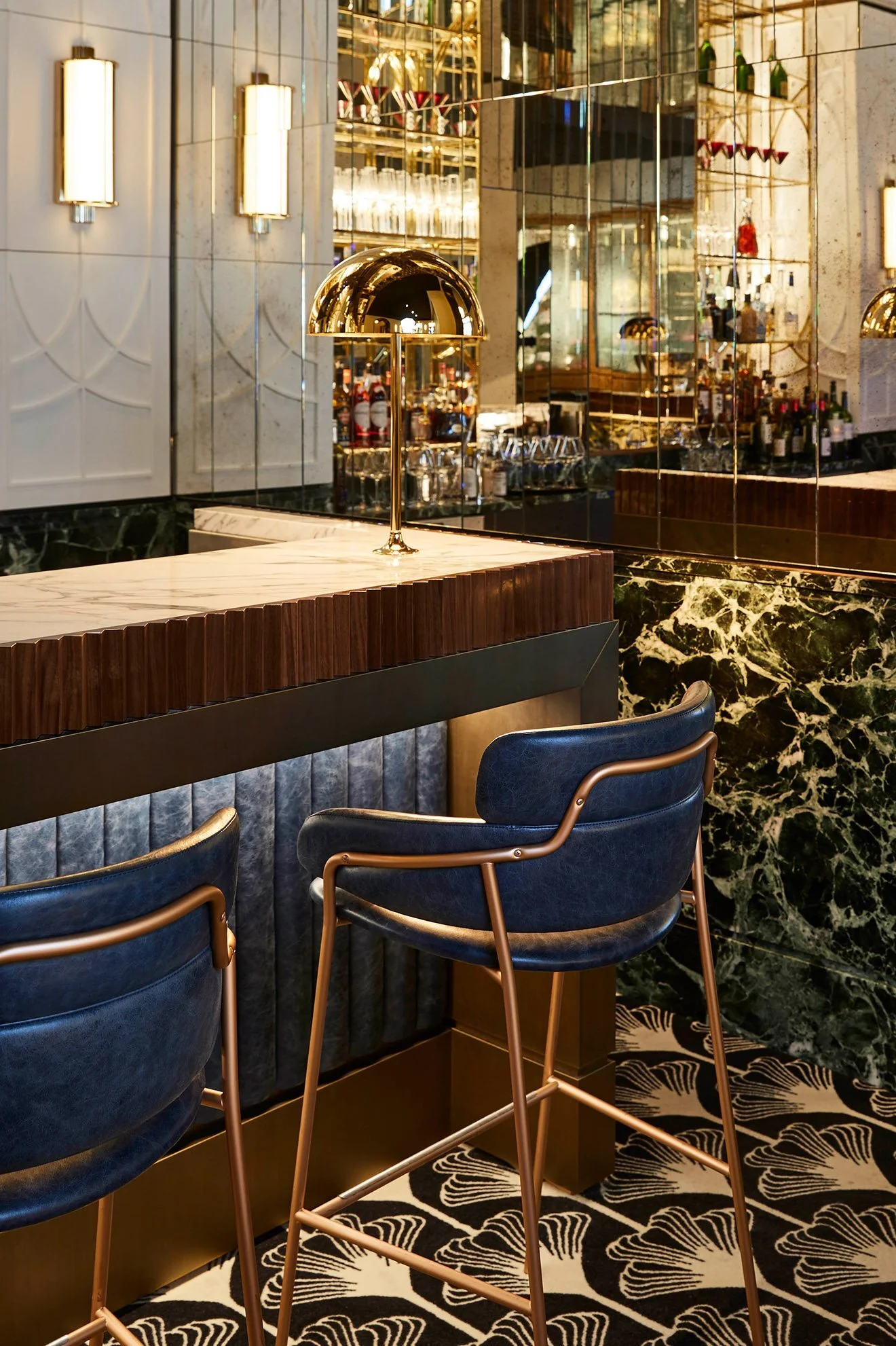
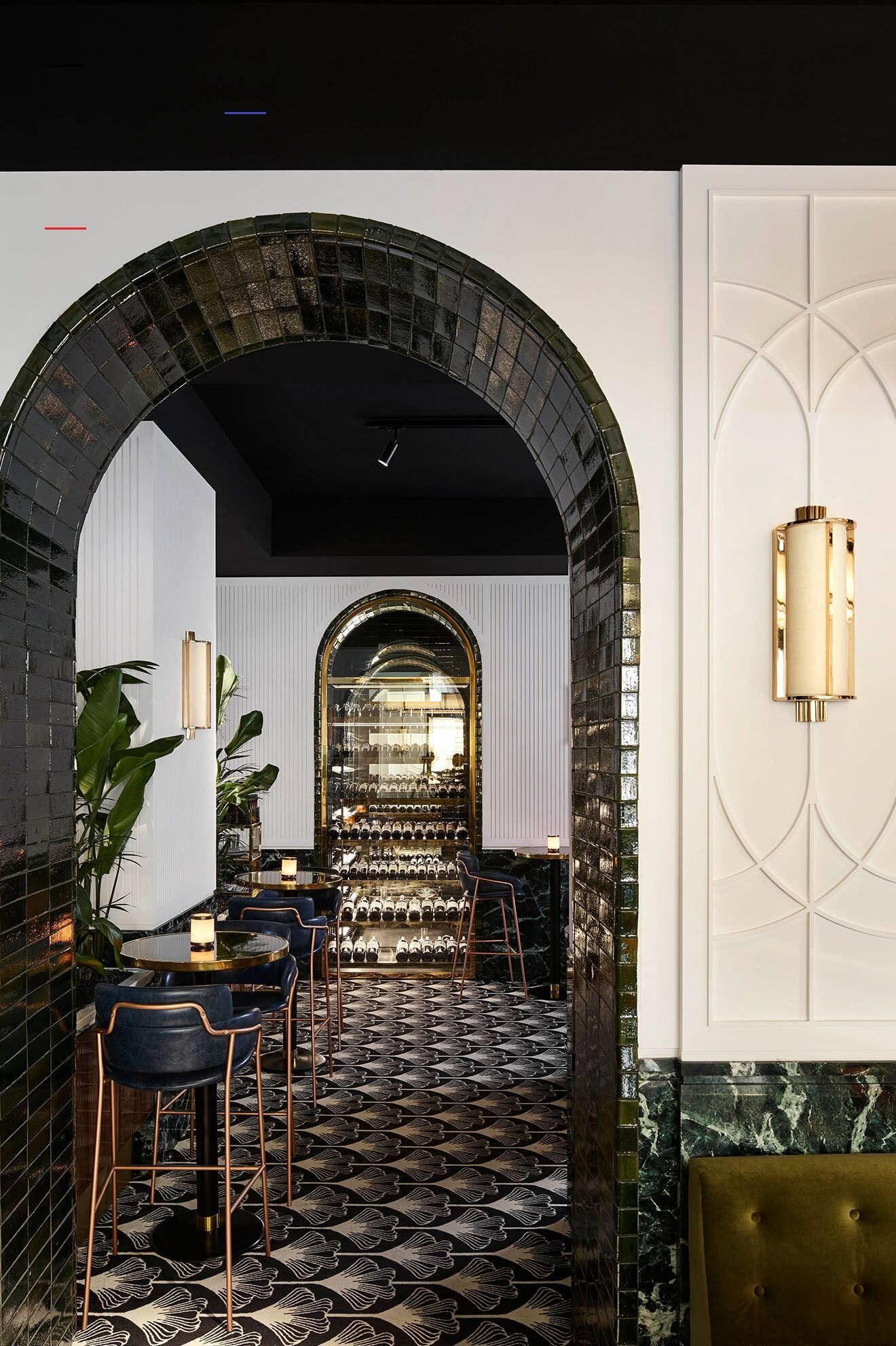
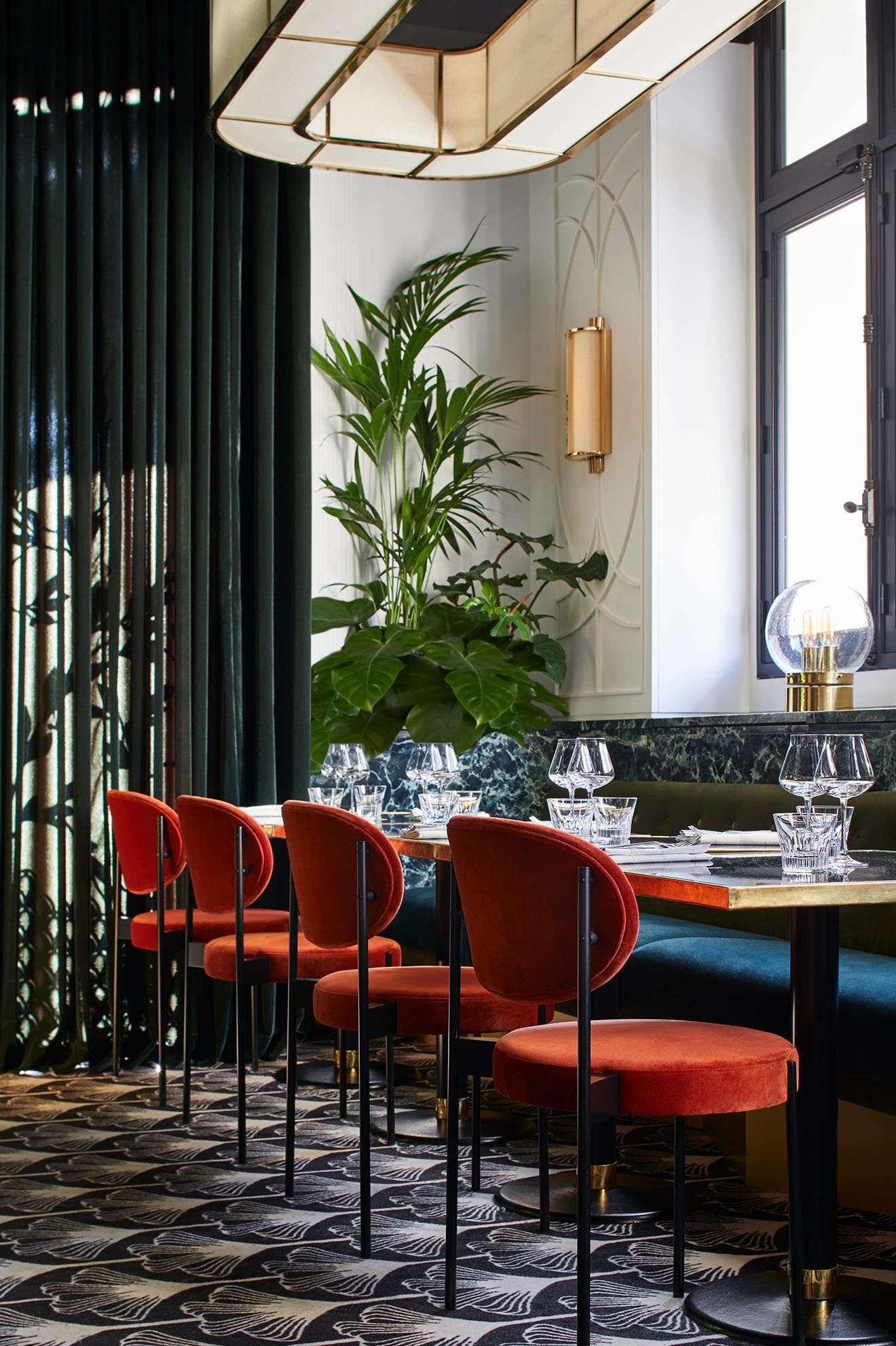
Best of Modern Art Deco Style
@Colin Miller
Classic, elegant, luxurious - all good words to describe the Art Deco design movement. Coming of age in the during the 1920s, Art Deco style harkens back to the major themes of that decade; Prohibition, the Jazz Age, the and the first glimpse of mass consumerism all led to a style that evoked a sense of glamour, intrigue, and dark sophistication.
The key characteristics of this design movement were the use of bold colors, geometric elements, and the application of modern materials like metals and glass. But more than anything, the Art Deco design movement was progressive and forward-thinking, creating experiences that felt both hopeful and bold.
Of course, these ideas weren’t only applicable to the 1920s but are still very relevant today. Inspired by the greatest designs of the 1920s, Art Deco’s influence can be seen in some of the most exciting spaces and products being created today! We’ve often drawn inspiration from this era, adapting its geometric forms and classic materials to pay homage to the Art Deco movement in modern and sophisticated spaces.
Today we’re showcasing a collection of modern Art Deco spaces and products - take a look below to see some of our favorites!
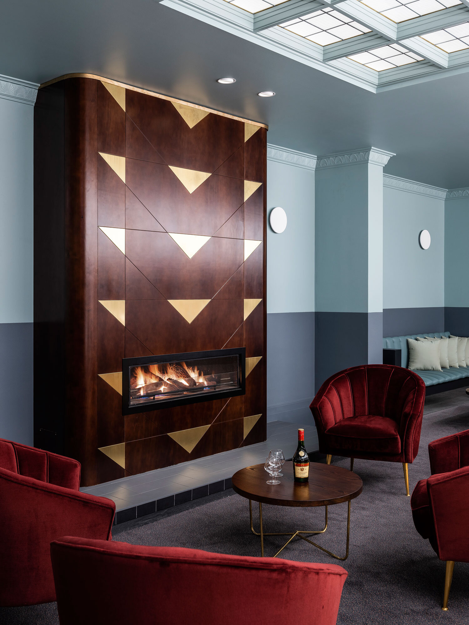
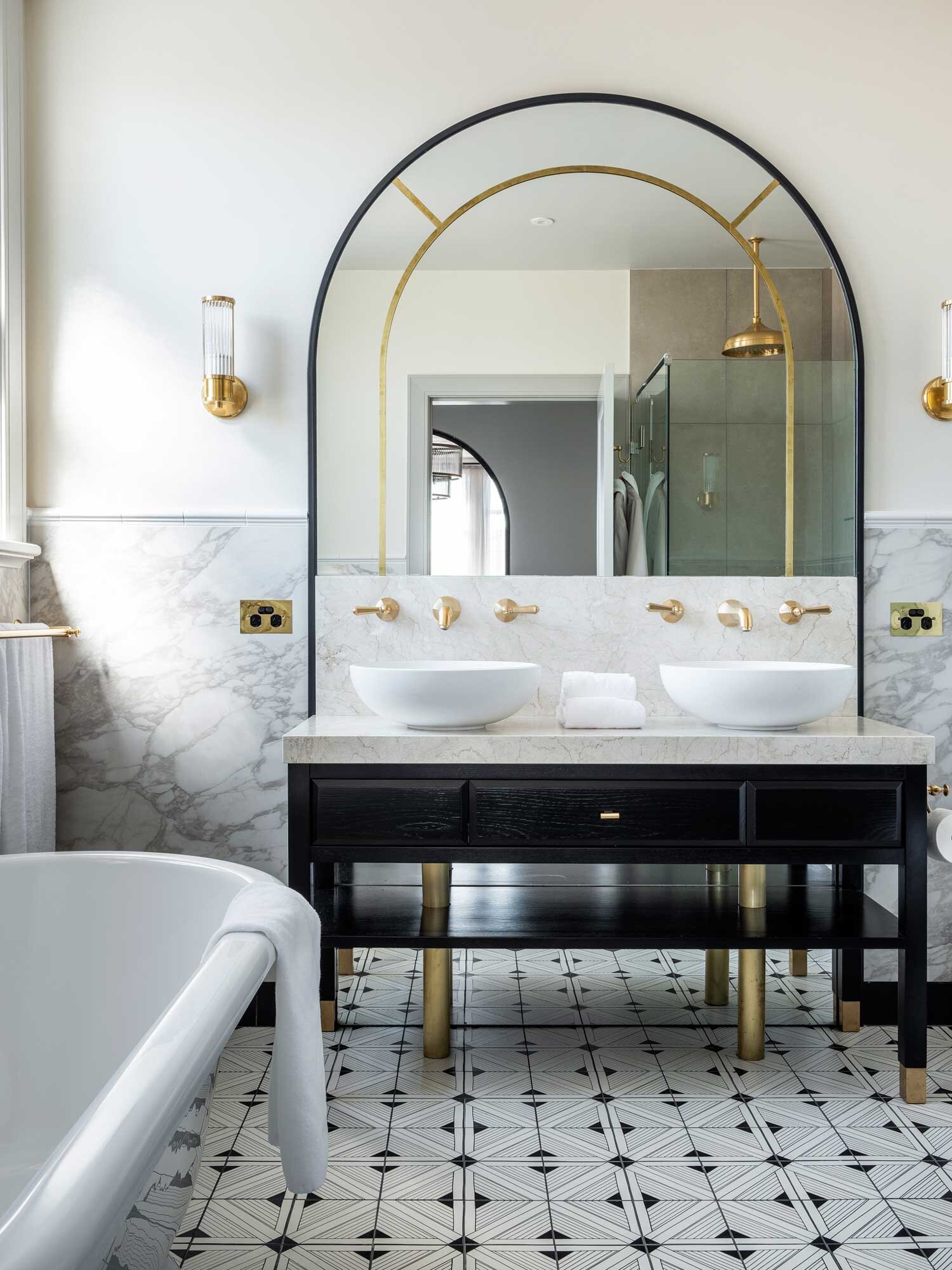
BEST OF MODERN ART DECO | SPACES
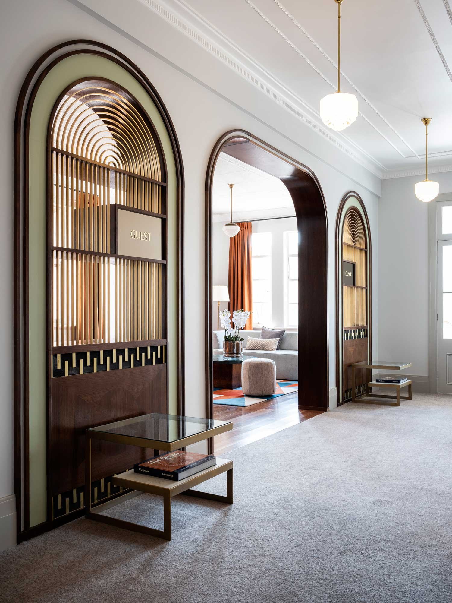
Tattersalls Hotel | @Luchetti Krelle

Paley Hollywood | @Plan Do See
Beefbar Paris | @Humbert & Poyet
Gwen | @Home Studios
Herzog Bar & Restaurant | @Built Inc. Architects
BEST OF MODERN ART DECO | PRODUCTS
How does modern Art Deco style inspire you?
International Design Trends
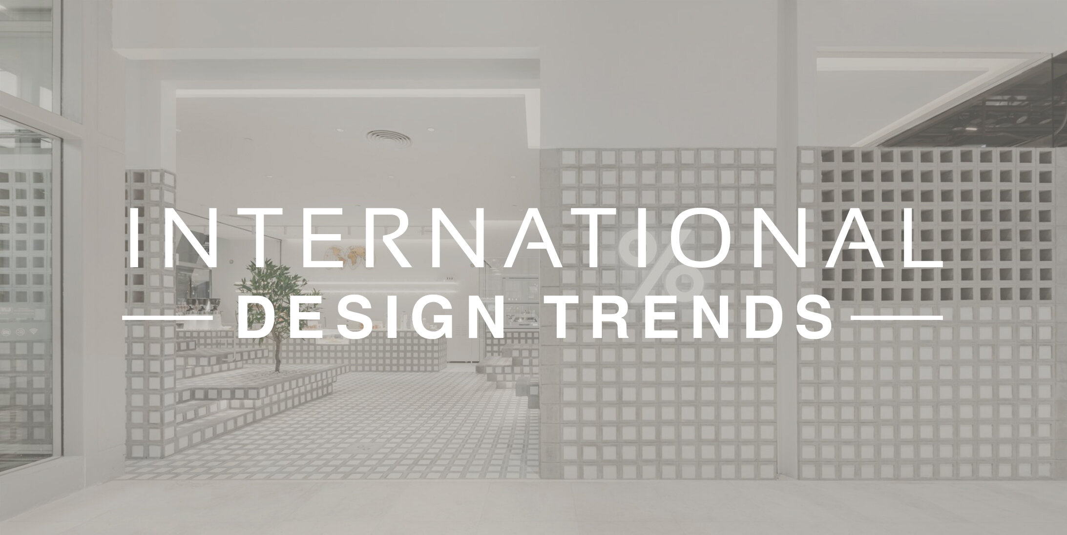
@Precht
Interior design trends are never a stationary target, and fresh concepts are constantly evolving to inspire and amaze. We love taking existing ideas and reinterpreting them in new ways, and appreciate seeing other designers do the same. But because creation is so often influenced by experience, we frequently like to expand our point of view and see what where design is headed on a more global level.
Today we’re taking a look at international design and the trends that we’re seeing aboard. Take a look below to get an overview of these trends and some of our favorite projects that use them!
ENBRACING A SOFTER SIDE
We’re seeing more and more international design with softer concepts, colors, and textures - check out a few of our favorites below!
@Elena Lokastova
A Moscow jewelry store has achieves a soft and luxurious feel using pastel colors inspired by local architecture and plush textures.
@Bryan O’Sullivan
The Berkeley Bar in London strikes a perfect balance by mixing masculine materials like wood and tone with feminine colors and forms
@PAVE Architects
A recent remodel at the Original Sokos Hotel Arina in Finland introduced locally-inspired theme rooms, which are based on whimsical concepts like as Summer Night and Salmon and Tar
REFINED + MINIMAL
A refined and minimalist aesthetic has been quite prominent in many international projects this year. We love the clean lines, sophisticated palettes, natural textures, and impeccable lighting used in these spaces - take a look below to see a collection of our favorites!

@YuQiang & Partners
A beautiful, minimalist hotel, the Hainan Nanyang Meili Hui in Danzhou, China uses a combination of simple yet engaging geometry and natural elements to create refined and elegant spaces
@Roar Studio
The Sensasia Stories Spa in Dubai juxtaposes brutalist elements with natural materials, ethereal lighting, and glamorous details
@Cumulus Studio
The design team behind Hotel Verge wanted to project to fit purposefully within the heritage and context of it’s location in Launceston, Australia. The area’s industrial history informed their use of sleek, raw materials and sophisticated forms.
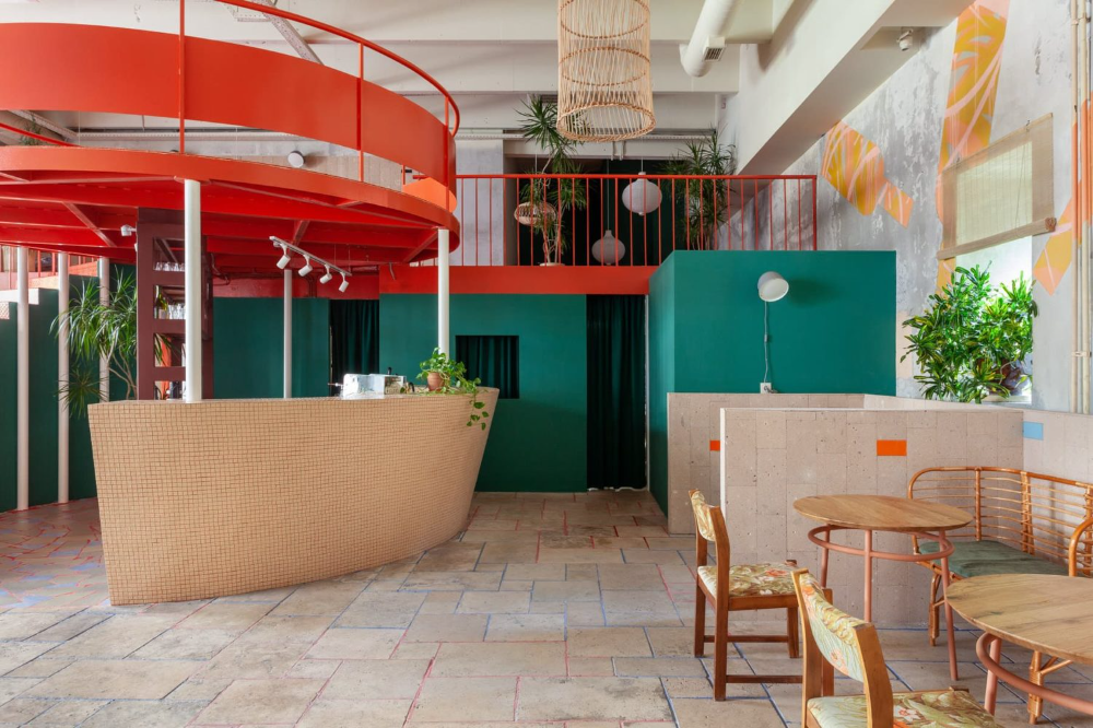
BOLD COLORS
A new trend in bold, playful colors and can be seen in many recent international projects - check out a few favorites below!
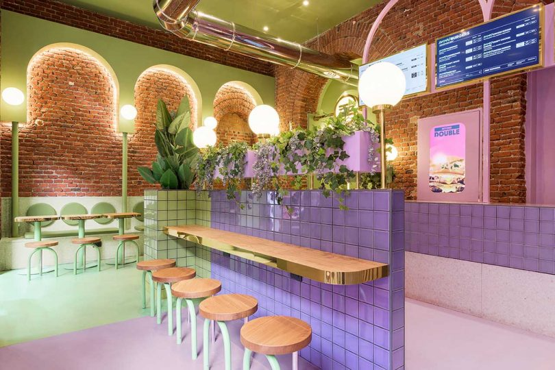

@Masquespacio
A Milan location for the the Italian hamburger chain Bun mixes vintage elements, bright colors, and sophisticated details to appeal to a new generation of younger customers
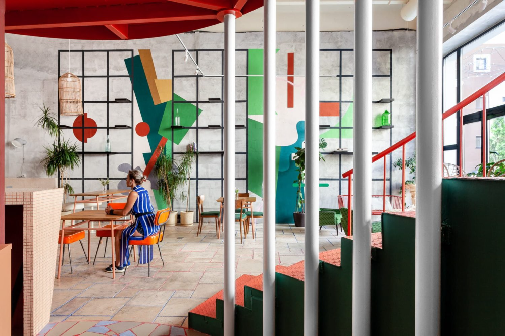
@Dvekati
A Moscow wine bar provides a fun and playful atmosphere using bold shapes and bright colors
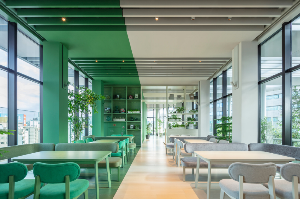
@Klein Dytham Architecture
The Toggle Hotel in Tokyo makes bold use of color-blocking, mixing clean lines with bright tones for a sophisticated but playful atmosphere
What international design trends are inspiring you lately?
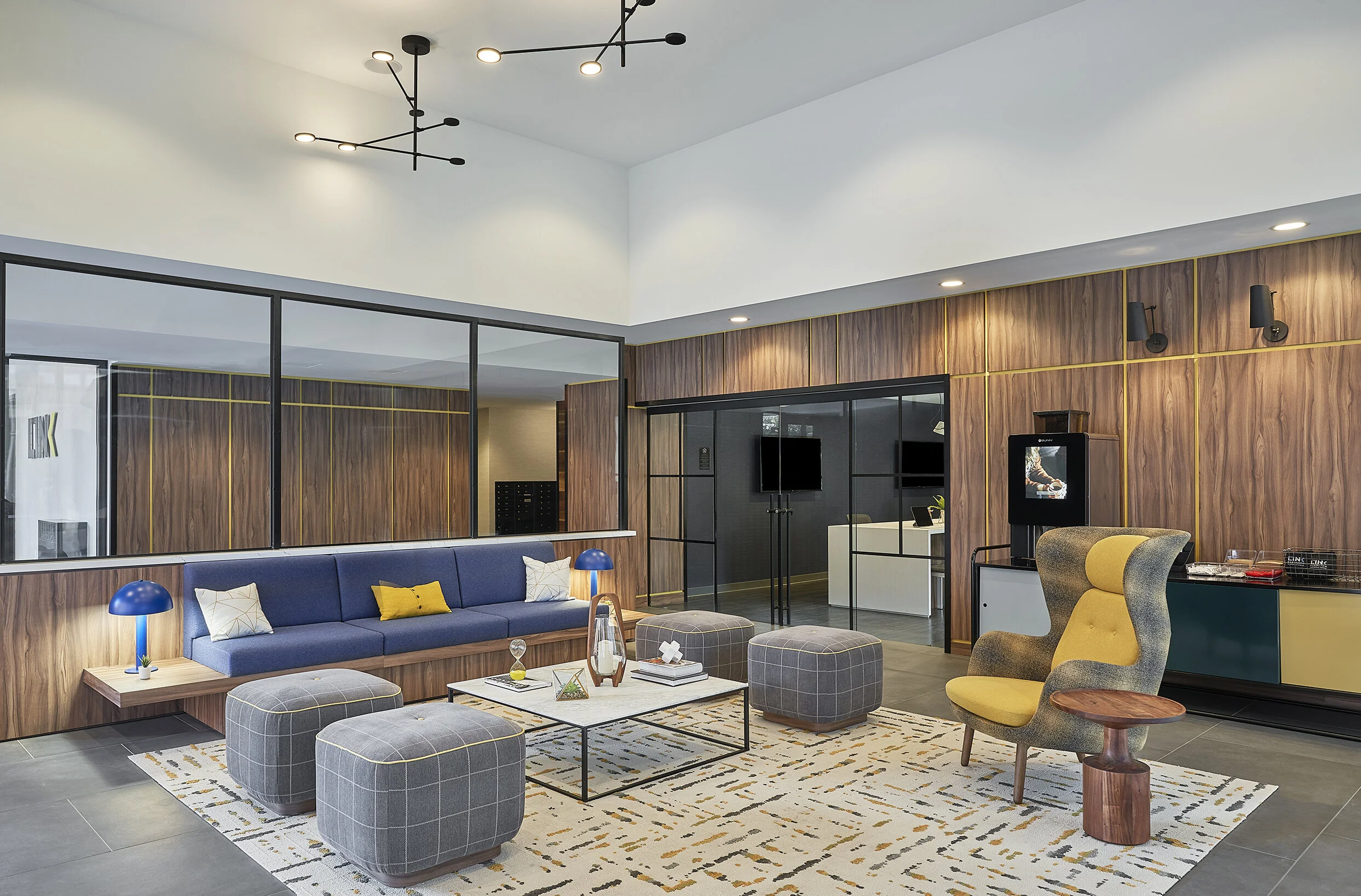
Amenity Spaces

Link at Evanston | @blocHaus
Amenity spaces in a lot of multifamily housing properties might seem like an afterthought. Basic lobby and front desk, standard mailboxes along a corridor; maybe there’s a gym with a few treadmills and free weights, or a small outdoor pool with lounge chairs. While this might describe the amenities in many of the apartment buildings we’re familiar with, the fact is that we’re now seeing multifamily housing projects that put amenities at the forefront and turn these spaces into great features.
In order to attract and retain tenants, multifamily amenities not only need to serve basic needs, but they also need to enhance the living experiences for residents. There are a lot of great ways you can do this when designing amenity spaces, and we love being able to create unexpected and amazing amenities in our own multifamily projects as well! Today we’re breaking down some of the basic amenity types seen most in multifamily interior design, and taking a closer look at how they can be designed be amazing features for any building!
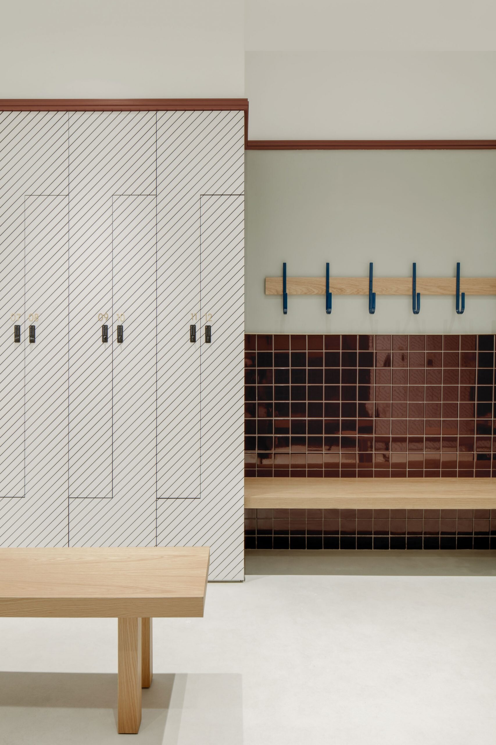
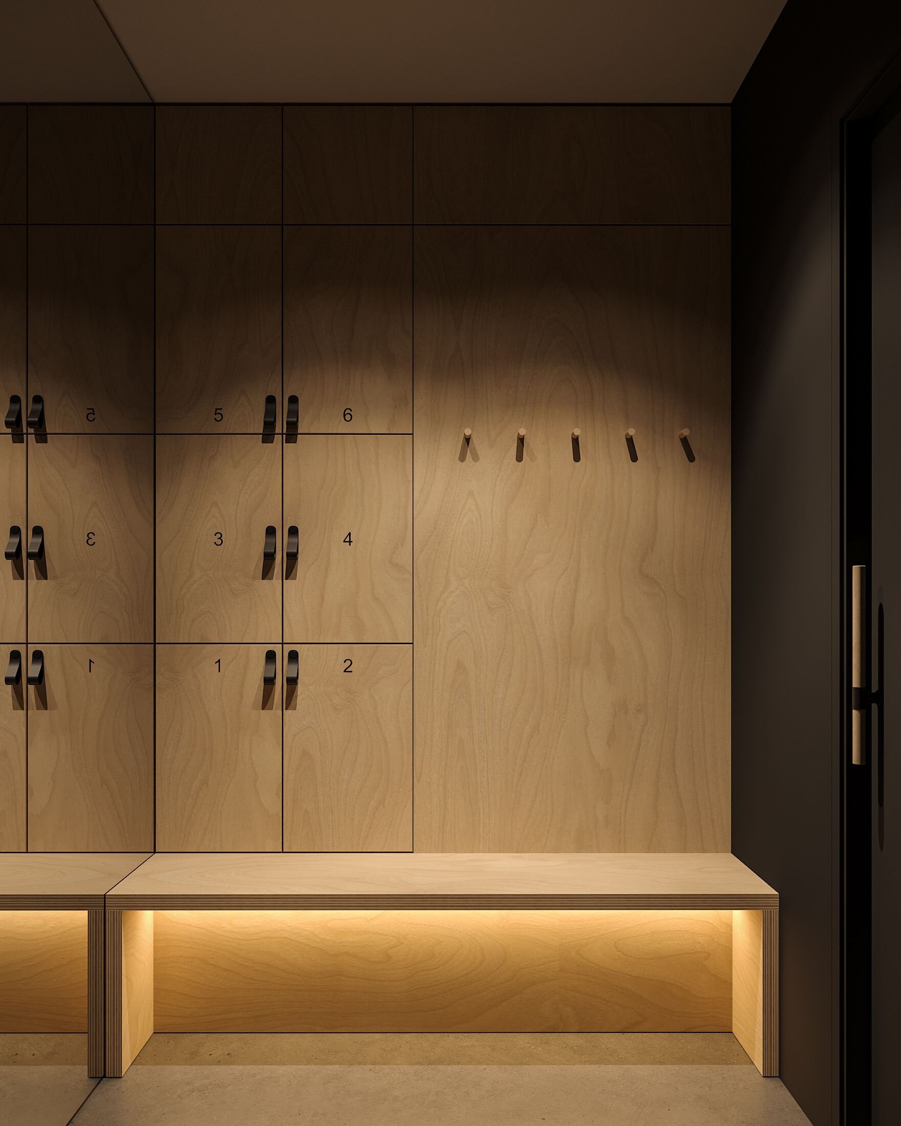
LOBBY + MAILROOM
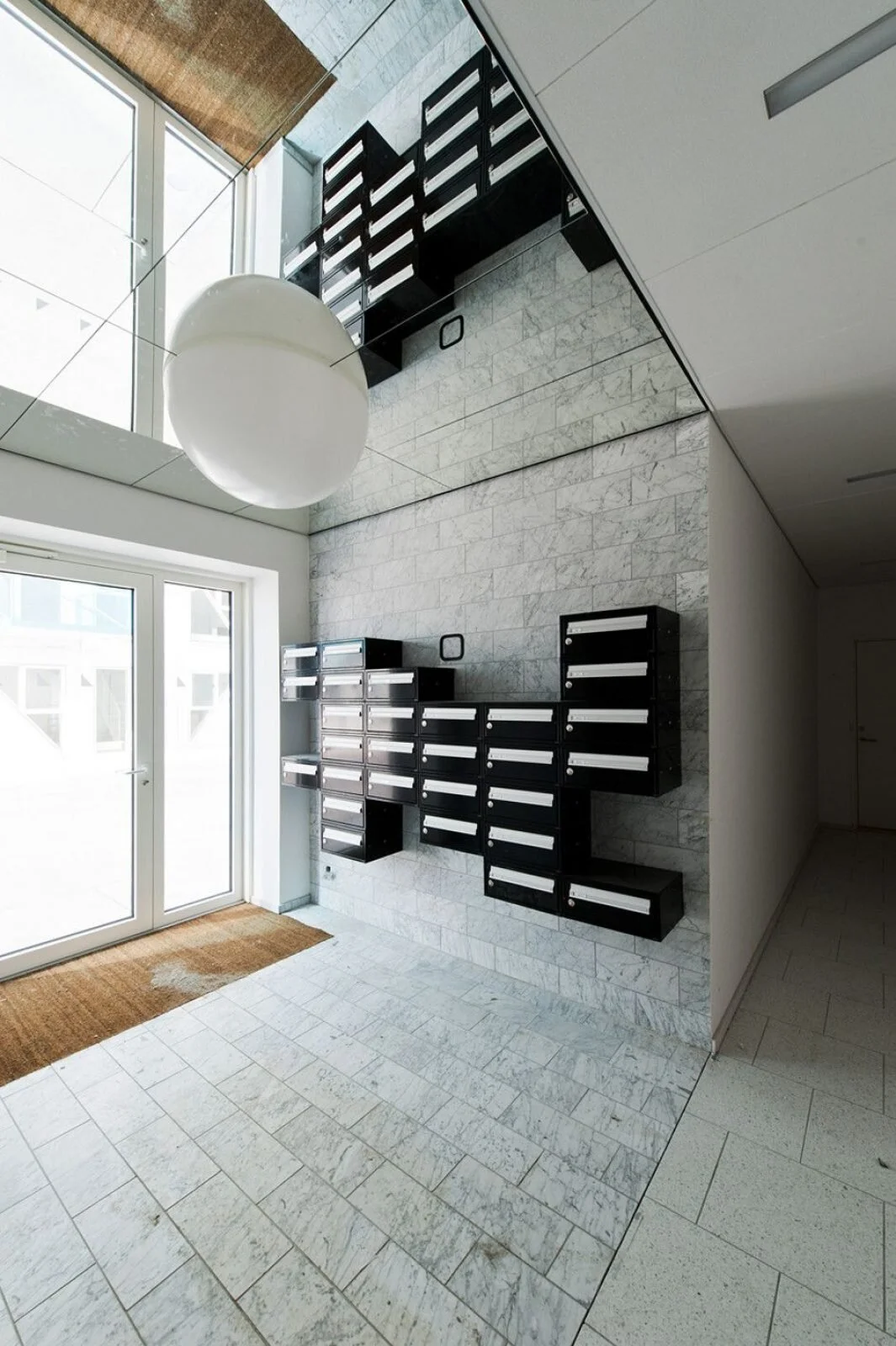
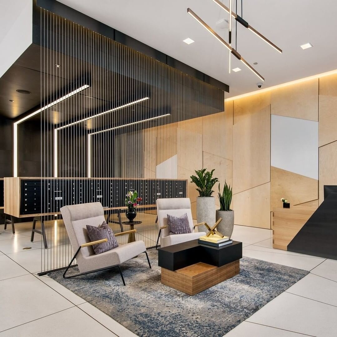
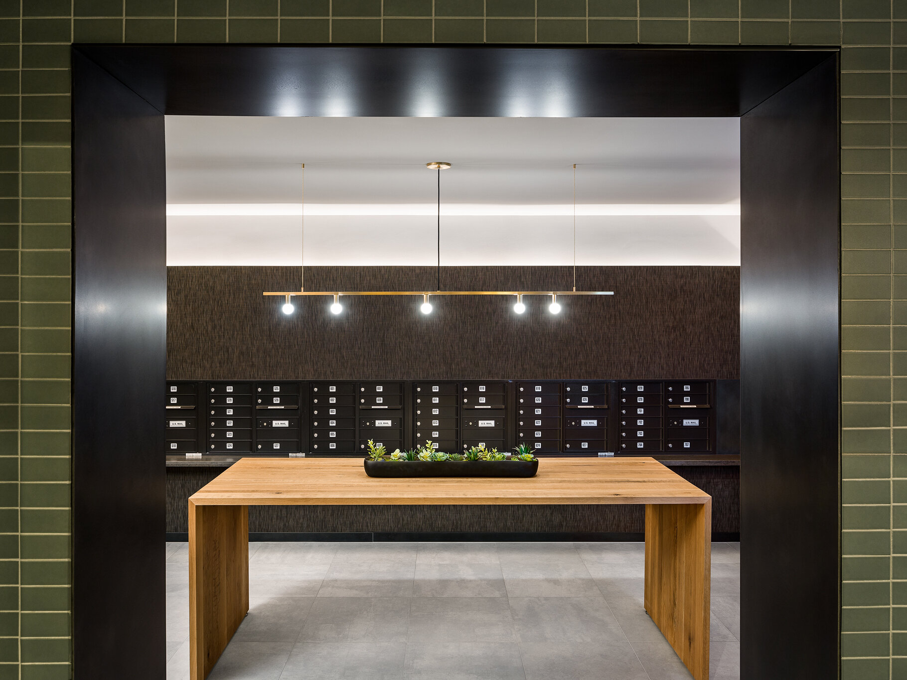
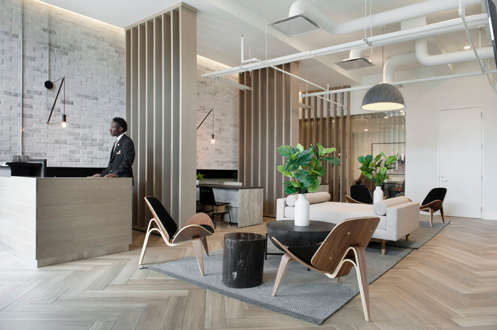
Lobbies and mailrooms may seem like simple, utilitarian spaces, but they are they are the introduction to the building and should provide a great first impression! Not all multifamily projects have a lot of space for expansive lobby area, but even using a small seating group with unique light fixtures and interesting materials can be enough to set the right tone.
Mailrooms are another necessity that are often overlooked from a design standpoint. If designating a separate room isn’t an option, mailboxes can be incorporated into lobbies in unique ways, such as integrating them into custom furniture or by patterning the individual boxes on the wall.
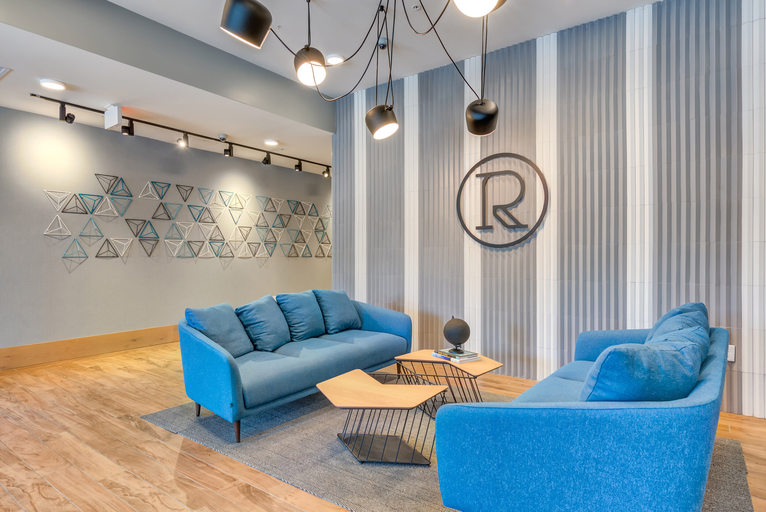
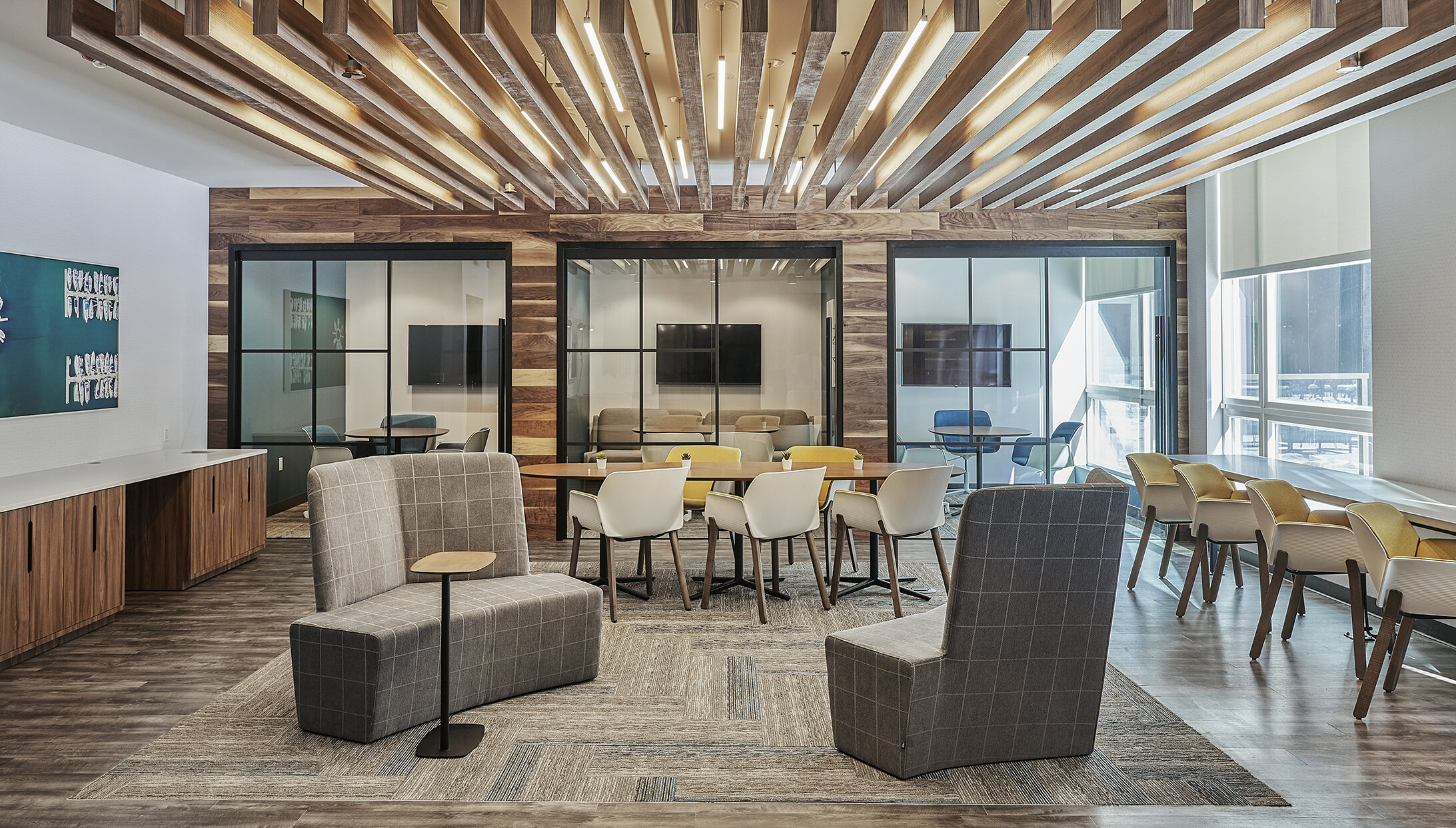
LOUNGE + CLUBHOUSE

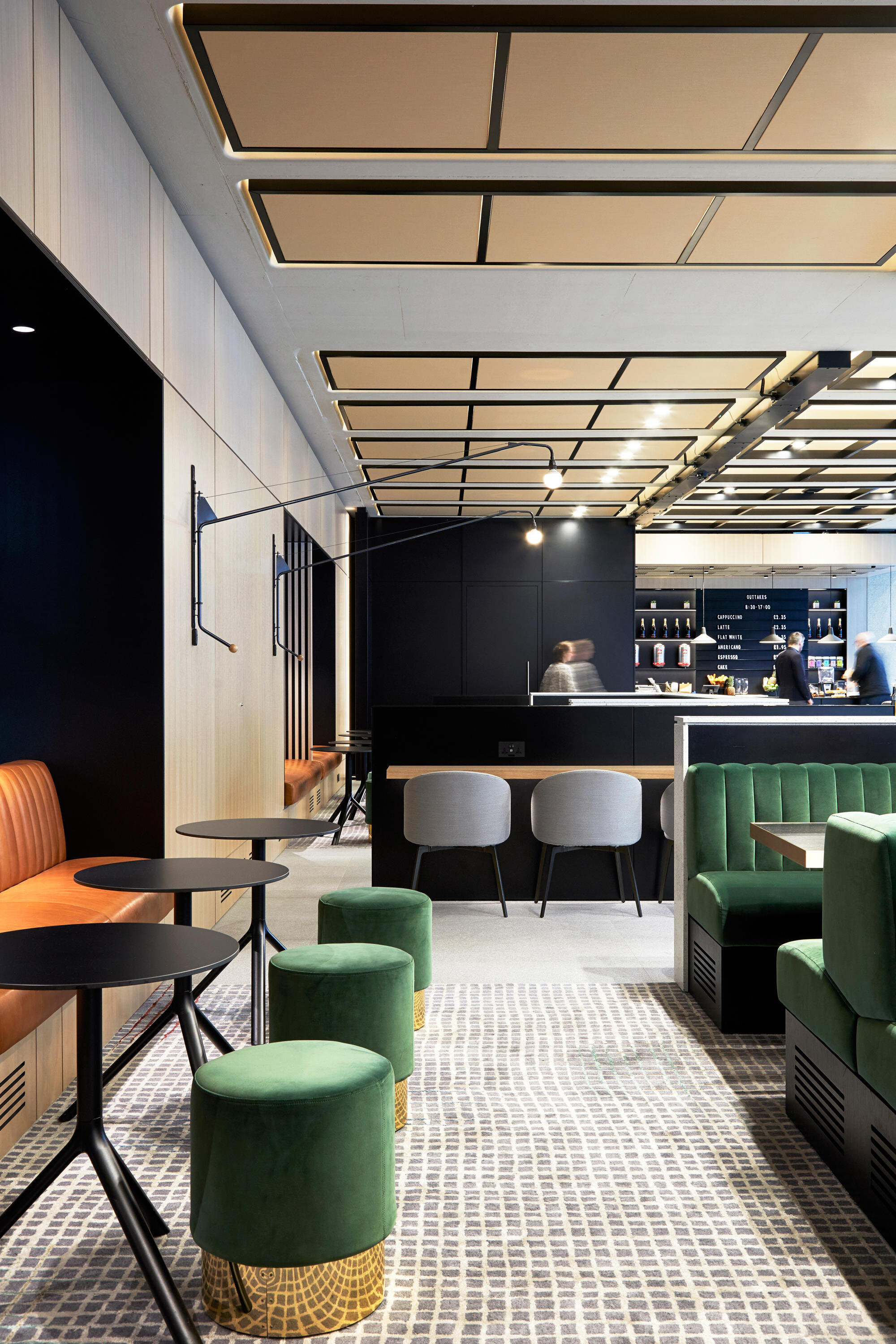
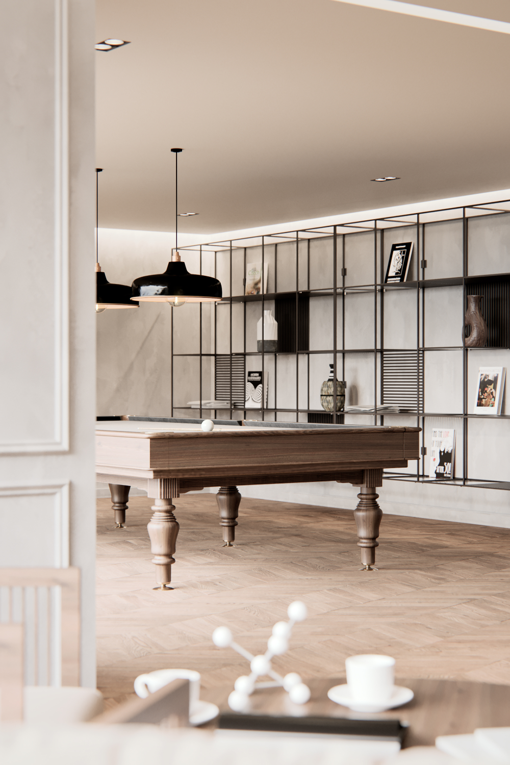


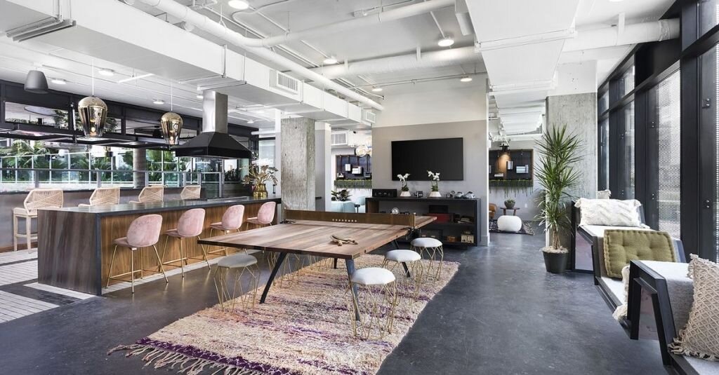
Great community lounges or clubhouses can be a great feature for attracting perspective residents. These can be simple spaces with lounge seating and a TV, or can they can incorporate other elements like games, community kitchens, or even a coffee bar. Regardless of how large it is or how many activities there are, an amenity lounge or clubhouse space should include multiple seating types and zones so different groups can comfortably use the space at the same time. Small additions like board games or unique light fixtures are great ways to round out the space and make it a destination for residents.
FITNESS

@VSHD Design
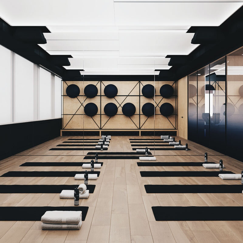
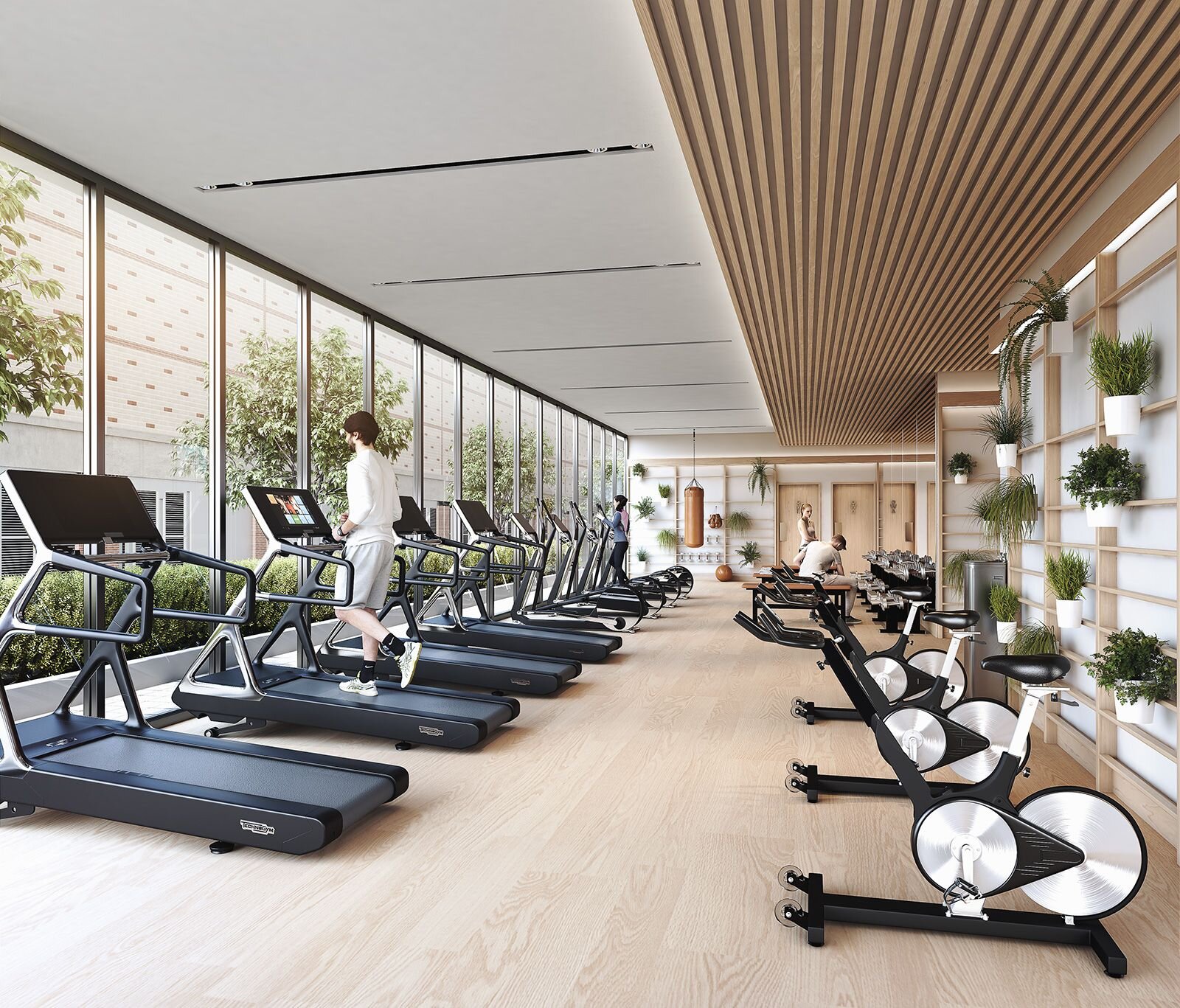
Gyms aren’t a necessity for multifamily housing, but they are another great feature that residents like having in the building. A well-designed fitness center should be more than just a room with mirrors and workout equipment, but a place that people get excited about going - even a small gym and locker room can be great amenities with good lighting, materials, and focal points!
CO-WORKING


Working from home has obviously become a lot more common over the last year. And as things start getting back to normal and community areas reopen, co-working spaces will be great features for residents who have more flexibility to work outside the office.
These amenities work best when they offer a variety of work settings. Desks, lounge seating, communal tables, private “phone booths” for heads down work, small meeting rooms for groups - multiple options makes it easier for residents to find the best fit and enjoy co-working amenity spaces!
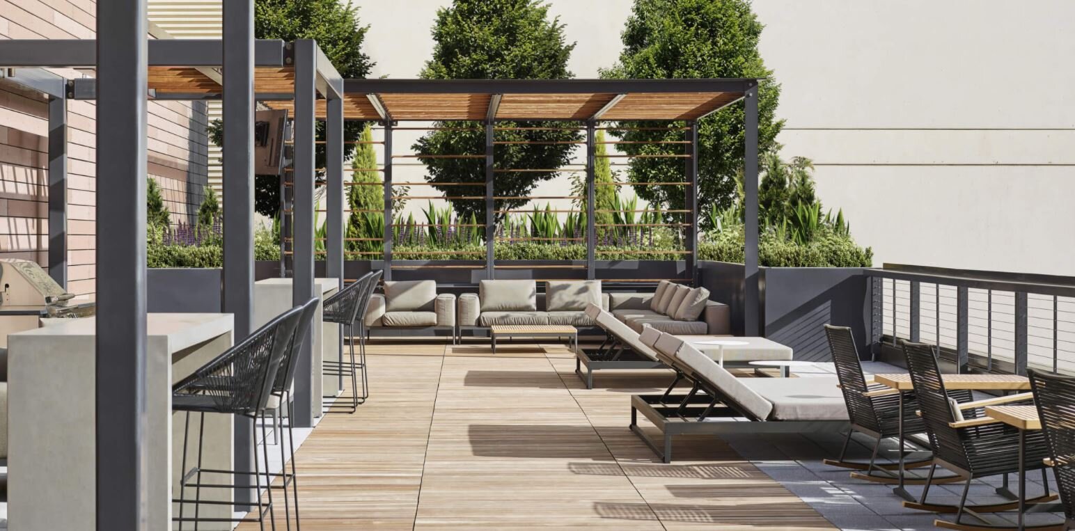
OUTDOOR
@Instrata Lifestyle

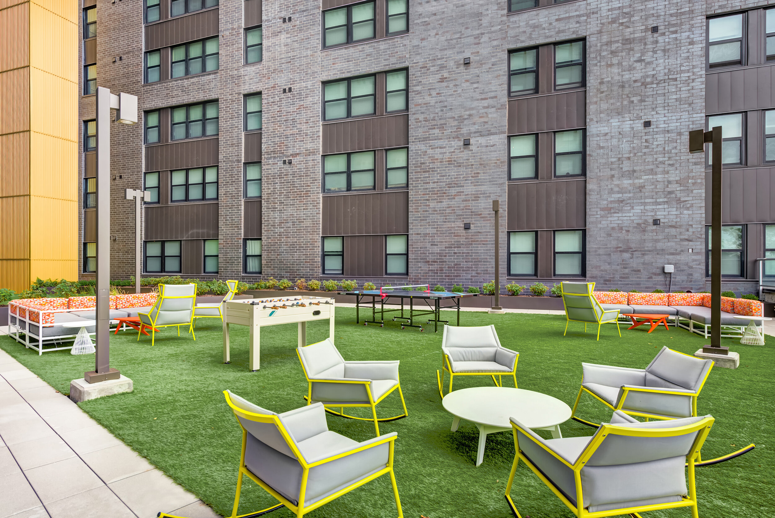
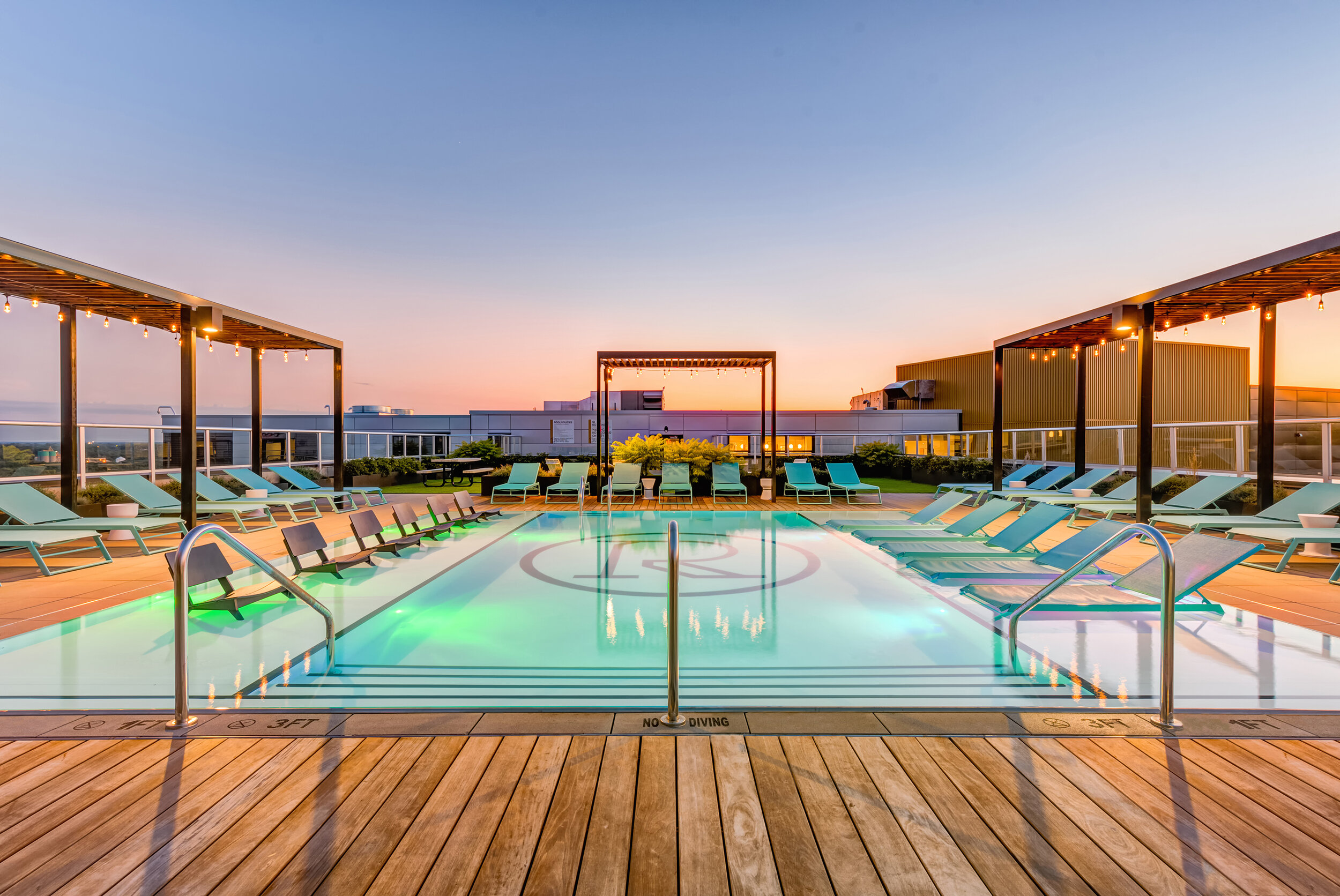
Access to an outdoor area can be a major feature for apartment-dwellers who don’t want to leave the premises in order to enjoy time outside. Outdoor amenity spaces can offer a wide variety of features - pools, lounge seating, cabanas, and outdoor kitchens, are all great additions! We love incorporating bold materials and outdoor games when designing outdoor amenity areas so that they become a destination for residents!
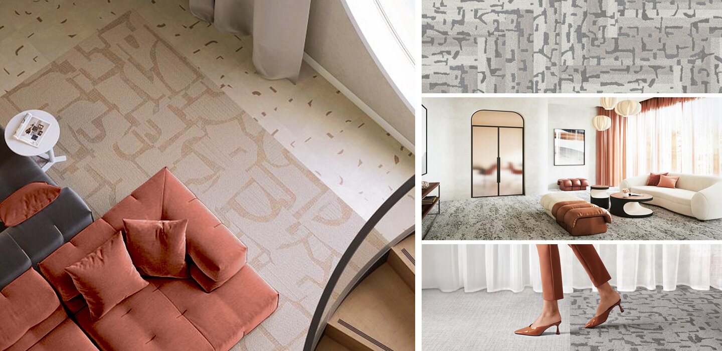
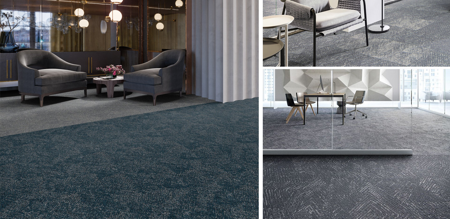
Sustainability | Carpet

As a major contributor to commercial production and waste cycles, the design and construction industry is focusing ever more on sustainability in new projects. It’s an incredibly important factor, and as designers, we love companies that make it easier for us to specify environmentally-conscious products and take part in sustainability programs.
Carpet is a big industry, and it’s installed into millions of new spaces each year. With that in mind, carpet companies can make a major environmental impact based on what materials they use, how they produce their products, and what sustainability efforts they choose to make. We love companies that take eco-consciousness seriously, so today we’re looking at sustainability in the carpet industry - take a look below to see some amazing companies and their products!

We love companies and products that are committed to reducing or eliminating post-consumer waste, and Shaw is doing just that! The company introduced the first Cradle to Cradle (C2C) flooring product more than 20 years ago, and continues to offer C2C products today. Moreover, their Re[TURN] Reclamation Program has allowed Shaw to reclaim and recycle almost 1 billion pounds of carpet since 2006, much of which has been reused in the production of new flooring products!

Mannington not only creates beautiful carpets, but the company produces them using less energy and resources! They are committed to reducing their environmental footprint, and were one of the original 50 Save Energy Now Leaders (now know as the Better Plants initiative). Mannington has 3.3 acres of solar arrays and has reduced energy intensity by 17% since 2007 - all while doubling their manufacturing sites!


Some of our favorite flooring is from EF Contract, and we love their commitment to reclamation! Their R4 Program was started in 2007, and focuses on the ideas of Return, Reuse, Recycle, & Reduce. Each year more than 60,000 pounds of waste are diverted from landfills through this program!
What sustainable carpets are you loving right now?
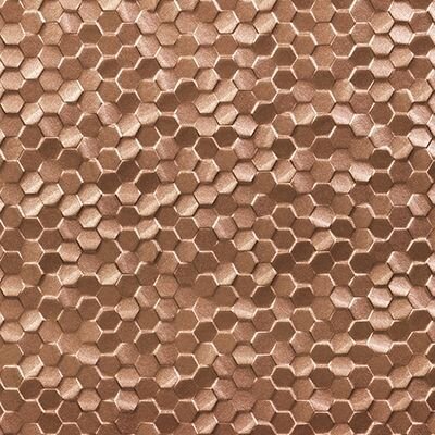
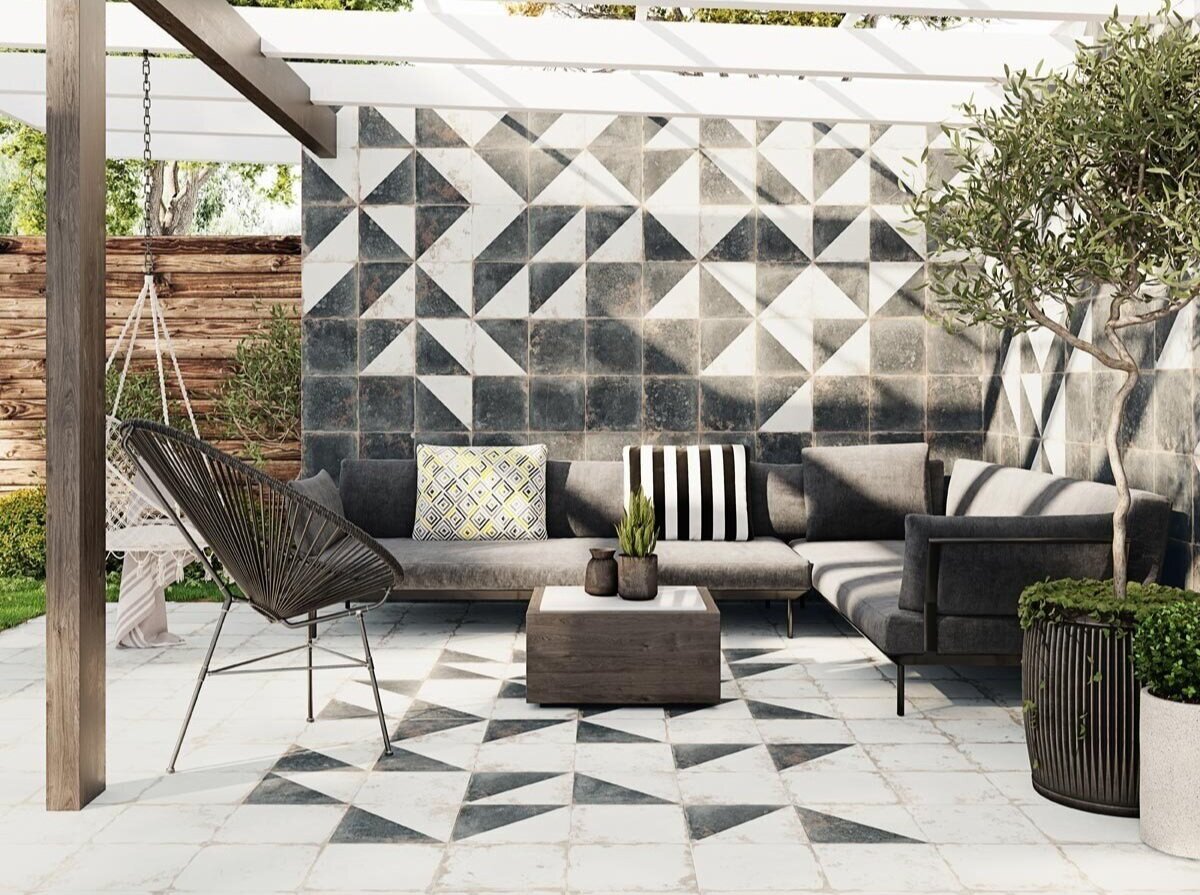
Spring Colors in Tile

As the weather gets warmer and the days get longer, we find ourselves getting inspired by the new spring season! Although we love the cool and tones of winter, spring is full of bright colors and interesting textures can add new life into a design.
And one of our favorite ways to do this is through tile - it’s variety and versatility make it a great material for introducing new colors and patterns. Take a look below at some of the spring-colored tiles that are inspiring us right now!

We love the different color color combinations you can make with the Technicolor line from Specialty Tile

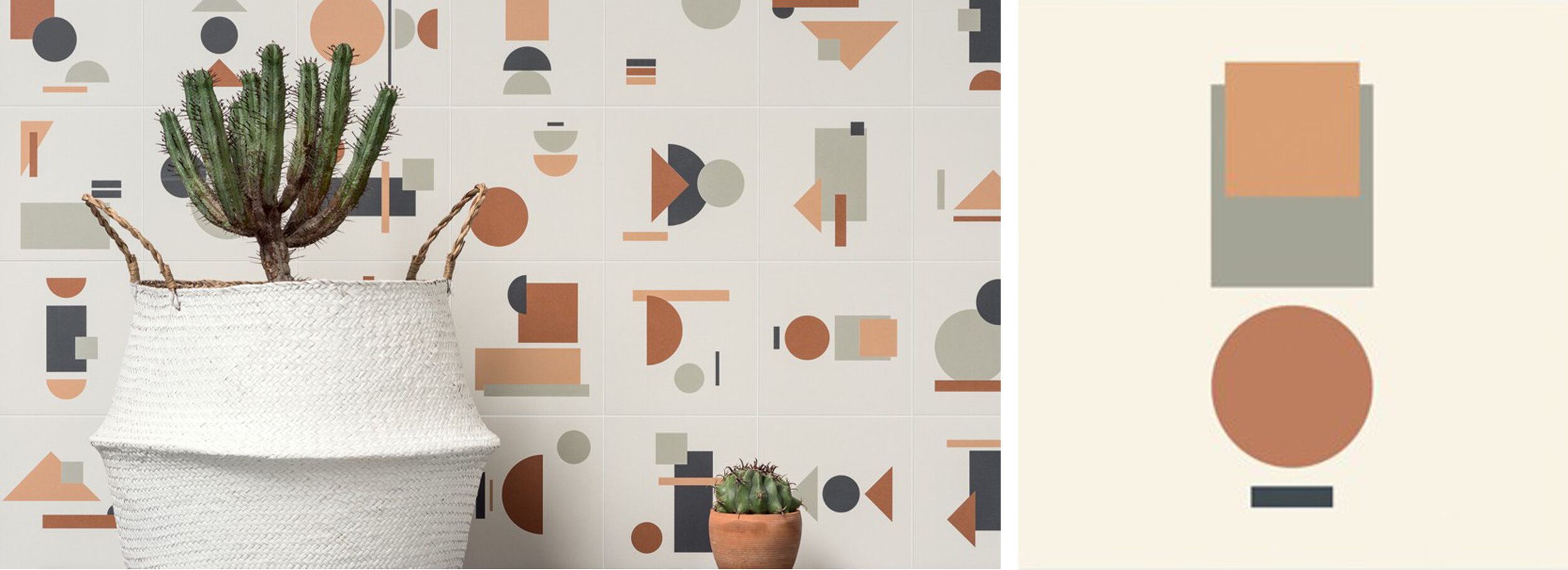

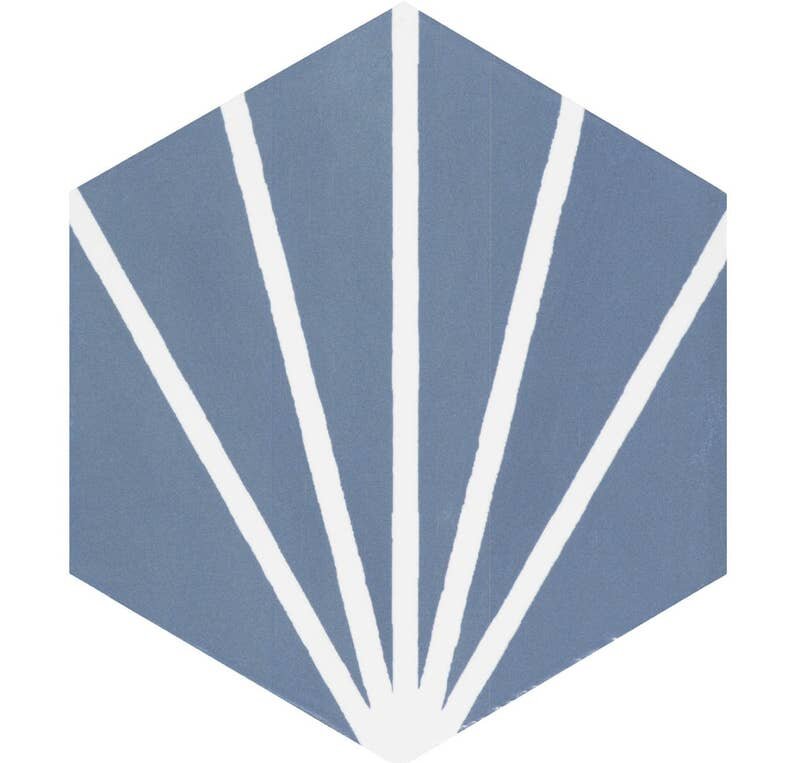
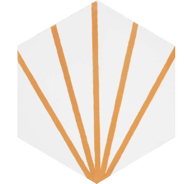
The Focus line from Trinity Tile is a great mix of bright, energetic colors and bold geometry

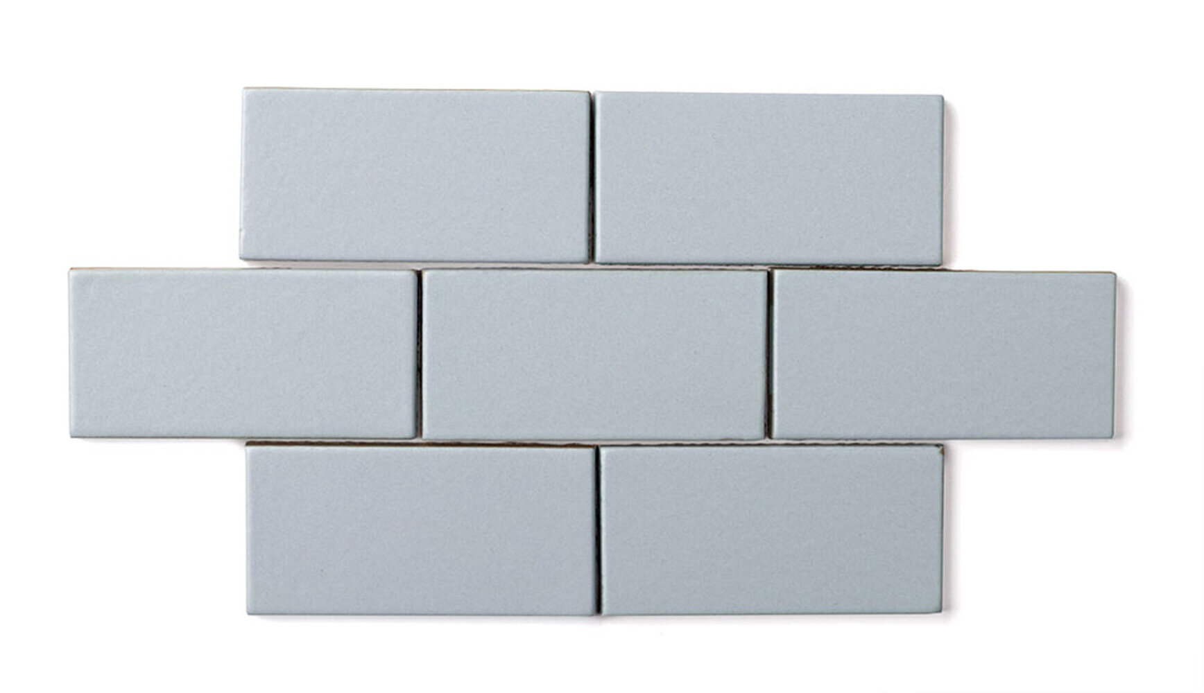
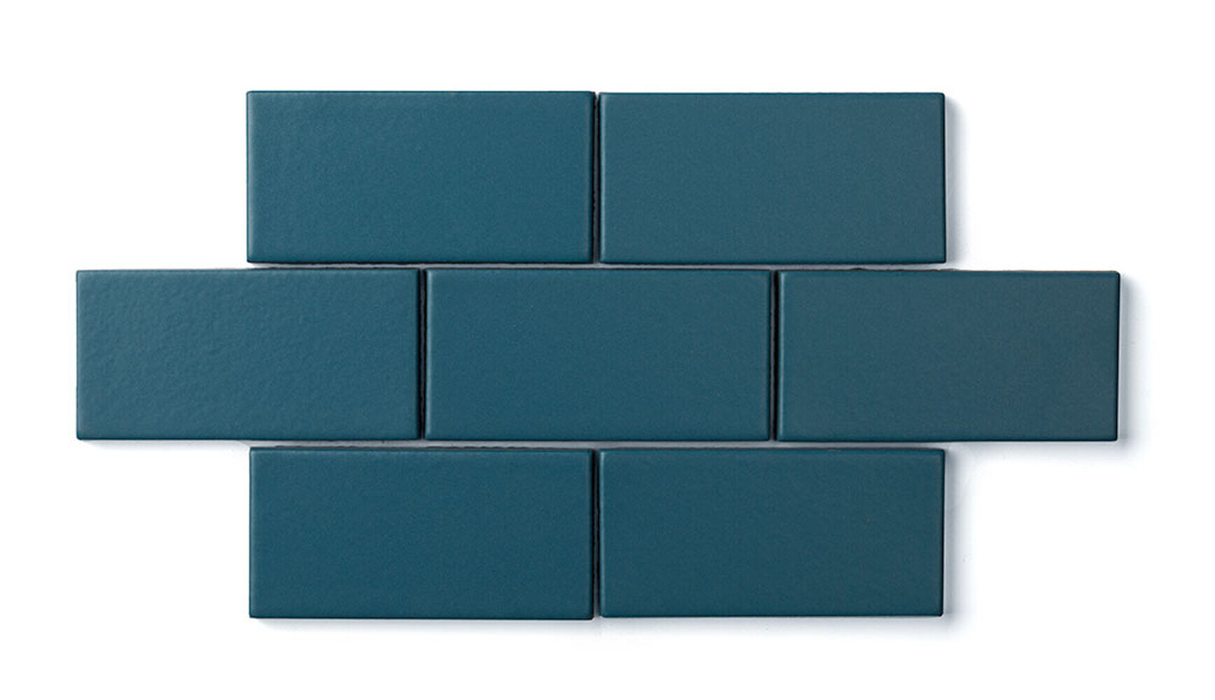
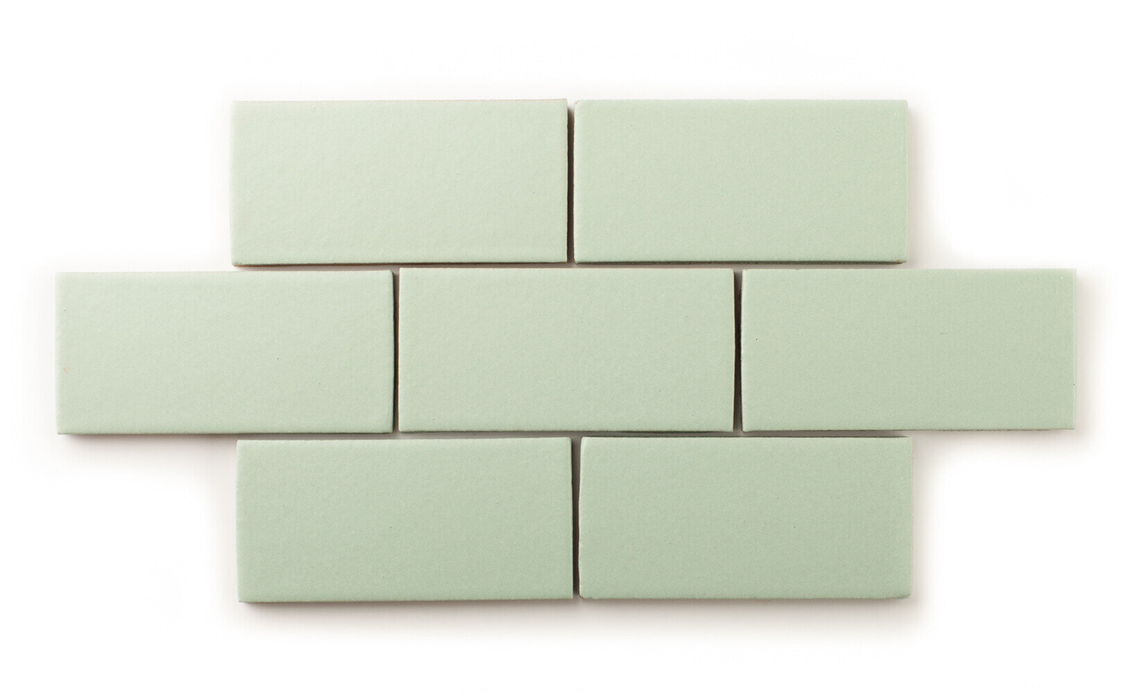
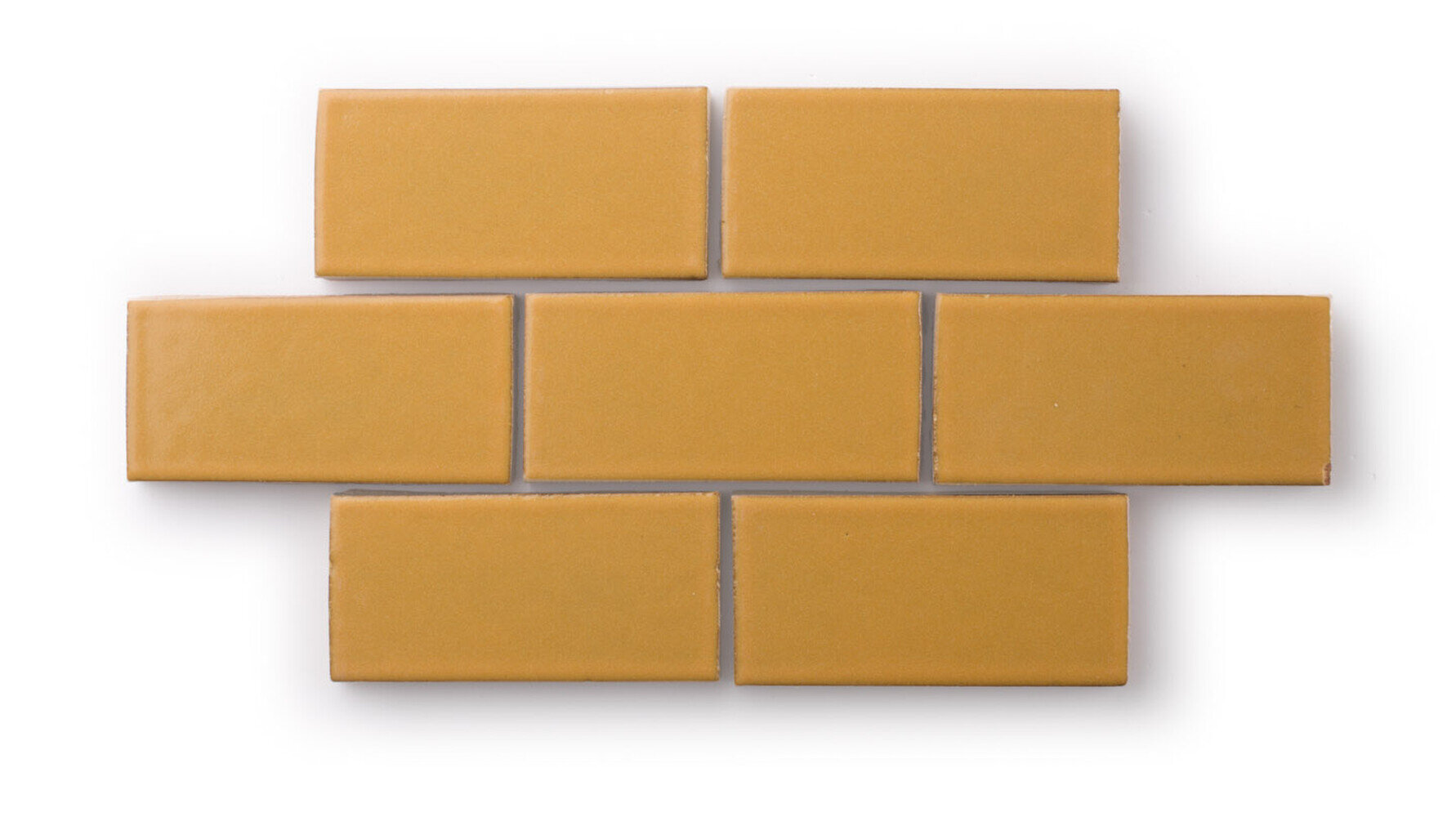
Fireclay Tile offers an amazing variety of tile shapes and hues as part of their Colors line - we love this install of spring-inspired colors!
What spring colors are inspiring you right now?